
More Related Content
What's hot
What's hot (20)
Viewers also liked
Similar to Digital package analysis
Similar to Digital package analysis (20)
More from Alice Bates
More from Alice Bates (20)
Recently uploaded
Recently uploaded (20)
Digital package analysis
- 2. THE NEIGHBOURHOOD DIGIPAKS Olivver the kid, otherwise known as Bryan Summis, was first the drummer in “the neighborhood”, until he went solo and started producing his won music and named himself “Olivver the Kid” or styled as ØV . The Neighborhood as a band however still had a very similar style to Olivver the kid and holds a lot of similarities. They tend to use very minimalistic colour schemes of mainly black, white and greys in their designs. They also like to use graphics for their logo and front covers that are similar to that of the Olivver the kid logo. I think that a lot of Bryan Sammis’s design inspiration came from been in ‘the neighborhood’ because to this day he still uses similar formats and style. I also noticed that their CD’s are plain white with their logo either at the top or bottom of the CD which is the same design as Olivver the kids. This is a very simplistic layout but one that’s effective and runs in the theme of their overall style. They’re inside compartments of their digipak are usually images that have been edited on Photoshop and are also very dark in colour. The white CD therefore contrasts with the darker background but there are still flecks of white in the background so that it doesn’t look completely out of place. I’ve also noticed that the positioning of the band name and EP name on the front cover is in the same position as the front cover of Olivver the kids EP,’ the boy who cried wolf’. It’s positioned centrally but placed nearer the top of the page so that the image or graphic can be placed underneath but they make it a big font so that it still stands out. All of these aspects are very similar to Olivver the kids designs and therefore by analysing both we can take inspiration and ideas from both formats.
- 3. SHAWN MENDES Shawn mendes music is in the same genre to Olivver the kid and therefore some aspects of their designs and styles are similar. The front cover of ‘the Shawn mendes EP’ as well as the actual CD and back cover all use the same fonts and colour scheme of blue, black and white. This technique creates synergy throughout the album and shows off his own personal style. The Black and white front cover has’t got an extremely strong contrast between them because it looks as if it’s been edited and faded slightly so that it doesn’t look as harsh. The fade od the photograph means that the paler blue colour is bright enough to see and isn't drowned out by a block of black and just brings a nice subtle pop of colour to the cover. On the back cover the titles of the songs are In the largest font size and is the brightest colour on the layout. Information of the album are all in white small print at the bottom of the page. The front and back cover both tie into the CD design and the same layout for the artists name and the EP name that’s on the front cover is in the same format on the CD. Although I like the simplicity of his digipak and the photograph used as the background on the front cover there are other aspects that I dislike and isn't very similar to Olivver the kids style. One of these aspects is I don’t find the design very interesting to look at and think that it looks very similar to a lot of other CD covers. Indie/ alternative pop music bands and artists usually have very simplistic covers and use minimalist colours. I will use this for the design of the digipak as I do like the overall style it creates however I want to add a bit of a twist and discover a way to make minimalism and graphics to deisgn something that also will catch peoples attention.
- 4. OLIVVER THE KID DIGIPAKS For his EP, ‘freak’ he designed his digital in a very simplistic and modern way which I really like. For the front over the colours that are on the image originally that was used I can tell was a black and white image. A lot of artists in the same genre use black and white photographs or graphics on their front covers too. However what I like is that there is a twist on the design because they have edited it so that it’s a double exposure image and have done this by laying an edited version over the top and positioned it slightly differently to the original. This gives the effect that he’s moving and makes the image look more surreal and abstract. The songs in this EP where all about things in his life that weren’t going well but also the music videos for Lucy, freak and Attica were all quite abstract but also brought to light situations that people do have to face and can be hard. There's always an underlying meaning behind his songs and I think that the double exposure is a good way of demonstrating this. The yellow on the front cover is the brightest part on the whole digipak and I like how they’ve done this. I think that it works when digipaks and their components are all tied in together, like Shawn mendes EP, but I also like the idea of the title standing out amongst everything else and tie them all in together through other ways. In this EP, it’s difficult to see because of the light in the photograph hitting the cd back cover, but the back cover is black and so is the actual cd. The simplicity of black and white on the back cover and the grey logo on the cd are very precisely designed and positioned. The structure of the box that the track songs are inside of on the back cover is something that I like and I think that it works well with the abstract cover because it brings the formality and structural style of Olivver the kids back to the EP digital. I think that overall all three work together very well and like the designs of each component on the digital, I will take forward techniques that have been used in this design to create the digital for our project.
- 5. The boy who cried wolf is the EP that ‘the woods’ is in. The album is all about escaping your personal addiction and how your own conscious and subconscious thoughts have a role in what you do. I think that the style and design of this EP’s digipak does reflect the meaning behind the album itself. The colours used are neautral and it uses a lot of greys and whites in the design. However what I like most about this digipak is the illustration and abstract feel about the front cover. He is featured on the cover with a cat head mask on and looks as if he’s sat on his bed. The part of the cover that captures your eye is the framed illustration of a girl and a boy walking through a forest. The painting of them is in an oval in the center of the page and the forest in the painting doesn’t look that daunting nor how forests are portrayed in Olivver the kids songs. This suggests to me that the painting is of what is ideal or what he wants the outcome of his story to be; simply him and his girlfriend walking through a forest. However the black outlines of branches bring a darker side to the illustration and ties in with his tattoos, shirt and the darkness of his hair. I think that the black branches are a representation of addiction and how they completely can take over your life that you had before the addiction. I think that how the black in the branches tie into his clothing, hair and tattoos is to make it seem as if the problem is within him and it’s as if he’s fighting himself. The white of the text contrasts really nicely against the grey but isn’t too bold so that the main focus is still on the illustration and the track listing is in white at the bottom of the front cover. The CD was in a plain white with the light grey Olivver the kid logo at the top, I think that this looks really nice and simplistic and goes well with the overall aesthetic of his EP. The back cover of this digipak was just a plain white colour which at first I didn’t like because track listings are usually at the back and I liked the way he did the layout for his ‘freak’ EP back cover. However I do actually think that having a plain white back cover does mean that all the focus of the album from a first look and the music on the album is all represented in the front cover.
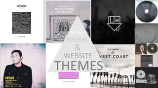
- 6. WEBSITE THEMES These screenshots are of Olivver the kids (Bryan Sammis’s) website. His website doesn’t contain any information about him, it only has a picture of his ‘the boy who cried wolf’ EP, the option to shop his merchandise and submit emails to him on the home page. Much like the CD design for this EP, the background is white and his logo is a light grey which is placed at the top of the page. The email submission section is in two light grey boxes that match the colour of the logo, as well as the ‘shop’ title. If the viewer clicks on ‘shop’ it takes them to a different where it has photographs of 6 possible items they could purchase. The photographs are on top of a white background and above them states ‘olivver the kid’ in a dark grey/ black writing. For initial information of prices and the name of the merchandise, if the viewer hovers their mouse above the photograph a dark grey transparent layer covers the photograph and has the information written in white. The clothing merchandise is black and white, as well as ‘the boy who cried wolf’ EP colour scheme and therefore his collection of items matches the design of his website and his overall theme. I do like his website theme and think that it’s very clever how it matches all of his EP’s and merchandise however there are some aspects that I dislike. Usually when artists have a website, it’s so that their fans can look at tour dates, listen to their music but also read and learn information about the artist. Non of these access points can be found on his website which I think makes looking at his website quite dull if you’re not someone who is looking to buy his merchandise. I don’t think that he is using his website to it’s full potential nor providing his audience with what they would like on website. Although I didn’t like every aspect of his website theme I still think that the design, layout and style of his website is impeccable and really represents his tastes. It leaves a blank canvas for his music to be the main focus and will make his viewers want to listen to his music If they like the look and feel of his website.
- 8. Olivver the kid doesn’t appear to have any magazine adverts or posters that have been included in the contents of a magazine. Online he has had articles written about his music and interviews are available to view, however he hasn’t had a poster that has been advertised in a magazine. This makes more difficult to get an exact replicable idea of what is his preferred format for an advert representing his music. To find out and have an idea of what things he likes to include, I’ve found some posters that are available for his fans to purchase and have noticed trends and style ideas that he uses in a lot of his posters. I can assume that these posters would be similar to how he would lay out and style a magazine advertising poster. One of the noticeable style techniques I found was that he used in numerous of his posters a filter that made the images on the poster look as if they had ben taken with film. Ive noticed that in a lot of his music videos he has also used this technique and it’s something quite novelty about his style. Taking photographs with film, polaroid's or the look as if digital photographs have been taken with film Is something that’s becoming more and more popular and is associated with having quite an ‘indie’ style. I think that it’s a really nice outcome and gives images a haze and warmth to them but also looks quite raw and can make photographs look as if they’ve got a story behind them because they look as if they were taken in the past. Another common feature of all of the posters Is that position of images and text is vey important as well as the colour scheme. Frames and boxes are consistent in every designed poster and have been used to create a structure and makes it look very clean and professional. I also really like that on some of the posters, the photographs have been laid over the top of a cream or white backgrounds or have white borders which I think makes the poster look slightly more formal and brings out the colours in the image. POSTERS Every poster has a central theme where either the photograph or text is placed right in the center of the poster, the focus when someone first glances at a photo will be the central point and therefore this position is intentional to make it stand out more. These are all aspects that I can take inspiration from in the design of my own project and use in my magazine advertising poster.