This document provides an evaluation of a music video, album cover, and promotional materials for a fictitious band.
The music video represents different social classes through three girls ages 17-19 dressed in warm outdoor clothes. It aims to convey the message that stereotyping teenagers leads to lower class behavior and things need to change.
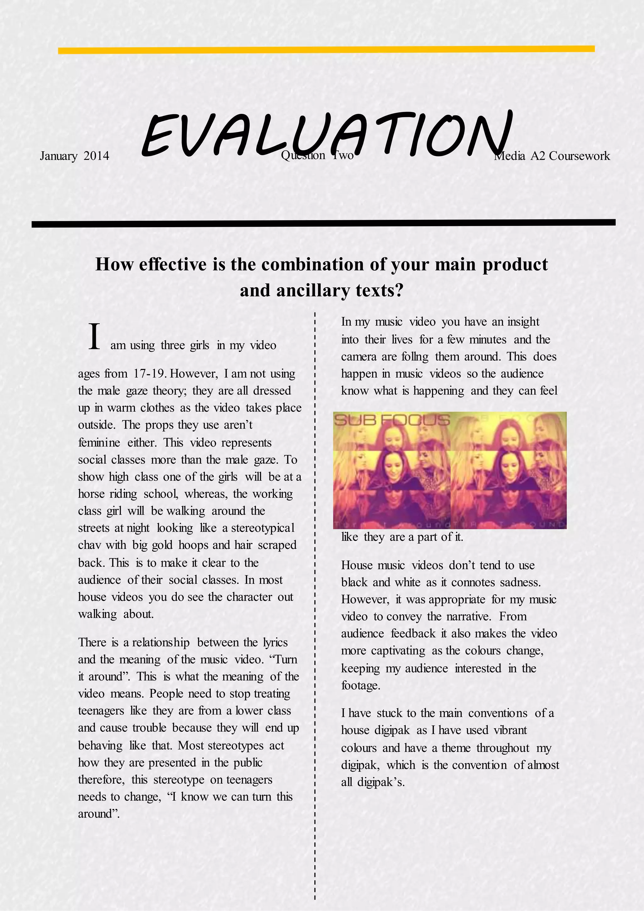
The album cover features the same photo layered three times, with font representing the house music genre. Originally a more pop-oriented cover was considered but changed to better suit the genre.
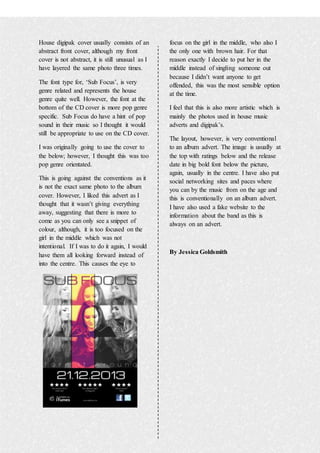
The promotional materials follow conventions like ratings, release date, and ways to purchase the music prominently displayed, along with fake band information. Feedback was that using black and white captured attention while conveying the