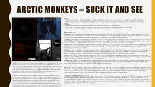
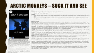
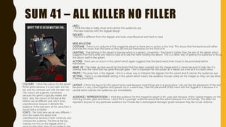
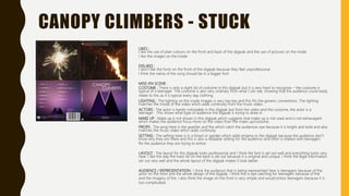
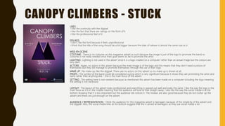
The document provides an analysis of three student ancillary tasks evaluating digipaks from different bands. For the Arctic Monkeys digipak, the student likes the fonts and color scheme but finds the images hard to make out. For the mise-en-scene analysis, the student notes the casual costume fits the indie rock genre. The Sum 41 digipak fonts are hard to read and the band photo needs flipping. The Canopy Climbers digipak uses plain colors and fitting inside images, but the front fonts feel unprofessional.


