
Recommended
More Related Content
What's hot
What's hot (19)
Similar to Album cover analysis
Similar to Album cover analysis (20)
More from Eden McClymont
Recently uploaded
Recently uploaded (20)
Album cover analysis
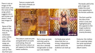
- 1. The font used for the title of the artist is curly and highlighted pink, this appeals to the target audience which is tweens (mainly females). Costume: the clothes she is wearing makes her quite sexualised common of female album covers. Full body pose which show that she is a strong, independent woman which the audience can look up to. The colours used are pink and gold which are quite contrasting, they are quite feminine colours so will appeal to the female- tween audience. Name of the album is the first song, it is easy to remember and a catchy song. The titles of the songs are relatable to teen girls, such as ‘One kiss from you’. There is not an image on the back cover, only the name of the songs which suggests she is well known and doesn’t need two images of her,. The beads add to the girly image and makes the cover more appealing to the female audience. Not a close up used, mid shot used to show off her body also she is already recognisable so close up is not needed. Texture created with the shots of beads on the back cover.
- 2. The font used for the front and back cover are plain and bold, therefore it stands out and is easy to read. The costume the artist is wearing is again very plain and simple, her entire body is covered which is unusual of female album covers as they are often sexualized. This therefore appeals to her audience who are more mature and enjoy songs that are more serious and indie. A picture of the artist is used which is common. She is standing full on and is directly addressing the camera, which could conform to her star image of being a confident woman. The colours used on both the front and back link, they are plain white and blue which stand out. The back cover features the names of the artist's songs, which could be argued relate to the female audience such as 'This is what makes us girls' and Summertime sadness.' The front cover uses a plain background of a sky, however the back cover does not use an image but is just a plain white. This again adds to the simpleness. It has a very vintage look to the album, appealing to fans of indie music. Her hair and makeup has is very plain and her clothing gives off a very sophisticated and classy look.
- 3. The front cover features the band's logo which has appeared on all of their previous album covers. It is placed above a child that is cuddling a toy and appears scared, this therefore links to the album title 'nightmare' as she could have been woken up by a bad dream. The location of both the front and back cover are situated in a graveyard, this again relates to the title as they are known to be scary places especially at night. The colours used are dark which relate to the album's dark nature and overall tone. This also relates to the genre of music. A picture of the band has not been used, which shows they are well established and well known in the hard rock genre. The back cover is plain and links to the front as another picture of a graveyard has been used. It also follows the same colour scheme. The font used for the name of the band is bold and rugged which relates to the genre. The names of the songs appear on the back cover, one which is titled 'nightmare' which is the same as the album name. One is also name 'buried alive' which links to the graveyard themes. The album focuses more on visuals than the other two, which shows that they are committed and serious about their image and style. This will then appeal to the fans of the band who may also be interested in live music and bands that play and write their own music.