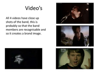
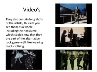
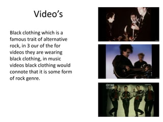
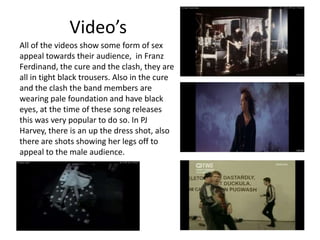
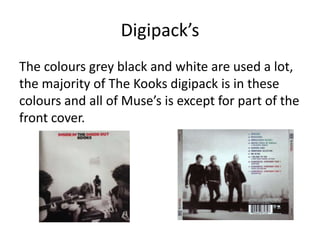
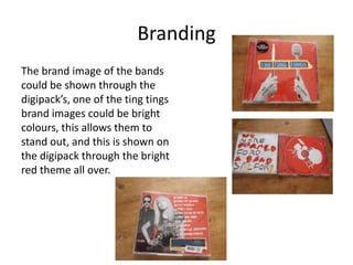
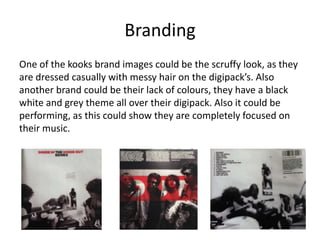
2. Video’s
All 4 videos have close up
shots of the band, this is
probably so that the band
members are recognisable and
so it creates a brand image.
3. Video’s
They also contain long shots
of the artists, this lets you
see them as a whole,
including their costume,
which could show that they
are part of the alternative
rock genre well, like wearing
black clothing.
4. Video’s
Black clothing which is a
famous trait of alternative
rock, in 3 our of the for
videos they are wearing
black clothing, in music
videos black clothing would
connote that it is some form
of rock genre.
5. Video’s
All of the videos show some form of sex
appeal towards their audience, in Franz
Ferdinand, the cure and the clash, they are
all in tight black trousers. Also in the cure
and the clash the band members are
wearing pale foundation and have black
eyes, at the time of these song releases
this was very popular to do so. In PJ
Harvey, there is an up the dress shot, also
there are shots showing her legs off to
appeal to the male audience.
6. Video’s
The three artists where they are
bands, all show performance
shots of them as a band playing
together. Them playing on the
guitars and drums and bass
would connote that it is an
alternative rock video as all
alternative rock bands would
include these instruments.
7. Video’s
In the cure and the clash they are
both set outside, the clash is in
the dark and the cure is at the
point where its turning dark,
darkness is a known trait of rock
genres so including the darkness
and cold in the videos would
connote that it is in the
alternative rock genre.
8. Characteristics
Alternative rock was originally related to non-commercial music
so the artists weren’t signed to any record labels. Also the
‘alternative’ part denotes that it is intentionally different from
other genre of music, the artists were all different. But obviously
you can only have so many different variations so most bands
started sounding similar. The word Alternative by the mid-90s
did not work anymore, because a lot of the music was featured
on commercial radio. These days Indie is the closest descendant
of what was Alternative rock.
9. Brand Image
All the artists have created their own brand
image, PJ Harvey has stars.
10. Brand Image
the cure has big black hair, pale faces, make up
and tight clothing, a lot of which would relate to
sex appeal at the time of the songs release.
11. Brand Image
The clash too have black clothing and pale faces,
they are also very performance based in their
videos, this could be a brand image for them
too.
12. Brand Image
Franz Ferdinand’s brand image could be their
jokey side as they are messing about in their
video and not taking themselves too seriously, it
could also be just shots of the band members, as
they are focused on the whole video, maybe to
create a brand image.
13. Digipacks
Mylo Xyloto and Resistance both
use multi coloured themes, this
could be so that the digipack is
bold and stands out compared to
other artists digipack’s.
14. Digipack’s
Resistance and we started nothing both
include band shots on the back of the digipack
but on the front of the digipack they have
pictures, by having the band members picture
on the back, this could be so that the audience
are intrigued by the picture on the front but
then are able to see what the band are really
like by how they look on the back.
15. Digipack’s
The kooks, resistance and Mylo Xyloto all
have grey backgrounds on the inside
sleeve, this could be so other features
stand out or because alternative rock
tend to use quite dull colours.
16. Digipack’s
The kooks and the ting tings both
show instrument related pictures on
the front cover, by doing this it could
show to people who see the digipack
what sort of band this album is, as
alternative rock use drums and guitar
so by showing pictures of these it
would connote what sort of genre the
album is.
17. Digipack’s
Mylo Xyloto, resistance and the ting tings all have bright front
covers, this could be to stand out so people are aware of the
album.
18. Digipack’s
All of the digipack’s keep a theme, the ting tings have a bold red
theme all over, Mylo Xyloto has a graffiti theme, this could
appeal to teenagers. Both of these themes are bold so would
attract attention from people that see them which could
increase sales.
19. Digipack’s
The kooks have a black, white and grey colour
scheme with non posing photos of the band,
this could connote that they focus completely
on the music and are not creating the album
for commercial purposes.
The background all over the digipack of
resistance is grey, this could be like this to not
draw any attention away from the picture on
the front and it goes with the black and white
photos of the band.
20. Digipack’s
The genre is expressed in The Ting Tings digipack
by showing instruments, this would be
associated towards alternative rock as they are
always used.
21. Digipack’s
The genre is expressed in Mylo Xyloto by the
graffiti, this shows their wild rocky side.
22. Digipack’s
The colours grey black and white are used a lot,
the majority of The Kooks digipack is in these
colours and all of Muse’s is except for part of the
front cover.
23. Digipack’s
The digipack’s use a lot of bold colours too, so
the colour scheme tends to be completely dull
or completely bold, there’s no real in between.
24. Branding
The brand image of the bands
could be shown through the
digipack’s, one of the ting tings
brand images could be bright
colours, this allows them to
stand out, and this is shown on
the digipack through the bright
red theme all over.
25. Branding
One of the kooks brand images could be the scruffy look, as they
are dressed casually with messy hair on the digipack’s. Also
another brand could be their lack of colours, they have a black
white and grey theme all over their digipack. Also it could be
performing, as this could show they are completely focused on
their music.
26. Branding
One of Coldplay’s brand images could be bold colours too, they
use neon colours all through out their digipack, this could
connote that their music will be very high energy too.
27. Branding
Muse’s brand image could be that they are a serious band, they
have a picture of the earth and there is a posed tilted upward
shot in black and white of them walking this would show they
have power.
28. Adverts
Both of the backgrounds are white, this could
denote that they are trying to lead focus
towards what the advert says and what they are
advertising.
29. Advert’s
Both of the adverts have doodling on, this could
show the jokey side of the band, it could show
that they don’t take themselves too seriously,
which can be a trait of alternative rock, just
doing what they want to.
30. Advert’s
The artist name and album name are written boldly in black
writing at the top of the advert, this would be because you tend
to read from the top so it would be the first thing that people
would read when they see the advert, so it would be the most
memorable so the artist name could stick in their mind.
31. Advert’s
Both of the adverts stick to a colour theme, All Time Low have a
black, white and yellow theme whereas The View has a black,
white, pink and green theme. Again this shows that Alternative
Rock things tend to incorporate the colours black and white in.
32. Advert’s
All Time Low has a big picture of them on the advert this could
be so people know who they are, so they are recognized. Also it
allows us to see their costume, this could connote what type of
genre it is just by what they’re wearing e.g. skinny genes.