This document analyzes and summarizes the cover artwork and textual elements of three different album covers:
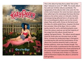
1) Katy Perry's "One of the Boys" album depicts stereotypical feminine imagery like pink objects but also includes a blue hat to reference the album title. The colors indicate upbeat, feel-good songs aimed at both male and female audiences.
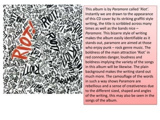
2) Paramore's "Riot" album features graffiti-style writing of the band and album names, implying a punk-rock genre of bold and loud songs with a rebellious spirit.
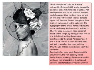
3) Cheryl Cole's "3 Words" album depicts the artist in a delicate, partially nude pose with the album title written on her body for a