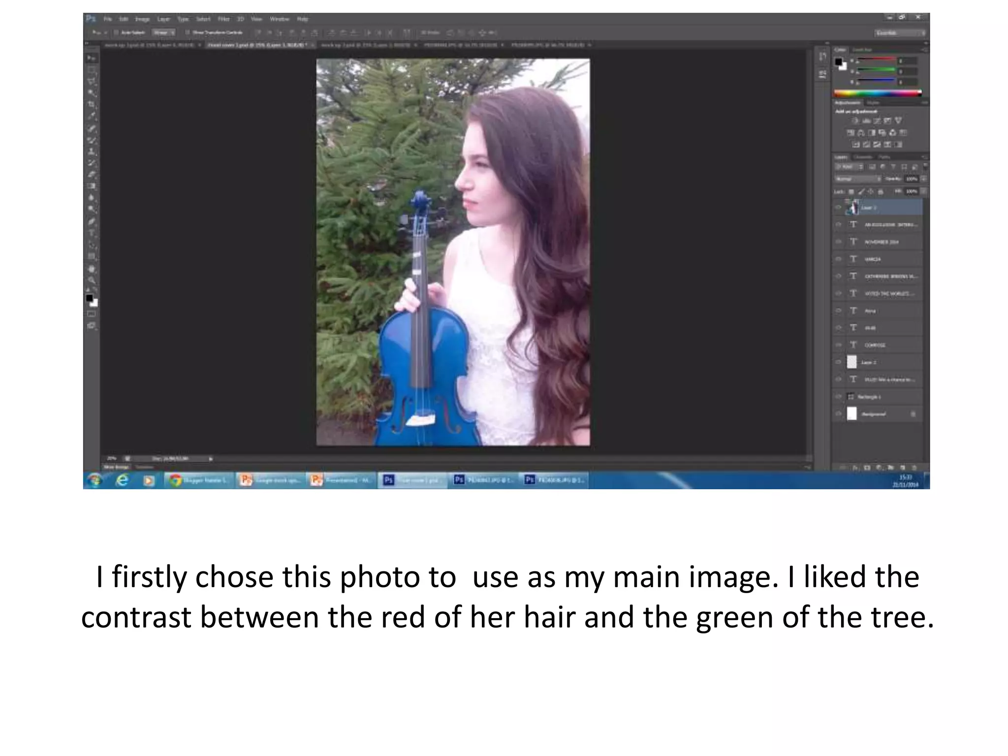
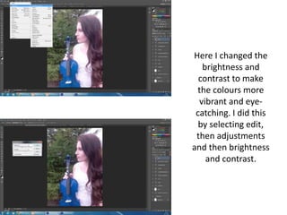
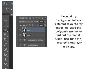
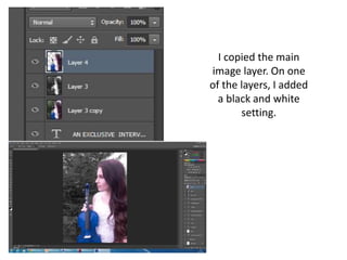
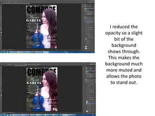
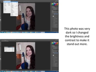
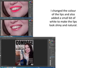
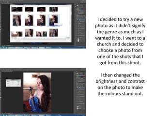
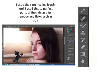
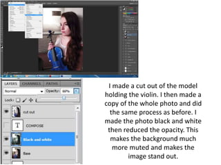
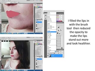
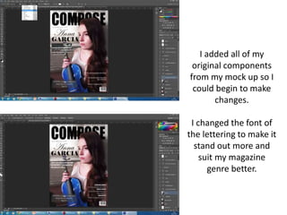
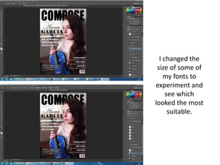
I firstly chose this photo to use as my main image. I liked the
contrast between the red of her hair and the green of the tree.
Here I changed the
brightness and
contrast to make
the colours more
vibrant and eye-
catching. I did this
by selecting edit,
then adjustments
and then brightness
and contrast.
I wanted my
background to be a
different colour to my
model so I used the
polygon lasso tool to
cut out the model.
Once I had done this,
I created a new layer
as a copy.
I copied the main
image layer. On one
of the layers, I added
a black and white
setting.
I reduced the
opacity so a slight
bit of the
background
shows through.
This makes the
background much
more muted and
allows the photo
to stand out.
This photo was very
dark so I changed
the brightness and
contrast to make it
stand out more.
I changed the colour
of the lips and also
added a small bit of
white to make the lips
look shiny and natural.
I decided to try a new
photo as it didn’t signify
the genre as much as I
wanted it to. I went to a
church and decided to
choose a photo from
one of the shots that I
got from this shoot.
I then changed the
brightness and contrast
on the photo to make
the colours stand out.
I used the spot healing brush
tool. I used this to perfect
parts of the skin and to
remove any flaws such as
spots.
I made a cut out of the model
holding the violin. I then made a
copy of the whole photo and did
the same process as before. I
made the photo black and white
then reduced the opacity. This
makes the background much
more muted and makes the
image stand out.
I filled the lips in
with the brush
tool then reduced
the opacity to
make the lips
stand out more
and look healthier.
I added all of my
original components
from my mock up so I
could begin to make
changes.
I changed the font of
the lettering to make it
stand out more and
suit my magazine
genre better.
I changed the
size of some of
my fonts to
experiment and
see which
looked the most
suitable.
I went online and checked on a website to see if a
website was taken. I found a website that was not
taken which I then placed on my magazine. This
ensures that the URL is not taken.

Front cover stages

  • 1.
    I firstly chosethis photo to use as my main image. I liked the contrast between the red of her hair and the green of the tree.
  • 2.
    Here I changedthe brightness and contrast to make the colours more vibrant and eye- catching. I did this by selecting edit, then adjustments and then brightness and contrast.
  • 3.
    I wanted my backgroundto be a different colour to my model so I used the polygon lasso tool to cut out the model. Once I had done this, I created a new layer as a copy.
  • 4.
    I copied themain image layer. On one of the layers, I added a black and white setting.
  • 5.
    I reduced the opacityso a slight bit of the background shows through. This makes the background much more muted and allows the photo to stand out.
  • 6.
    This photo wasvery dark so I changed the brightness and contrast to make it stand out more.
  • 7.
    I changed thecolour of the lips and also added a small bit of white to make the lips look shiny and natural.
  • 8.
    I decided totry a new photo as it didn’t signify the genre as much as I wanted it to. I went to a church and decided to choose a photo from one of the shots that I got from this shoot. I then changed the brightness and contrast on the photo to make the colours stand out.
  • 9.
    I used thespot healing brush tool. I used this to perfect parts of the skin and to remove any flaws such as spots.
  • 10.
    I made acut out of the model holding the violin. I then made a copy of the whole photo and did the same process as before. I made the photo black and white then reduced the opacity. This makes the background much more muted and makes the image stand out.
  • 11.
    I filled thelips in with the brush tool then reduced the opacity to make the lips stand out more and look healthier.
  • 12.
    I added allof my original components from my mock up so I could begin to make changes. I changed the font of the lettering to make it stand out more and suit my magazine genre better.
  • 13.
    I changed the sizeof some of my fonts to experiment and see which looked the most suitable.
  • 14.
    I went onlineand checked on a website to see if a website was taken. I found a website that was not taken which I then placed on my magazine. This ensures that the URL is not taken.