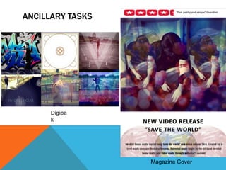
The document discusses the layout, fonts, and tone used in the ancillary tasks of a digipak and magazine cover created to promote a song. For the digipak, typical templates were used and images were laid out around the CD holder. Fonts like 'Castellar' and 'Imprint MT' were used and edited to fit the images and tone. The magazine cover featured a bright background image with fonts in Arial to stand out. Both ancillary tasks aimed to engage the target audience of 16-30 year olds with themes and colors relevant to house music like festivals and partying.