
Recommended
More Related Content
What's hot
What's hot (19)
Similar to manipulation
Similar to manipulation (20)
More from annie addicott
More from annie addicott (15)
Recently uploaded
Recently uploaded (20)
manipulation
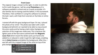
- 1. Front Cover The original image is shown to the right. In order to edit this to fit in with the genre, I will be using Photoshop as it is software available in school and so is easily accessible. It’s also familiar due to having used this before, in AS coursework. Therefore, I feel confident in using this software to achieve the look I want, with help from tutorials on YouTube or online forums. I started off with the grey background layer. On top, I placed the photo of my ‘artist’. The photo was taken with a dark background behind it as I wanted to be able to crop around the actor easily and by having a dark colour background, selection of the image was made easy. This is because the lighter parts of the face were outlined with the Magnetic Lasso Tool which meant the darker parts just hand to be added to or reduced in order to get the right shape, enabling me to Select Inverse and delete the background. After this, I was left with the cropped image of the artist on top of the grey background.
- 2. Next, I played around with different colour settings, such as lowering brightness, to make the image less harsh and fit more with the background, upping the saturation and changing the hue so the image still looked noticeable and was less grey toned, also giving the image a colour gradient as this was conventional of the EDM genre, having a bright central image which contrasted to the background. However, I decided the image was too faded due to the green colour not standing out as much as I wanted it to. I also played around with the transparency as it being shown on full was again too harsh so I needed to find a good balance between vibrancy and blending. When adjusting the blending settings, I dragged the scale in on both ends so that the background would overlap the image slightly to give the effect that the artist was in the process of evolution, to illustrate the album title, ‘the evolution of man’.
- 3. I decided to add in text at this point so I could see the front cover come together. I used Example’s standard font for this which appears in all his work to keep to conventions of the artist. This is because it is his logo and branding and it’s part of how people know him so I wanted to maintain that familiarity his audience would have with him.
- 4. At this stage, I used the Blend If: Red effect so that there was a gradual yet ‘glitchy’ fade from the image to the background. This is so visually it can contradict the title as it connotes more to deterioration than progression due to the image not being as strong in contrast to the background. Therefore, showing the effects of being part of the negative side of EDM, such as drug use, anti social behaviour and I also darkened the background by lowering the brightness of the background layer. This was to increase vibrancy of the red so it was less difficult to see and to add definition to the images as it looked too faded before.
- 5. I added in the album title using the Horizontal Text tool. Then moved it to the centre of the cover, across the eyes of the artist as this is a conventional placement for the title which I found from analysing other albums. I changed the font a few times to see what looked boldest and what suited the whole tone of the album. I asked people to choose their favourite out of the options and it concluded to be the one shown on the left. This may be because it stands out the most and is more unique than the other.
- 6. My final step was to fade the image to the background so it appeared less harsh as I didn’t like the appearance of being able to see the straight line where the edge of the image was. This was achieved by selecting the top layer, adding a Layer Mask and then using the Gradient Tool on the image by dragging a line from the background into the image.