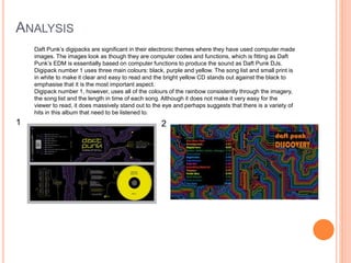
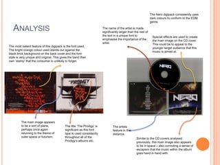
– DIGIPACK AND POSTER ANALYSIS
I have chosen several CD covers ,digipacks and an
advert from artists that share the same genre that I
have chosen for my A2 Media Music Video – Electronic
Dance Music
TYPICAL CONVENTIONS OF A CD COVER
 Artists name
 Album / single title
 Main image
 Age restrictions
 Use of a different colour for the band name
compared to the rest of the cover
CD COVERS
Dada Life LTJ Buckem Electronic Light Orchestra Pet Shop Boys
Each of these CD covers share common themes as they all seem to be out of this earth; either viewing
the earth from an outer perspective or futuristic elements such as the electronic dog-looking figure and
the spaceship on the ELO album cover.
ANALYSIS
This album cover is for the Speaker of the
House’s remix of Dada Life’s ‘One Last Night on
Earth – the song that I have chosen to do my
music video to. The original cover was of the
earth without the golden symbol surrounding it –
the symbol that the remix DJ has used to ‘place
his stamp’. This gives a significant symbolic
meaning that will be shared with the fans of the
EDM music.
The clear,
bold font
gives clear
titles and the
song title
conforms to
the image –
the earth.
This
recurring
theme
perhaps
suggests that
the music is
‘out of this
world’.
Both CD covers share a
similar colour theme – dark
blues of the universe and
the bright lights of stars.
This theme is simple yet
effective.
LTJ Bukem’s Logical Progression Album cover
uses an image of the earth’s surface from a
space perspective – also suggesting an ‘out of
this world’ theme. The bright light may be a
star but could also be some kind of futuristic,
space bound object.
The writing on this album cover is simple and plain,
with the name of the album capitalised. This helps
for the main focus to be on the image of the planet
earth.
As both album
covers are in
outer space,
they give the
sense of
escapism. The
images could
be suggesting
that the music
also gives this
sense.
ANALYSIS
Electronic Light Orchestra’s album ‘Out of the
Blue’ also takes an outer space, futuristic
approach.
The Pet Shop Boy’s Album ‘Yes’ is a
very simplistic album cover. It uses
eleven bright colours to form the main
image: a tick, suggesting ‘Yes’.
The artist and album name are simple
in bold, black writing and are put
together to form a sentence: Yes, Pet
Shop Boys.
Their initials ‘ELO’ are illustrated in the
centre of the space ship and then
written in yellow font in the top right
corner.
Both album
covers use bright,
vibrant colours to
illustrate the band
and their music.
The variety of
colours stands out
as very bold,
perhaps
suggesting that
the music is bold
for it’s time as the
growth of
Electronic Music
was largely
influenced by
these artists.
TTYPICAL CONVENTIONS OF A DIGIPACK
 Name of artist
 Name of album/single
 Pictures of artist
 Artist information - Vocalist, Guitarist etc.
 Track list
 Bar code
 Record label
 Copyright
 Consistent house style - font, colours etc.
 Spine - featuring artist + album/single name.
ANALYSIS
Daft Punk’s digipacks are significant in their electronic themes where they have used computer made
images. The images look as though they are computer codes and functions, which is fitting as Daft
Punk’s EDM is essentially based on computer functions to produce the sound as Daft Punk DJs.
Digipack number 1 uses three main colours: black, purple and yellow. The song list and small print is
in white to make it clear and easy to read and the bright yellow CD stands out against the black to
emphasise that it is the most important aspect.
Digipack number 1, however, uses all of the colours of the rainbow consistently through the imagery,
the song list and the length in time of each song. Although it does not make it very easy for the
viewer to read, it does massively stand out to the eye and perhaps suggests that there is a variety of
hits in this album that need to be listened to.
1 2
ANALYSIS
Similar to the CD covers analysed
previously, this main image also appears
to be in space – also connoting a sense of
escapism that the music within the album
goes hand in hand with.
The Nero digipack consistently uses
dark colours to conform to the EDM
genre.
The artists
feature in the
distance.
Special effects are used to create
the main image on the CD cover.
This could be to appeal to the
younger target audience that this
music is aimed at.
The name of the artist is made
significantly larger than the rest of
the text in a unique font to
emphasise the importance of the
artist.
The most salient feature of this digipack is the font used.
The bright orange colour used stands out against the
black brick background on the back cover and the font
style is very unique and original. This gives the band their
own ‘stamp’ that the consumer is unlikely to forget.
The main image appears
to be a sort of plane,
perhaps once again
returning to the theme of
outer space or futurism.
The title ‘The Prodigy’ is
significant as this font
type is used consistently
throughout all of the
Prodigy’s albums etc.
POSTER ANALYSIS
This is a poster for Deadmau5’s new single
“Right this Second”. We are given this
information instantly in large font in an
electric blue colour. This colour contrasts
against the black background – perhaps
replicating the bright, strobe lights that
would be found during raves or festivals
against the dark of a venue or the night.
The text is clear, but minimal, catching the
eye of the viewer and causing for them to
feel intrigued about the song and will
therefore listen to it.
The image/logo of a mouse-like figure
dressed in a suit is used universally by
Deadmau5 and therefore helps for viewers
to identify the artist without even having to
read the text.

Digipack and poster analysis

  • 1.
    – DIGIPACK ANDPOSTER ANALYSIS I have chosen several CD covers ,digipacks and an advert from artists that share the same genre that I have chosen for my A2 Media Music Video – Electronic Dance Music
  • 2.
    TYPICAL CONVENTIONS OFA CD COVER  Artists name  Album / single title  Main image  Age restrictions  Use of a different colour for the band name compared to the rest of the cover
  • 3.
    CD COVERS Dada LifeLTJ Buckem Electronic Light Orchestra Pet Shop Boys Each of these CD covers share common themes as they all seem to be out of this earth; either viewing the earth from an outer perspective or futuristic elements such as the electronic dog-looking figure and the spaceship on the ELO album cover.
  • 4.
    ANALYSIS This album coveris for the Speaker of the House’s remix of Dada Life’s ‘One Last Night on Earth – the song that I have chosen to do my music video to. The original cover was of the earth without the golden symbol surrounding it – the symbol that the remix DJ has used to ‘place his stamp’. This gives a significant symbolic meaning that will be shared with the fans of the EDM music. The clear, bold font gives clear titles and the song title conforms to the image – the earth. This recurring theme perhaps suggests that the music is ‘out of this world’. Both CD covers share a similar colour theme – dark blues of the universe and the bright lights of stars. This theme is simple yet effective. LTJ Bukem’s Logical Progression Album cover uses an image of the earth’s surface from a space perspective – also suggesting an ‘out of this world’ theme. The bright light may be a star but could also be some kind of futuristic, space bound object. The writing on this album cover is simple and plain, with the name of the album capitalised. This helps for the main focus to be on the image of the planet earth. As both album covers are in outer space, they give the sense of escapism. The images could be suggesting that the music also gives this sense.
  • 5.
    ANALYSIS Electronic Light Orchestra’salbum ‘Out of the Blue’ also takes an outer space, futuristic approach. The Pet Shop Boy’s Album ‘Yes’ is a very simplistic album cover. It uses eleven bright colours to form the main image: a tick, suggesting ‘Yes’. The artist and album name are simple in bold, black writing and are put together to form a sentence: Yes, Pet Shop Boys. Their initials ‘ELO’ are illustrated in the centre of the space ship and then written in yellow font in the top right corner. Both album covers use bright, vibrant colours to illustrate the band and their music. The variety of colours stands out as very bold, perhaps suggesting that the music is bold for it’s time as the growth of Electronic Music was largely influenced by these artists.
  • 6.
    TTYPICAL CONVENTIONS OFA DIGIPACK  Name of artist  Name of album/single  Pictures of artist  Artist information - Vocalist, Guitarist etc.  Track list  Bar code  Record label  Copyright  Consistent house style - font, colours etc.  Spine - featuring artist + album/single name.
  • 7.
    ANALYSIS Daft Punk’s digipacksare significant in their electronic themes where they have used computer made images. The images look as though they are computer codes and functions, which is fitting as Daft Punk’s EDM is essentially based on computer functions to produce the sound as Daft Punk DJs. Digipack number 1 uses three main colours: black, purple and yellow. The song list and small print is in white to make it clear and easy to read and the bright yellow CD stands out against the black to emphasise that it is the most important aspect. Digipack number 1, however, uses all of the colours of the rainbow consistently through the imagery, the song list and the length in time of each song. Although it does not make it very easy for the viewer to read, it does massively stand out to the eye and perhaps suggests that there is a variety of hits in this album that need to be listened to. 1 2
  • 8.
    ANALYSIS Similar to theCD covers analysed previously, this main image also appears to be in space – also connoting a sense of escapism that the music within the album goes hand in hand with. The Nero digipack consistently uses dark colours to conform to the EDM genre. The artists feature in the distance. Special effects are used to create the main image on the CD cover. This could be to appeal to the younger target audience that this music is aimed at. The name of the artist is made significantly larger than the rest of the text in a unique font to emphasise the importance of the artist. The most salient feature of this digipack is the font used. The bright orange colour used stands out against the black brick background on the back cover and the font style is very unique and original. This gives the band their own ‘stamp’ that the consumer is unlikely to forget. The main image appears to be a sort of plane, perhaps once again returning to the theme of outer space or futurism. The title ‘The Prodigy’ is significant as this font type is used consistently throughout all of the Prodigy’s albums etc.
  • 9.
    POSTER ANALYSIS This isa poster for Deadmau5’s new single “Right this Second”. We are given this information instantly in large font in an electric blue colour. This colour contrasts against the black background – perhaps replicating the bright, strobe lights that would be found during raves or festivals against the dark of a venue or the night. The text is clear, but minimal, catching the eye of the viewer and causing for them to feel intrigued about the song and will therefore listen to it. The image/logo of a mouse-like figure dressed in a suit is used universally by Deadmau5 and therefore helps for viewers to identify the artist without even having to read the text.