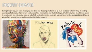
During the process, we were developing our ideas and choosing what style to go in. In particular when looking at existing
examples of alternative front covers a lot were of the minimalistic and illustrated style. What I really love about these covers
is how there is one interesting piece of art which centres the entire cover. We wanted to mirror the composition and have a
piece of art which draws he audiences attention to the imagery.
The freedom with music videos is very much similar to the freedom with CD covers. I have previously discussed how artists
have used aspects in their videos to provoke a response and create attention around their music video, and the same goes
for album covers. Over time, album covers have become almost the branding for the artist’s music. The image is shown
across advertisements or posters – so that the artist can create an identity for themselves. Although some covers can be
very safe and simple, many serve to create controversy which will provoke a response from the public.
We conformed to the
illustrative style, by
illustrating a bear using
Photoshop. This also
works to create a
certain theme or
imagery which album
covers commonly do.
We featured the artist
name and album on the
front cover, ensure that
people are aware of
who the artist is.
We followed the
conventions of a more
minimalistic front cover,
where the composition
features a piece of art at
the centre. This is
particularly conventional
in alternative album
covers.
Alternative album
covers, are typically
very authentic and
quirky. We hope that
the bear design is
something slightly more
new and interesting.
During the research process I was so inspired by all these different cd and inside cover art. We decided
that focusing and researching into the alternative genre’s albums would give us a clearer picture of the
type of style we should go in. From this, we found that most of them have something more original and
quirky to them – and the style that stood out to us the most was the illustrative!
For the inside cover, we wanted
to take inspiration from our
front cover, but put a twist on it.
Our idea began with the concept
of leaves and waves. I drew up
an illustrated outline and began
playing around with it on
Photoshop.
Many inside covers in the media,
are very simplistic but bring
everything together and that is
what we wanted to do. The map
in the background of the outline
works to serve as the colours for
the inside cover.
We were mostly inspired by
Bombay Bicycle clubs CD. I
love the detail that has
gone into the design and
the beautiful colour choices
enhance the artists genre
and style of music. We
featured more earthy tones
but kept the concept of an
intricate design.
I was inspired by the colour
choices in Bruno Mars CD
art. I also love the simplicity
to it, which we reflected in
our own.
When researching into different back
covers, a common theme was that they
were very minimal and focused more on the
information rather than the design. Placing
the barcode and company logo allows the
cover to look far more professional.
They also feature the tracks on the album
and any other extra features which might be
on the deluxe version. Another convention
is that it usually is very cohesive with the
rest of the digipack.
For our back cover I followed the convention of
keeping the design minimal but ensuring that all the
information was there. The barcode and the logo I
think makes it appear more authentic and professional.
Also we featured the tracks on the album with the
same font that we used on the front cover. I was
mostly inspired by the Foals cover for Antidotes.

digipack

  • 2.
    During the process,we were developing our ideas and choosing what style to go in. In particular when looking at existing examples of alternative front covers a lot were of the minimalistic and illustrated style. What I really love about these covers is how there is one interesting piece of art which centres the entire cover. We wanted to mirror the composition and have a piece of art which draws he audiences attention to the imagery.
  • 3.
    The freedom withmusic videos is very much similar to the freedom with CD covers. I have previously discussed how artists have used aspects in their videos to provoke a response and create attention around their music video, and the same goes for album covers. Over time, album covers have become almost the branding for the artist’s music. The image is shown across advertisements or posters – so that the artist can create an identity for themselves. Although some covers can be very safe and simple, many serve to create controversy which will provoke a response from the public.
  • 4.
    We conformed tothe illustrative style, by illustrating a bear using Photoshop. This also works to create a certain theme or imagery which album covers commonly do. We featured the artist name and album on the front cover, ensure that people are aware of who the artist is. We followed the conventions of a more minimalistic front cover, where the composition features a piece of art at the centre. This is particularly conventional in alternative album covers. Alternative album covers, are typically very authentic and quirky. We hope that the bear design is something slightly more new and interesting.
  • 5.
    During the researchprocess I was so inspired by all these different cd and inside cover art. We decided that focusing and researching into the alternative genre’s albums would give us a clearer picture of the type of style we should go in. From this, we found that most of them have something more original and quirky to them – and the style that stood out to us the most was the illustrative!
  • 6.
    For the insidecover, we wanted to take inspiration from our front cover, but put a twist on it. Our idea began with the concept of leaves and waves. I drew up an illustrated outline and began playing around with it on Photoshop. Many inside covers in the media, are very simplistic but bring everything together and that is what we wanted to do. The map in the background of the outline works to serve as the colours for the inside cover.
  • 7.
    We were mostlyinspired by Bombay Bicycle clubs CD. I love the detail that has gone into the design and the beautiful colour choices enhance the artists genre and style of music. We featured more earthy tones but kept the concept of an intricate design. I was inspired by the colour choices in Bruno Mars CD art. I also love the simplicity to it, which we reflected in our own.
  • 8.
    When researching intodifferent back covers, a common theme was that they were very minimal and focused more on the information rather than the design. Placing the barcode and company logo allows the cover to look far more professional. They also feature the tracks on the album and any other extra features which might be on the deluxe version. Another convention is that it usually is very cohesive with the rest of the digipack.
  • 9.
    For our backcover I followed the convention of keeping the design minimal but ensuring that all the information was there. The barcode and the logo I think makes it appear more authentic and professional. Also we featured the tracks on the album with the same font that we used on the front cover. I was mostly inspired by the Foals cover for Antidotes.