
Recommended
More Related Content
What's hot
What's hot (19)
Viewers also liked
Similar to Ancillary 1 chemical brothers
Similar to Ancillary 1 chemical brothers (20)
Ancillary 1 chemical brothers
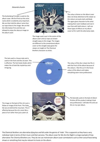
- 1. Alexandra Austin The colour scheme on the album cover The Guttenberg Principle is used on the does not draw attention to the viewer as album cover. We first find out the artist the colours are quite dark and bleak. name which is evidently very important. This again gives character to the artist We are then told the album name then making them seem laidback and not in our eyes draw to the image. We are fed your face with bold colours. I will use the information first and then are these types of effects on my album allowed to enjoy the obscure image on cover to fit in with the alternative style. the album cover. The image used is put in the centre of the album cover and our eyes are drawn straight away to this image. The images are different to the conventional album cover so this straight away gives the viewer an insight on The Chemical Brothers character as artists. The text used is a house style and is used on the front and the cd cover. This is effective. The font looks Arabic which The colour of the disc is basic but fits in makes the cd look like mysterious and with the front of the album because of intriguing. the colours. I like this as it’s the house colour of the album and makes everything seem more professional. The barcode used on the back of album finishes off the product making it look The image on the back of the cd is just a very professional. I will take this and use follow on image of the front. This looks this on my own album. like we are behind the mountain. This is effective because the cd is more like a piece of art rather than just a plain cd. The Chemical Brothers are alternative djing duo and fall under the genres of ‘indie’. This is apparent as they have a very individual style in terms of their music and their persona. The album cover for We Are the Night is a large example of how alternative The Chemical Brothers are. They do not use mainstream album cover connotations such as their actual faces being shown or something that may be relevant to tracks on the album.