DIGI PACK
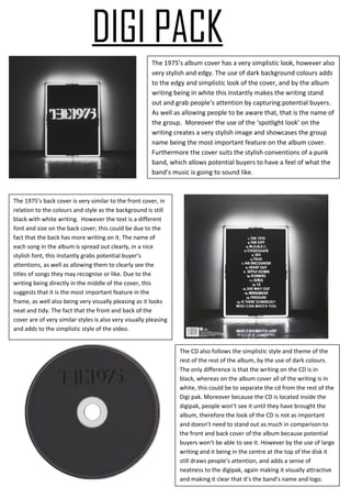
The 1975’s album cover has a very simplistic look, however also
very stylish and edgy. The use of dark background colours adds
to the edgy and simplistic look of the cover, and by the album
writing being in white this instantly makes the writing stand
out and grab people’s attention by capturing potential buyers.
As well as allowing people to be aware that, that is the name of
the group. Moreover the use of the ‘spotlight look’ on the
writing creates a very stylish image and showcases the group
name being the most important feature on the album cover.
Furthermore the cover suits the stylish conventions of a punk
band, which allows potential buyers to have a feel of what the
band’s music is going to sound like.
The 1975’s back cover is very similar to the front cover, in
relation to the colours and style as the background is still
black with white writing. However the text is a different
font and size on the back cover; this could be due to the
fact that the back has more writing on it. The name of
each song in the album is spread out clearly, in a nice
stylish font, this instantly grabs potential buyer’s
attentions, as well as allowing them to clearly see the
titles of songs they may recognise or like. Due to the
writing being directly in the middle of the cover, this
suggests that it is the most important feature in the
frame, as well also being very visually pleasing as it looks
neat and tidy. The fact that the front and back of the
cover are of very similar styles is also very visually pleasing
and adds to the simplistic style of the video.
The CD also follows the simplistic style and theme of the
rest of the rest of the album, by the use of dark colours.
The only difference is that the writing on the CD is in
black, whereas on the album cover all of the writing is in
white, this could be to separate the cd from the rest of the
Digi pak. Moreover because the CD is located inside the
digipak, people won’t see it until they have brought the
album, therefore the look of the CD is not as important
and doesn’t need to stand out as much in comparison to
the front and back cover of the album because potential
buyers won’t be able to see it. However by the use of large
writing and it being in the centre at the top of the disk it
still draws people’s attention, and adds a sense of
neatness to the digipak, again making it visually attractive
and making it clear that it’s the band’s name and logo.

Digi pak

  • 1.
    DIGI PACK The 1975’salbum cover has a very simplistic look, however also very stylish and edgy. The use of dark background colours adds to the edgy and simplistic look of the cover, and by the album writing being in white this instantly makes the writing stand out and grab people’s attention by capturing potential buyers. As well as allowing people to be aware that, that is the name of the group. Moreover the use of the ‘spotlight look’ on the writing creates a very stylish image and showcases the group name being the most important feature on the album cover. Furthermore the cover suits the stylish conventions of a punk band, which allows potential buyers to have a feel of what the band’s music is going to sound like. The 1975’s back cover is very similar to the front cover, in relation to the colours and style as the background is still black with white writing. However the text is a different font and size on the back cover; this could be due to the fact that the back has more writing on it. The name of each song in the album is spread out clearly, in a nice stylish font, this instantly grabs potential buyer’s attentions, as well as allowing them to clearly see the titles of songs they may recognise or like. Due to the writing being directly in the middle of the cover, this suggests that it is the most important feature in the frame, as well also being very visually pleasing as it looks neat and tidy. The fact that the front and back of the cover are of very similar styles is also very visually pleasing and adds to the simplistic style of the video. The CD also follows the simplistic style and theme of the rest of the rest of the album, by the use of dark colours. The only difference is that the writing on the CD is in black, whereas on the album cover all of the writing is in white, this could be to separate the cd from the rest of the Digi pak. Moreover because the CD is located inside the digipak, people won’t see it until they have brought the album, therefore the look of the CD is not as important and doesn’t need to stand out as much in comparison to the front and back cover of the album because potential buyers won’t be able to see it. However by the use of large writing and it being in the centre at the top of the disk it still draws people’s attention, and adds a sense of neatness to the digipak, again making it visually attractive and making it clear that it’s the band’s name and logo.