Download as PDF, PPTX


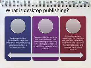
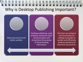
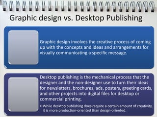


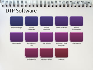


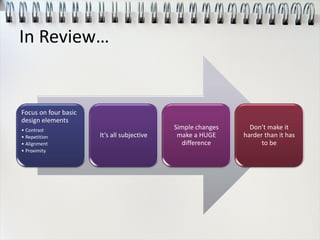

Desktop publishing involves using page layout skills on a personal computer to design publications. It allows users to combine text, graphics, and other elements into a standardized format for printed output or digital distribution. Key benefits of desktop publishing include making documents visually appealing and streamlining the process of disseminating information to others. While graphic design focuses more on conceptual creativity, desktop publishing is a more production-oriented process of implementing design ideas. Popular desktop publishing software gives users tools for formatting pages, inserting images and arranging objects on a page in layers for high-quality output comparable to traditional printing. Factors like intended audience, delivery method, and page limitations must be considered during the desktop publishing process.


![Desktop Publishing - Jovel Edited [Autosaved] - Copy - Copy.pptx](https://cdn.slidesharecdn.com/ss_thumbnails/desktoppublishing-joveleditedautosaved-copy-copy-250717082728-280dbf5b-thumbnail.jpg?width=640&height=640&fit=bounds)


