
Recommended
More Related Content
What's hot
What's hot (20)
Viewers also liked
Viewers also liked (18)
Similar to Art1100 LVA 5 Online
Similar to Art1100 LVA 5 Online (20)
More from Dan Gunn
More from Dan Gunn (14)
Recently uploaded
Recently uploaded (20)
Art1100 LVA 5 Online
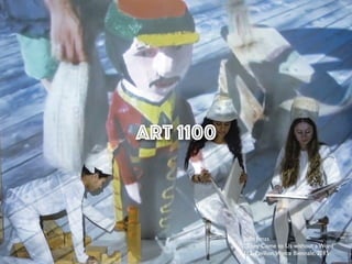
- 1. Art 1100 Joan Jonas “They Come to Us without a Word” U.S. Pavilion,Venice Biennale, 2015
- 2. Chapter 5: Principles of Design The organization of elements is called composition or design. • Visual Weight • Balance • Symmetrical Balance • Asymmetrical Balance • Emphasis & Subordination • Focal Point • Unity vs.Variety
- 3. Visual Weight Visual weight is the ability of an element within a composition to draw attention to itself. Visual weight is often created through the use of high value contrasts and/or the use of color. Blue (Blau)Vasily Kandinsky (French, born Russia. 1866-1944) 1927
- 4. A large shape is heavier than a small shape. Cool colors weigh less than warm colors. Dull tones are lightweight, bright hues are heavy. High contrast values weigh more than low. Textures have more visual weight than smooth shapes.
- 5. Black Relationship (Schwarze Beziehung) Vasily Kandinsky (French, born Russia. 1866-1944) 1924
- 6. Balance - “some equal distribution of visual weight - is a universal aim of composition.” Imbalance - an artist may chose to use imbalance in a composition to enhance a theme or topic, or to create a response. Causes a tension to be created. ! More on bottom = stable and calm. ! More on top = unstable and dynamic. Visual Weight
- 7. Balance An unbalanced object or scene can cause discomfort in a viewer, like a room with all of the furniture pushed to one side or a painting that is crooked on the wall. So, unless this is a desired effect, compositions should strive to be balanced. Physical objects will balance on a scale if they have equal weight, not equal size. For an image, the unit of measure is visual interest, a.k.a. “Visual Weight”.
- 8. Symmetry 1). balanced proportions; also : beauty of form arising from balanced proportions 2). the property of being symmetrical; especially : correspondence in size, shape, and relative position of parts on opposite sides of a dividing line or median plane or about a center or axis — Types of Balance Symmetrical Asymmetrical Radial Crystallographic
- 9. Symmetry
- 10. Symmetrical balance: Mirror image of shapes/ forms on either side of an imaginary axial dividing line; elements correspond to one another in size, shape, and placement Figure 5.7 Newar artists at Densatil Monastery,Tibet, Thirteen-Deity Jnanadakini Mandala, 1417-47. Symmetry
- 11. Bilateral Symmetry the simplest kind of balance to recognize and see. ! The same shapes are repeated on the left and the right side of the vertical axis. ! Popularly considered to be the “basis” for beauty in facial features. Audrey Hepburn’s face reflected bilaterally. Symmetry
- 13. Using Symmetry of Nature: Many things in nature are symmetrical. Vertical Axis and the human body – We relate forms to our own human shape. Symmetry as Emphasis Ed Ruscha. Step on No Pets. 2002. Acrylic on canvas, 5' 4” x 6’. Gagosian Gallery, New York.
- 14. 14 Asymmetrical balance:Two sides that do not correspond to one another in size, shape, and placement Figure 5.10 Gustav Klimt, Death and Life, Before 1911-1915.
- 15. Asymmetrical balance tends to allow the most variety; therefore, it tends to be more interesting.The heaviness or lightness of each form varies depending on its size in relation to other forms around it; its color in relation to other colors around it; and its placement in the composition in relation to other forms. The asymmetrical balance emphasizes the opposition between life and death.The woman Death has come for is placed in the center of the painting, a symbolic border between life and death. She is the only waking person, and gestures as if to say, “Me?” What links the two halves of the painting is the gaze that passes between Death and his victim.The figure of Death is so compelling that Klimt consciously balances this visual weight with a myriad of patterns at the lower right of the painting.
- 16. Asymmetrical balance: Two sides that do not correspond to one another in size, shape, and placement. Balance can be achieved with... 1). Dissimilar objects that have equal visual weight. 2). Contrasting a “heavy” side with a “light” side. Asymmetrical balance tends to allow the most variety, causing compositions to appear spontaneous, energetic and in motion as visual weight shifts from one place to another.
- 17. Asymmetrical Balance = Informal Balance Ham Steinbach. supremely black. 1985. Plastic laminated wood shelf, ceramic pitchers, cardboard detergent boxes, 2’ 5”5’ 6” 1’ 1” (74 x168 x33 cm). Sonnabend Gallery and Jay Gorney Modern Art, NewYork.
- 18. Asymmetrical Balance: Appears casual and less planned, but in fact, is harder to create. Carefully planning symmetry gives a less rigid, more casual impression. Nan Goldin. Siobhan with a Cigarette. Berlin. 1994. Photograph.
- 19. Figure 5.11 Tawaraya (Nonomura) Sotatsu,The Zen Priest Choka, late 16th-early 17th century. Japanese artists often use dramatic asymmetrical compositions.This image is an example of economy, resulting in a peaceful, meditative scene.This ink painting of Choka is placed so far to the left as to be barely on the page.An implied line of vision is used both to balance the composition and to reveal its meaning.We naturally raise our eyes to look at the priest- that’s all there is to look at.We then follow the direction of his gaze down to… nothing. Meditation on emptiness is one of the exercises prescribed by Zen Buddhism, and Sotatsu makes it clear in this daring composition.
- 20. 1. Balance byValue or Color 2. Balance by Texture and Pattern 3. Balance by Position and Eye Direction 3 Way to Achieve Asymmetrical Balance:
- 21. Camille Monet (1847–1879) on a Garden Bench, 1873 Claude Monet (French, 1840–1926) Asymmetrical Balance
- 22. ! Texture draws the eye more then smooth flat color. Using Texture and Pattern for Balance ! A large shape can be balanced by a smaller textured shape. ! Texture can be balanced by a more complex shape. 2. Balance by Texture and Pattern
- 24. ! In Physics, to balance two objects of different weights place the larger one closer to the center. ! The “see-saw” metaphor. 3. Balance by Position and Eye Direction
- 25. Joan Miro, Person Throwing a Stone at a Bird, 1926.
- 26. Crystallographic Balance: “All over” composition. Or compositions whose elements are evenly distributed. Or that correspond to a hidden structure. Gives the impression that the repetition goes on forever outside the boundaries of the composition. Campbell's Soup Cans, AndyWarhol , 1962
- 27. 'Contained' Crazy Quilt United States, Pennsylvania, circa 1880 Textiles; quilts Quilted printed cotton 80 1/8 x 80 in. (203.52 x 203.2 cm)
- 28. Emphasis: The viewer’s attention will be centered more on certain parts of the composition than on others Focal point: A specific spot to which one’s attention is directed Subordination: A less visually interesting area Figure 5.14 Henry Tanner, The Banjo Lesson, 1893. Emphasis and Subordination
- 29. Tanner uses size and placement to emphasize the figures in the foreground. It is as if they have combined to form a single mass, emphasizing their bond. Additionally, he uses strongly contrasting values to create further emphasis. The directional lines of sight create a small focal point of the banjo.Tanner has subordinated the background, blurring the detail and working in a narrow range of light values.
- 30. Figure 5.15 Paul Cézanne, Still Life With Compotier, Pitcher and Fruit, 1892-94. This artist arranged a white napkin to create a central focal area and subordinated the rest with earth tones.The napkin is peaked at the center, like a domestic version of Mont Saint-Victoire, the mountain that Cézanne painted so often.The white fruit dish (compotier) and white pitcher flank the peak, lending additional visual weight to the center. Patches of intense color are scattered throughout the fruits.This busy still life is ordered through the white cloth and pyramidal form. Emphasis and Subordination
- 31. " There can be more then one focal point in a picture. " A second focal point might be referred to as an accent or counterpoint. " Too many points of focus can lead to visual confusion. " Abstracts and patterns can also have focal points. Henri Matisse. Bathers with a Turtle. 1908. Oil on canvas. © St. Louis Art Museum, Missouri, USA/© Succession H. Matisse/DACS/The Bridgeman Art Library. “When everything is emphasized, nothing is emphasized.” Emphasis and Subordination
- 32. Dancing in Colombia, 1980 Fernando Botero (Colombian, born 1932) A focal point (or point of emphasis) results when one element is significantly different from the others. In this case the scale of the couple in the front. Emphasis by Contrast
- 33. Thomas Eakins.The Agnew Clinic. 1889. Oil on canvas, 6’ 2 1/2” 10’ 10 1/2” (1.9 3.3 m). University of Pennsylvania Art Collection, Philadelphia. Emphasis by Isolation
- 34. The Banquet of the Starved, 1915 James Ensor (Belgian, 1860– 1949) By placing objects in a prominent position they become focal points. Emphasis by Placement
- 35. Unity: The sense of oneness, of things belonging together and making up a coherent whole Variety: Differences that provide interest and contrast Unity vs.Variety Stuart Davis American, 1892-1964 Ready-to-Wear, 1955
- 36. This is NOT about getting along in a narrative or emotional unity.This is aVISUAL “getting along” Creating Unity
- 37. John F. Peto,American, 1854-1907 Lights of Other Days, 1906 Unity: Proximity By placing different parts closer together, because of Gestalt proximity they tend to be seen as a unified group despite their differences.
- 38. Unity: Proximity The migration gained in momentum Jacob Lawrence (American, 1917-2000) 1940-41
- 39. Untitled David Moreno (American, born 1957) 2001 Unity: Repetition (Similarity) Pattern because of its repetition of similar shapes creates unity.
- 40. Balthus (Balthasar Klossowski de Rola).The Living Room. 1941ミ1943. Oil on canvas, 3ユ 81/2モ 4ユ 93/4モ.The Minneapolis Institute of Arts. # The main figure’s limbs or forms can intersect with an object or they can point at it, which leads the viewer’s eye to and through the composition.
- 41. These are the two principles that must be present in a work of art. A piece with little or no variety can become boring, causing the viewer to scan quickly.Variety is what holds our attention for longer periods of time. On the other hand, a piece with too much variety can be chaotic or overwhelming. Color and shape provide the variety in this piece, but the colors are repeated to create unity and visual connections for our eyes to follow. Unity vs.Variety
- 42. Compositions with too much Unity can become Static and boring. Untitled Number 5 Agnes Martin (American, born Canada. 1912-2004) 1975
- 43. Broadway BoogieWoogie Piet Mondrian (Dutch, 1872-1944) 1942-43 Unity withVariety: Heavy on the Unity
- 44. Unity withVariety : Heavy on theVariety Frans Snyders, Flemish, 1579-1657 Still Life with Dead Game, Fruits, andVegetables in a Market, 1614
- 45. Compositions with too muchVariety can be chaotic. Jackson Pollock, Number 27, 1950, 1950. Oil, enamel, and aluminum paint on canvas, 49 × 106 in. (124.5 × 269.2 cm).Whitney Museum of American Art, NewYork