What is meantby “Principles of Interior
Design”?
3
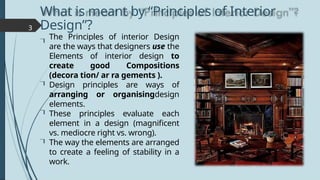
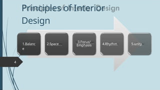
The Principles of interior Design
are the ways that designers use the
Elements of interior design to
create good Compositions
(decora tion/ ar ra gements ).
Design principles are ways of
arranging or organisingdesign
elements.
These principles evaluate each
element in a design (magnificent
vs. mediocre right vs. wrong).
The way the elements are arranged
to create a feeling of stability in a
work.
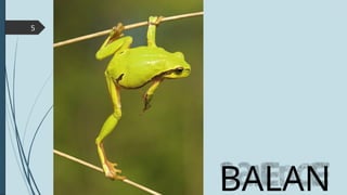
Balance
i n tr o d u c t i o n
6
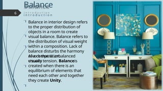
Balance in interior design refers
to the proper distribution of
objects in a room to create
visual balance. Balance refers to
the distribution of visual weight
within a composition. Lack of
balance disturbs the harmony
of a composition.
Awork that is unbalanced
visually
creates tension. Balanceis
created when there is an
equilibrium of elements that
need each other and together
they create Unity.
6.
7
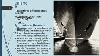
He easiest wayto achieve balance is
by using the symmetrical or formal
form, objects are repeated or
mirrored along a central axis. It’s
when the space is evenly split into
two sides that mirror each other.
Symmetry is created by dividing a
space and the elements within it
equally. Symmetry can create order,
formality, calmness and stillness.
Symmetry Makes Design Simple
Balanc
e
T y p e s
There’sthree different kinds
of
symmetrical (formal),
asymmetrical
(informal)
radial.
balance:
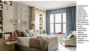
Symmetrical (formal)
Balance
9
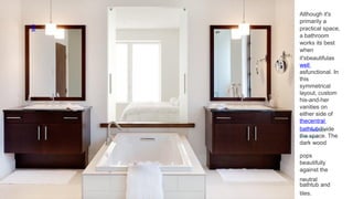
pops
beautifully
against the
neutral
bathtub and
tiles.
Althoughit's
primarily a
practical space,
a bathroom
works its best
when
it'sbeautifulas
well
asfunctional. In
this
symmetrical
layout, custom
his-and-her
vanities on
either side of
thecentral
bathtubdivide
the space. The
dark wood
1
1
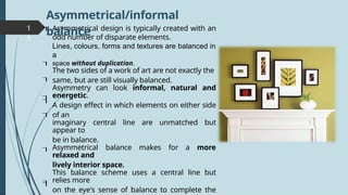
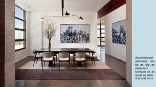
Asymmetrical design istypically created with an
odd number of disparate elements.
Lines, colours, forms and textures are balanced in
a
space without duplication.
The two sides of a work of art are not exactly the
same, but are still visually balanced.
Asymmetry can look informal, natural and
energetic.
A design effect in which elements on either side
of an
imaginary central line are unmatched but
appear to
be in balance.
Asymmetrical balance makes for a more
relaxed and
lively interior space.
This balance scheme uses a central line but
relies more
on the eye's sense of balance to complete the
Asymmetrical/informal
balance
11.
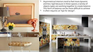
1
2
Asymmetrical interiors tendto feel more dynamic
and less rigid because in these spaces a variety of
objects types are working together to create balance.
This form of balance can be more difficult to achieve
it often requires an “eye for design”.
12.
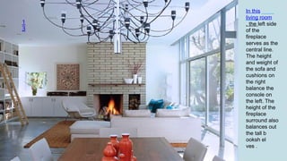
1
3
In this
living room
,the left side
of the
fireplace
serves as the
central line.
The height
and weight of
the sofa and
cushions on
the right
balance the
console on
the left. The
height of the
fireplace
surround also
balances out
the tall b
ooksh el
ves .
13.
1
4
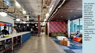
You wouldn’t
guess that
theabove
photo of
Microsoft’s
new office,
designed is
balanced,
but it is. This
is because
it’s balanced
in an
asymmetrica
l way using
variety in the
visual
weight of
objects.
1
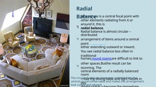
6 When thereis a central focal point with
other elements radiating from it or
around it, this is
radial balance.
Radial balance is almost circular –
distributed
arrangement of items around a central
point
either extending outward or inward.
You see radial balance less often in
traditional
homes;round roomsare difficult to link to
other spaces.Butthe result can be
stunning. The
central elements of a radially balanced
room
—like the dining table and light fixture in
this
Radial
Balance
The circular furniture placement radiates from the
central round coffee table and makes the arrangement
look comfy and relaxed.
16.
1
7
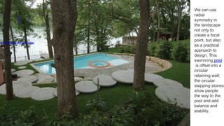
D-CRAIN Design andConstruction
We can use
radial
symmetry in
the landscape
not only to
create a focal
point, but also
as a practical
approach to
design. This
swimming pool
is offset into a
circular
retaining wall;
the circular
stepping stones
show people
the way to the
pool and add
balance and
stability.
17.
1
8
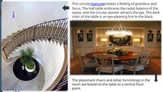
The placement chairsand other furnishings in the
room are based on the table as a central focal
point.
This circularstaircasecreates a feeling of grandeur and
focus. The hall table embraces the radial balance of the
space, and the circular planter attracts the eye. The dark
color of the table is an eye-pleasing link to the black
metal railing.
18.
1
9
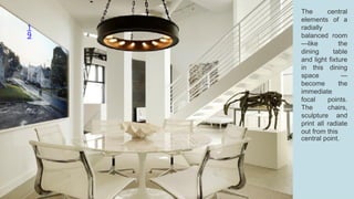
The central
elements ofa
radially
balanced room
—like the
dining table
and light fixture
in this dining
space —
become the
immediate
focal points.
The chairs,
sculpture and
print all radiate
out from this
central point.
19.
Visual
Balance
2
0
desired effect, butfor the
majority of spaces one goal is
visual balance.
This is achieved by distributing
the
visual weight of objects within a
space to achieve a feeling of
equilibrium. The size, color,
texture, shape of an element can
change its visual weight. For
example, larger, darker, brighter,
highly textured, complexly
shaped objects typically feel
heavier and require balance
through the placement equally
“heavy” items or multiple less
heavy items.
Thereareinstanceswhenthisist
he
20.
2
1
of colordemand
attention withina
composition. An area of
high contrast, even at a
small size, will
automatically draw the
viewerʼs eye. Forms
placed near the edge of a
page can also draw more
visual attention than
forms placed directly in
the center of a page.
Verydarkorsaturatedareas
21.
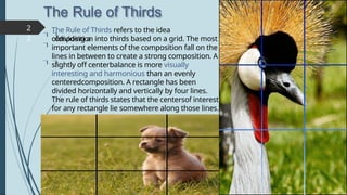
The Rule ofThirds
2
2
The Rule of Thirds refers to the idea
ofdividing a
composition into thirds based on a grid. The most
important elements of the composition fall on the
lines in between to create a strong composition. A
slightly off centerbalance is more visually
interesting and harmonious than an evenly
centeredcomposition. A rectangle has been
divided horizontally and vertically by four lines.
The rule of thirds states that the centersof interest
for any rectangle lie somewhere along those lines.
22.
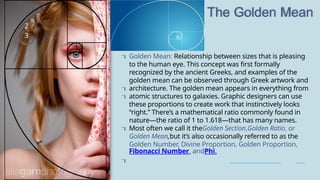
The Golden Mean
2
3
GoldenMean: Relationship between sizes that is pleasing
to the human eye. This concept was first formally
recognized by the ancient Greeks, and examples of the
golden mean can be observed through Greek artwork and
architecture. The golden mean appears in everything from
atomic structures to galaxies. Graphic designers can use
these proportions to create work that instinctively looks
“right.” There’s a mathematical ratio commonly found in
nature—the ratio of 1 to 1.618—that has many names.
Most often we call it theGolden Section,Golden Ratio, or
Golden Mean,but it’s also occasionally referred to as the
Golden Number, Divine Proportion, Golden Proportion,
Fibonacci Number, andPhi.
23.
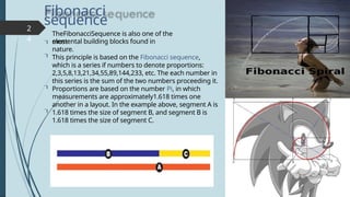
Fibonacci
sequence
2
4
TheFibonacciSequence is alsoone of the
most
elemental building blocks found in
nature.
This principle is based on the Fibonacci sequence,
which is a series if numbers to denote proportions:
2,3,5,8,13,21,34,55,89,144,233, etc. The each number in
this series is the sum of the two numbers proceeding it.
Proportions are based on the number Pi, in which
measurements are approximately1.618 times one
another in a layout. In the example above, segment A is
1.618 times the size of segment B, and segment B is
1.618 times the size of segment C.
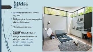
Spac
e
i n tr o d u c t i
o n
2
7
elements in space.
The distance or area
between,
around, above, below, or
within
things. Three-dimensional
designs have: • form •
length • width • height
and occupy space.
Spaceistheareainand around
so me th
in g.
Designinginvolvesarrangingdesi
gn
3
0
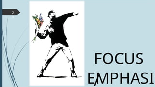
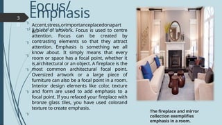
a piece ofartwork. Focus is used to centre
attention. Focus can be created by
contrasting elements so that they attract
attention. Emphasis is something we all
know about. It simply means that every
room or space has a focal point, whether it
is architectural or an object. A fireplace is the
most common architectural focal point.
Oversized artwork or a large piece of
furniture can also be a focal point in a room.
Interior design elements like color, texture
and form are used to add emphasis to a
focal point. If you refaced your fireplace with
bronze glass tiles, you have used colorand
texture to create emphasis.
Focus/
Emphasis
i n t r o d u c t i o n
The fireplace and mirror
collection exemplifies
emphasis in a room.
Accent,stress,orimportanceplacedonapart
of
3
3
The single elementof emphasis in this
bathroom is the sink structure. The sink
draws your eye to it because of the bold
gold and brown color, the shape and
size of the element in the room. The
shape provides movement in the space
and the colors complement the wall
colorbehind it. In this small area, the
sink dominates the space.
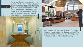
The ceiling in this kitchen is amazing, its the first
thing my eyes went to when I saw the image. The
placement, color, shape, and size of the lighting
makes this kitchen different and exciting.
33.
3
4
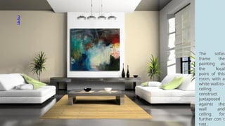
The sofas
frame the
paintingas
the focal
point of this
room, with a
white wall-to-
ceiling
construct
juxtaposed
against the
wall and
ceiling for
further con t
rast .
3
8
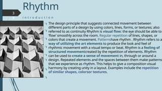
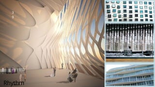
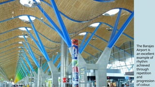
The design principlethat suggests connected movement between
different parts of a design by using colors, lines, forms, or textures; also
referred to as continuity Rhythm is visual flow: the eye should be able to
‘flow’ smoothly across the room. Regular repetition of lines, shapes, or
colors that create a movement. Patternshave rhythm . Rhythm refers to a
way of utilizing the art elements to produce the look and feel of
rhythmic movement with a visual tempo or beat. Rhythm is a feeling of
structured movementcreated by the repetition of elements. Rhythm
can be used to create a sense of movement in, through or around a
design. Repeated elements and the spaces between them make patterns
that we experience as rhythm. This helps to give a composition visual
harmony by creating unity in a layout. Examples include the repetition
of similar shapes, colorsor textures.
Rhythm
i n t r o d u c t i o n
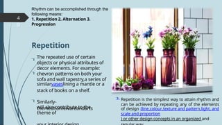
4
0
will also contributeto the
theme of
The repeated use of certain
objects or physical attributes of
decor elements. For example:
chevron patterns on both your
sofa and wall tapestry,a series of
similarvaseslining a mantle or a
stack of books on a shelf.
Rhythm can be accomplished through the
following means:
1. Repetition 2. Alternation 3.
Progression
Repetition is the simplest way to attain rhythm and
can be achieved by repeating any of the elements
of design (line,colour,texture and pattern,light, and
scale and proportion
) or other design concepts in an organized and
Repetition
Similarly-
themedhomewareandarts
40.
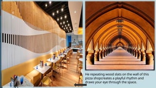
4
1
He repeating woodslats on the wall of this
pizza shopcreates a playful rhythm and
draws your eye through the space.
41.
4
2
Repetition is
the simplest
wayto attain
rhythm and
can be
achieved by
repeating any
of the
elements of
design (line,
colour,
tex ture and p
attern
,light, and
scale and prop
ortion
)
42.
4
3
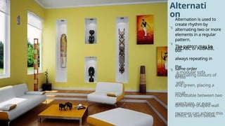
Alternati
on
Alternation is usedto
create rhythm by
alternating two or more
elements in a regular
pattern.
The pattern may be
ABCABC or ABBABB,
but
always repeating in
the
same order
a modular sofa
with
alternating colours of
white
and green, placing a
small
roundtable between two
armchairs, or even
differently-shaped wall
recesses can achieve this
effect, as seen below.
4
5
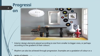
Progressi
on
Interior design elementsplaced according to size from smaller to bigger ones, or perhaps
according to the gradient of their colours.
Rhythm can also be achieved through progression. Examples are a gradation of colour or a
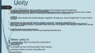
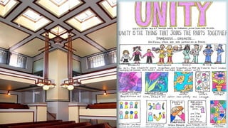
Unity
i n tr o d u c t i
o n
:
a composition does not become cluttered or
confusing.
a concept can be communicated more clearly.
a design evokes a sense of quality and
organization.
4
8
Unityisachievedwhenallof thedifferentelementsinadesignworktogetherto
createaunifiedwhole. Designersuseunityto
makeelementsinacompositionappeartobelongtogether. When each elements has a clear
visual relationship to one or more other elements, the composition is
unified.
Unity is what draws the whole design together. Simply put, every single item in your home
should
contribute to the overall interior design concept, not draw away from it.
AllPartsof aworkofartare interrelated,balanced, andorganizedto achieveaqualityof
oneness. A unified design is greater than the sum of its parts; the design is seen as a whole
first, before the
individualelementsarenoticed.
Unitycanbe comparedto harmony,integrityorwholeness.
When unity is
achieved
48.
4
9
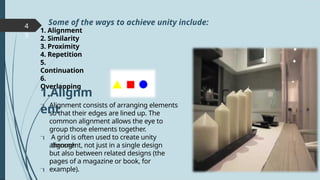
1. Alignment
2. Similarity
3.Proximity
4. Repetition
5.
Continuation
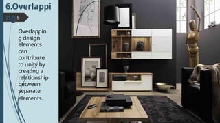
6.
Overlapping
Alignment consists of arranging elements
so that their edges are lined up. The
common alignment allows the eye to
group those elements together.
A grid is often used to create unity
through
alignment, not just in a single design
but also between related designs (the
pages of a magazine or book, for
example).
Some of the ways to achieve unity include:
1.Alignm
ent
5
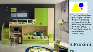
1
Proximity is basedon
grouping by closeness;
the closer elements
are to each other, the
more likely we will see
them as a group.
Proximity is one of the
easiest ways to
achieve unity.
3.Proximi
51.
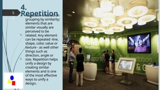
5
2
Repetition is basedon
grouping by similarity;
elements that are
similar visually are
perceived to be
related. Any element
can be repeated -line,
shape, color, value or
texture - as well other
things such as
direction, angle or
size. Repetition helps
unify a design by
creating similar
elements and is one
of the most effective
ways to unify a
design.
4.
Repetition
52.
5
3
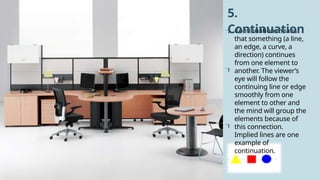
Continuation means
that something(a line,
an edge, a curve, a
direction) continues
from one element to
another. The viewer’s
eye will follow the
continuing line or edge
smoothly from one
element to other and
the mind will group the
elements because of
this connection.
Implied lines are one
example of
continuation.
5.
Continuation
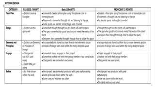
ACTIVITY: Design aDream Room
• Apply interior design principles by creating a
detailed design plan for a dream room,
considering functionality, aesthetics, and
personal preferences


![The principles of design [autosaved]](https://cdn.slidesharecdn.com/ss_thumbnails/theprinciplesofdesignautosaved-200419193252-thumbnail.jpg?width=640&height=640&fit=bounds)


