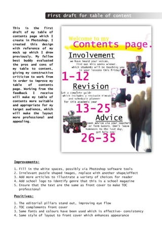
1. This is the first
draft of my table of
contents page which I
create in Photoshop. I
created this design
with reference of my
mock up which I drew
previously. My fellow
best buddy evaluated
the pros and cons of
my table to content,
giving my constructive
criticism to work from
in order to improve my
table of contents
page. Working from the
feedback I receive
will make my table of
contents more suitable
and appropriate for my
target audience, which
will make the layout
more professional and
appealing.
Improvements:
1. Fill in the white spaces, possibly via Photoshop software tools
2. Irrelevant puzzle shaped images, replace with another shape/effect
3. Add more articles to illustrate a variety of choices for reader
4. Add school logo to identify genre that this is a school magazine
5. Ensure that the text are the same as front cover to make TOC
professional
Positives:
1. The editorial pillars stand out, improving eye flow
2. TOC complements front cover
3. Same fonts and colours have been used which is effective- consistency
4. Same style of layout to front cover which enhances appearance
First draft for table of content
2. This is the final draft for my table of contents page. I made improvements
according to the feedback I received from my test buddy. The constructive
criticism was significant as it helped me improve my table of contents to
satisfy my target audience. In order to achieve that, I need to ensure that my
table of contents is attractive and appealing for my target audience.
Final draft for table of content
3. I ensured that the front cover
and the table of contents had
the same master head. I
duplicated the layer from my
front cover and copy and
pasted it into a new file,
which I saved as the
background. This allows the
users to relate and associate
the first two pages of my
school magazine. This makes
it easier and clearer to
follow and leads to effective
eye flow. I used the same
colours as my front cover. I
decided to use the same
colours to complement the two
pages, this will make my
design and layout of my
school magazine efficient,
and therefore, my magazine
will be professional and
appealing for my target
audience. Furthermore, this
will attract a wider audience
and makes the magazine
recognisable. I used the same
typeface as my front cover to
keep a consistent format;
this is significant as it
makes my magazine more
professional and
sophisticated, I abided the
conventions as I used
editorial pillars to
structure the content of the
page. I organised the kickers
on my front page into topics,
which I have positioned on
this page. I wanted it to be
unique and different from the
standard formatting so I challenged a few conventions. The right alignment is not
challenged as I did not want to disrupt the eye flow; I used the cookie cutter tool to
change the shape of the images. I think that this has worked successfully and is very
attractive to my previous draft. The images are clear and appealing, which will
attract my target audience. I rotated these images so it they were slanted, to create
an interesting effect, which worked well with the editorial pillars. I used the same
text as my front cover, replacing the kickers with editorial pillars. I made the
numbers bigger than the editorial pillars so it was clear and easy for the users to
see what pages to refer to for these articles. Once again, I have abided by my house
colours. I have also added featuring articles, these articles are not shown on my
front cover, but it was important that users can see more articles than just three
main editorial pillars. I challenged the conventions slightly as I did not align the
left hand side identically. I inserted the school logo to make the magazine more
personal. This would attract my target audience. I also used the brush tool, where I
loaded a brush called angry blue, to add an effective background, to make it more
interesting and appealing. Previously I experimented with the brush tool, and this was
useful because I could implant that task into my work efficiently. I combined
different brush strokes and sizes together; this was effective and enhanced the design
layout of my table of contents page. I also used a brush called the tape, which I
selected over the images. These small details created a bigger impact on the
appearance of page. I selected the colour yellow because it is the colour of tape and
I wanted the design to look realistic.
Table of content design analysis