This document evaluates the strengths and weaknesses of the magazine front cover and contents page created by Kealan Whittaker for their college magazine media product.
For the front cover, strengths included using a medium close-up image with direct address and a simple color scheme like real magazines. Weaknesses were the lack of varied cover lines and differently formatted masthead compared to sample magazines.
For the contents page, strengths were a clear title and inclusion of relevant images like the front cover shot. Weaknesses included plain article descriptions without subheadings unlike the sample magazine, and lack of captions for images. The evaluation compares the student's work to conventions from real magazine examples.
2. In what way does your media product use, develop or challenge forms and conventions of
real media products?
When I began to design the drafts for my media product I followed a set of codes and conventions
which should be included in my media product to make it as close to a real thing.
I’ve used a medium close up shot using direct mode of address for my front cover picture with a plain
navy blue background. I used a limited colour scheme so it doesn’t draw attention away from the main
image and it also makes it easier for the reader to read the text around the image e.g cover lines.
When designing my masthead I made sure it was clear and stood out from the rest of the text on the
page by using a unique font and a larger text size. I’ve used cover lines to allow the reader to have a
glimpse of what the magazine features.
I have included a splash and banner on my front cover as this attracts attention to my magazine.The
colour of the splash and banner differ from the colour of the main background so it clear what these
features are and also draws attention to the text in the splash and banner.
I have included a barcode and date on my front cover as all actual magazines use these features so it creates validity for my magazine.
The positioning statement is used on my front cover to again attract attention and also compete with other magazines. It is placed above the masthead
so it is in clear sight for the reader.
3. In what way does your media product use, develop or challenge forms and conventions of
real media products?
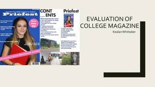
The title ‘Contents’ is present at the top of the page so it is visible to readers and they know that they are
on the contents page.The contents font differs from the masthead font which also appears on the
contents page.
I have an imagine of my front cover on my contents page as it is a reminder for readers and is conventional
in some magazines.
I have used images on my contents page which are related to the college as the magazine focuses on
college and college life. Images feature on the contents page in every magazine so this is conventional.
The text on my contents page differs from the font of my masthead and title page. It also uses a different
colour to attract people to the information.The page numbers next to the text allows people to navigate
through the magazine to their chosen articles. Lastly I have used a subheading which is underlined so
readers can clearly see this a subheading.
I have used a simple white background so no attention is drawn away from the text and images.
4. How did you use new media technologies in the construction of your media product?
When constructing my magazine front cover I worked on Adobe Photoshop, using an A4 size international
paper document. I started with the background image and added layers e.g. text. I used the shaping tool to
create the banner and splash. When adding my barcode I imported the image from google images.
When constructing my magazine contents page I worked on Quark Express, using an
A4 size document with 2 columns for my text. I used the text tool to create my
contents page title. I used the picture tool to import my images from the computer.
5. Strengths and weaknesses of the front cover
The first strength of my magazine front cover is the image of the model is a clear medium close up with
direct mode of address which is featured on the professional magazine below. Also the use of a single
simple background colour is used in the professional magazine as well as mine.
A weakness of my front cover is the lack of cover lines unlike the magazine below which uses various
styles. I didn’t think to change the different text font, size or colour which would have made the final
product look more professional like the Men's Health magazine which varies with the font, size and
colour.
Another strength of my front cover would be the use of a positioning statement which attracts potential
readers attention. Although the magazine below doesn’t have a positioning statement It is conventional in
most magazines.
Another weakness of my front cover is the masthead. It is the same colour as the text I used for my
cover lines and could be made bigger to attract more attention. The magazine below uses a separate
colour for the masthead and makes it much larger than the other text which gives it an authentic look.
6. Strengths and weaknesses of the contents page
A strength of my contents page is that the page title is clear and has an edgy design to attract the reader.
The masthead is also present on the contents page which is conventional is all magazines like the one
below.
A weakness of my contents page is the text. I haven’t added any detail to my articles whereas the magazine
below does. Also I haven’t split my text under sub-headings which features in the Vogue magazine.
Another strength of my contents page Is the use of relevant images. I have included a picture of my front
cover which features in the magazine below. The other images on my contents page are related to the
college e.g. the Lewis Carol building.
Another weakness of my contents page would be that my pictures don’t have a caption with them to explain
what they are. The magazine doesn’t feature this either but it is conventional In most magazines.