
Recommended
More Related Content
What's hot
Viewers also liked
Similar to Skills Development
Similar to Skills Development (20)
More from MWBECKERMEDIA
Recently uploaded
Recently uploaded (20)
Skills Development
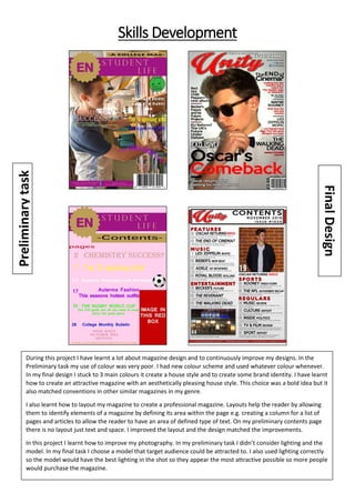
- 1. Skills Development During this project I have learnt a lot about magazine design and to continuously improve my designs. In the Preliminary task my use of colour was very poor. I had new colour scheme and used whatever colour whenever. In my final design I stuck to 3 main colours it create a house style and to create some brand identity. I have learnt how to create an attractive magazine with an aesthetically pleasing house style. This choice was a bold idea but it also matched conventions in other similar magazines in my genre. I also learnt how to layout my magazine to create a professional magazine. Layouts help the reader by allowing them to identify elements of a magazine by defining its area within the page e.g. creating a column for a list of pages and articles to allow the reader to have an area of defined type of text. On my preliminary contents page there is no layout just text and space. I improved the layout and the design matched the improvements. In this project I learnt how to improve my photography. In my preliminary task I didn’t consider lighting and the model. In my final task I choose a model that target audience could be attracted to. I also used lighting correctly so the model would have the best lighting in the shot so they appear the most attractive possible so more people would purchase the magazine.
- 2. In the finally project I also learnt to keep consistency with fonts. I learnt this by looking at other magazines in the genre. I mainly used san serif fonts except for the magazine name. This was done to make the magazine easy for the reader to read the articles at a glance and to create continuity in the magazine. Sometimes fonts can be used for affect and I did use this in my final design with the “exclusive “font but I mainly stuck to a select few fonts. I also learnt about colour blending in the magazine. This is where colours from spate entireties blend together and get lost e.g. on the contents page of the preliminary design with the logo and contents page box. In my final design to stop this I added a light stroke around some elements e.g. “Oscar’s Comeback” had a light white stroke around it so that the black “Oscar’s” wouldn’t get lost in the shadow. In the process to improve I used a software called Adobe Photoshop. This software had many features had many tools that allowed me to improve. One such was the ruler’s tool. This tool allow me to create lines on top of the design and allowed elements to snap to it when moving them. This tool was perfect when improving the layout of my designs as it allowed me to create a structured layout and stop layers from overlapping so the design looked attractive. Another tool I used to create a better design was the colour picking tool. This tool is where the tool can pick a colour from hovering over the colour from somewhere else on the file and adding it to the colours available to use later for another layer. The colour picking tool allowed me to create a design with a house style with continuity throughout the magazine. Additionally I used a lighting tool to create a better image. Originally the image was very pale and bland so I used a lighting effect to add more contrast and colour to the image. The software does this by adding a lighting affect into the image as if the lighting was originally there. This really benefitted the design and I’m really pleased with how it turned out. Though the affect did take a much more powerful computer to complete the process so the process took some time but the extra time was worth it. Finally the other main tool I used was the layer grouping tool. This tool allowed me to group layers into folders in the software and allowed me to organise my designs into an efficient system. This allowed me to organize the layers in the way I wanted without having to waste time doing so to other layers that I wished to follow suit. This feature really helped when organizing the cover lines and the contents page. When designing my magazine I made sure that the layout was a mature one and used similar conventions from other music magazines so that the magazine would appeal to the reader. I used bold fonts and bold colours to stand out to the reader but not so that it would be chaotic and confusing like a teen-pop magazine. I choose to do an interview feature article as I had the resources to complete one on my front cover model and it matched the conventions of other magazines in the genre of having a feature article on the front cover model. I choose to use a very structured layout so it would look professional and mature to appeal to the target audience. During the process I researched many music magazines by looking through the college library’s extensive collection. I used what I’ve seen to create a good design which matches conventions. Throughout the project I worked on my products and when I came to an obstacle I looked for feedback from my teachers and fellow class mates. This feedback allowed me to create a better designed magazine. I feel this is an essential part of the production process. I was also very attentive to detail with every aspect of the process as the process was meant to demonstrate the same process when building a real magazine so I treated it as such so I looked for errors so not to be embarrassed by a spelling mistake.