
Recommended
More Related Content
What's hot
What's hot (17)
Viewers also liked
Viewers also liked (20)
Similar to Evaluation question 7
Similar to Evaluation question 7 (20)
Recently uploaded
Recently uploaded (20)
Evaluation question 7
- 1. Evaluation Question 7: Looking back at your preliminary task, what do you feel you have learnt in the progression from it to the full product?
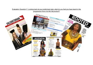
- 2. Aim of my Preliminary Task: The purpose of my preliminary task was to create a school-based magazine, complete with a contents page and front cover. At first I was unsure of how I would plan and structure the creation of my magazine and so I had to gain inspiration through researching and looking at past candidates’ attempts. To be honest I was not really fussed about the layout and structure of the preliminary task as a whole because I knew that my final product had to be way more professional and believable as a magazine. Hence, I started off the creation with no set plan in mind apart from having a clear-cut vision of a medium-shot of some younger student who attend my school, decked out in a novel graduation gown and cap as the name of my magazine was ‘Valedictorian’. Therefore, my key aim was to stress the importance of education and how it is the ‘key to success’. Aim of my Main Product: The aim of my main task was to create a believable music magazine of any genre possible. I opted for a genre I was familiar and comfortable with and that was Afrobeats. In the making of my final product I had to carefully consider every aspect of the magazine and include minor details that I believed would convey the idea of Afrobeats upon first glance. Therefore, on both occasions of my photoshoots {both sample and real} I incorporated an African flare by asking my models to wear an African traditional/ tribal clothing called the ‘Dashiki’. With that sorted I ensured that my front cover star had her hair in braids too as that’s a typical hairstyle that African girls wear today
- 3. Masthead
- 4. These are the two mastheads I have used in the progression of my media product. In terms of layout they are very different pieces of work. By looking at the first masthead used in my preliminary task we can see that I have used a third party font (KG Defying Gravity)- taken from dafont.com- and the letters within are narrowly placed besides one another, I wouldn't say that this looks particularly professional or effective, however, comparing it to the second piece of work you can see a vast improvement. The improvement comes from the layout and the positioning on the page amongst other aspects. As you can see, the masthead not only dominates over two-thirds of the page but it is centred nicely against the contrasting black background, thus creating a balanced sense for the page in which the focus is not only on one side of the page. The font is also an aspect that adds to the difference of the two pieces, as you can seem the text in the preliminary task looks much narrow, sharp and conservative therefore less effective whereas, in the main task a capitalised standard font (Khmer UI) has been used alongside a black background, which looks far more engaging yet minimal. To further this, I have employed the use of a forced gap within the masthead of my main task, this allowed the word to cver a majority of the black space and emphasises the effect of letting the masthead ‘do the talking’
- 5. Front Cover
- 6. My preliminary task in comparison to my final task shows how much I have improved my skills in producing a magazine. The front cover of my preliminary task was made on Publisher while the front cover of my final task was made on Adobe InDesign which was harder to use but more effective as it provided an entirely different range of editing opportunities. The biggest improvement I can see would be the design formatting. For my preliminary task, I did not put a lot of planning into it and this was reflected in the layout as there is no coordinating colour scheme and the taglines are in different sizes and fonts which does not make the magazine look very professional. My preliminary task has awful positioning and schemes that do not correlate at all so I discovered it was better to keep one consistent pattern and also position things correctly so the second time round I made sure that nothing was blocking my cover star. The layout for my preliminary task was poorly executed as it was overloaded with irrelevant content: there were too many cover line additions as well as the inserted images, all of these conveyed a clustered look as opposed to the minimalist and clean-cut appearance of my final product- thus distracting the readers. Meanwhile for my final task, I developed an idea and deliberated on how the layout of my magazine will look like and this is shown in the outcome of my final magazine.
- 8. In regards to my final contents page I can also see a clear improvement in my designing skills. In my preliminary I can see that I used an array of colours which didn't gel well with the remaining magazine. The overall layout is not presented appropriately as there are too many gaps/ white spaces on the page which makes it feel cheap and vague. Also, it looks unprofessional compared to my final product as the boxes and layout is very passive. The preliminary task does have quite a structured layout, however, I think after looking into the conventions of magazines more, I was able to develop a better layout which is separated up and easy to look at. By using the lines between features on the page the contents looks professional and stylish. Most importantly, I decided to have a focus on the middle of the page with my main task by using an enlarged main image, this is subtle but effective, in contrast to the preliminary task it does create more of a focus. I also decided to separate the features and the regulars, this was once more to create a more organised feel. However, in my final magazine I can see that have filled up most the space in the magazine so it doesn’t feel completely empty and over the double page spread I have categorized the content well and broken up the text on the page with the inclusion of images. My final contents page has more order and structure, the boxes also don’t follow a set measurement which allows the layout to look more easy to the eye, effectively making it more appealing. This design is lacking in my preliminary magazine as it is less creative which make it appear unprofessional.