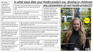
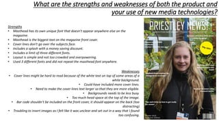
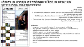
My media product uses some conventions of real magazines but also challenges some conventions. On the front cover, it includes a masthead with a unique font, cover lines that don't cross over the subject's face, and a discount splash. However, it only includes one singular image and the cover lines could be harder to read. For the contents page, it includes section titles and a range of small images, but the backgrounds are plain and images are too small. Overall, the product challenges conventions in some ways but could be stronger by improving readability and design elements.
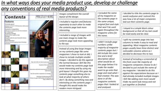
The strengths of using Photoshop include creating a professional-looking front cover with control over placement. However, QuarkXPress was more difficult to use