Downloaded 175 times

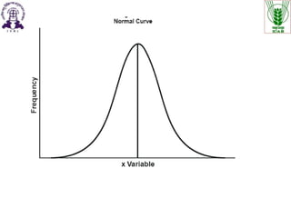
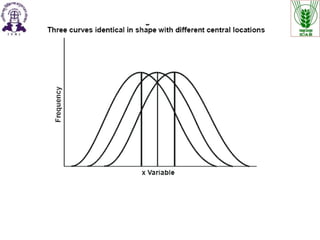
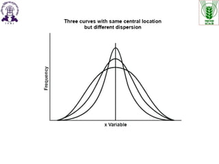
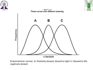
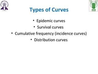
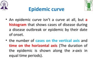
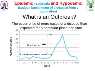
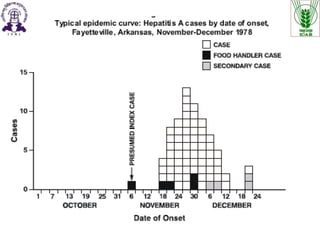
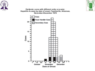
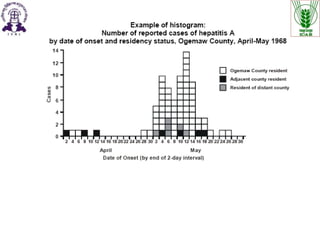
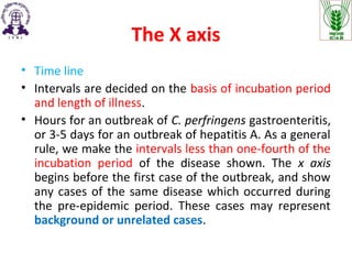
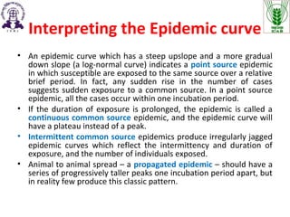
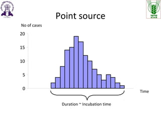
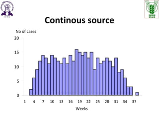
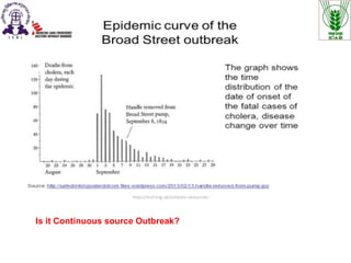
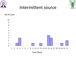
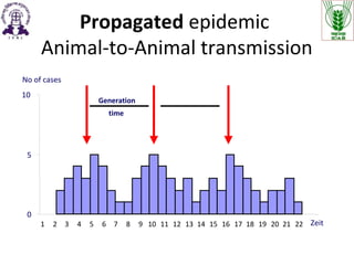
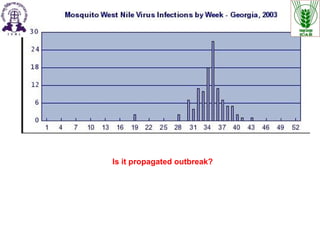
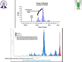
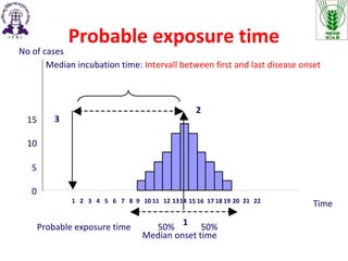
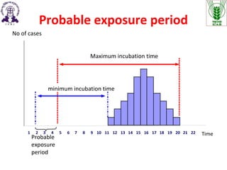
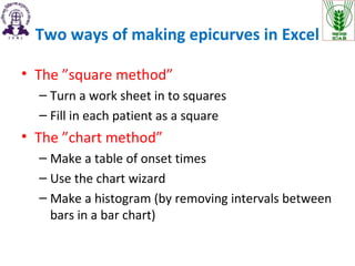
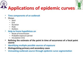

The document discusses the various types of curves used in epidemiology, including epidemic, survival, and cumulative frequency curves, and their characteristics. It explains how to interpret epidemic curves, including the implications of different shapes and the importance of time intervals related to disease outbreaks. Additionally, it outlines the applications of epidemic curves for understanding the timeline, transmission routes, and sources of outbreaks.