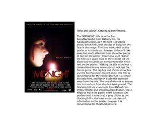
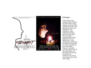
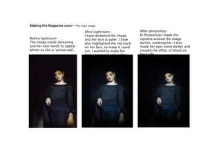
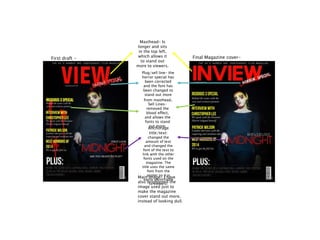
Download to read offline

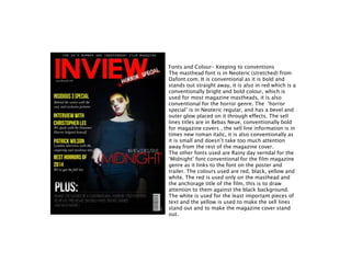
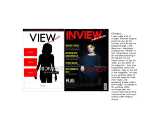

This document summarizes the process of creating ancillary products for the horror film "Midnight" including a poster and magazine cover. For the poster, the creator used Lightroom and Photoshop to edit the main image, adjusting lighting, contrast, and adding effects. Peer feedback led to changing the tagline font. For the magazine cover, Lightroom was used to darken the main image and highlight effects, and the layout was modified from the first draft based on conventions. Fonts, colors, and designs were selected to be consistent with horror genre conventions for both the poster and magazine cover.


