This the location mise-en-scene for the chosen locations that I will be shooting in for my short film. I have chosen four different locations in Portugal to shoot in.
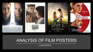
This is comparison work between my first drafts and my final products with my film poster(s) and my double page magazine article. Work by Clara Barroso.
How to Make a Field invisible in Odoo 17Celine George
It is possible to hide or invisible some fields in odoo. Commonly using “invisible” attribute in the field definition to invisible the fields. This slide will show how to make a field invisible in odoo 17.
Instructions for Submissions thorugh G- Classroom.pptxJheel Barad
This presentation provides a briefing on how to upload submissions and documents in Google Classroom. It was prepared as part of an orientation for new Sainik School in-service teacher trainees. As a training officer, my goal is to ensure that you are comfortable and proficient with this essential tool for managing assignments and fostering student engagement.
The Art Pastor's Guide to Sabbath | Steve ThomasonSteve Thomason
What is the purpose of the Sabbath Law in the Torah. It is interesting to compare how the context of the law shifts from Exodus to Deuteronomy. Who gets to rest, and why?
How to Split Bills in the Odoo 17 POS ModuleCeline George
Bills have a main role in point of sale procedure. It will help to track sales, handling payments and giving receipts to customers. Bill splitting also has an important role in POS. For example, If some friends come together for dinner and if they want to divide the bill then it is possible by POS bill splitting. This slide will show how to split bills in odoo 17 POS.
Read| The latest issue of The Challenger is here! We are thrilled to announce that our school paper has qualified for the NATIONAL SCHOOLS PRESS CONFERENCE (NSPC) 2024. Thank you for your unwavering support and trust. Dive into the stories that made us stand out!
The French Revolution, which began in 1789, was a period of radical social and political upheaval in France. It marked the decline of absolute monarchies, the rise of secular and democratic republics, and the eventual rise of Napoleon Bonaparte. This revolutionary period is crucial in understanding the transition from feudalism to modernity in Europe.
For more information, visit-www.vavaclasses.com
The Indian economy is classified into different sectors to simplify the analysis and understanding of economic activities. For Class 10, it's essential to grasp the sectors of the Indian economy, understand their characteristics, and recognize their importance. This guide will provide detailed notes on the Sectors of the Indian Economy Class 10, using specific long-tail keywords to enhance comprehension.
For more information, visit-www.vavaclasses.com
Ethnobotany and Ethnopharmacology:
Ethnobotany in herbal drug evaluation,
Impact of Ethnobotany in traditional medicine,
New development in herbals,
Bio-prospecting tools for drug discovery,
Role of Ethnopharmacology in drug evaluation,
Reverse Pharmacology.
This is a presentation by Dada Robert in a Your Skill Boost masterclass organised by the Excellence Foundation for South Sudan (EFSS) on Saturday, the 25th and Sunday, the 26th of May 2024.
He discussed the concept of quality improvement, emphasizing its applicability to various aspects of life, including personal, project, and program improvements. He defined quality as doing the right thing at the right time in the right way to achieve the best possible results and discussed the concept of the "gap" between what we know and what we do, and how this gap represents the areas we need to improve. He explained the scientific approach to quality improvement, which involves systematic performance analysis, testing and learning, and implementing change ideas. He also highlighted the importance of client focus and a team approach to quality improvement.
The Roman Empire A Historical Colossus.pdfkaushalkr1407
The Roman Empire, a vast and enduring power, stands as one of history's most remarkable civilizations, leaving an indelible imprint on the world. It emerged from the Roman Republic, transitioning into an imperial powerhouse under the leadership of Augustus Caesar in 27 BCE. This transformation marked the beginning of an era defined by unprecedented territorial expansion, architectural marvels, and profound cultural influence.
The empire's roots lie in the city of Rome, founded, according to legend, by Romulus in 753 BCE. Over centuries, Rome evolved from a small settlement to a formidable republic, characterized by a complex political system with elected officials and checks on power. However, internal strife, class conflicts, and military ambitions paved the way for the end of the Republic. Julius Caesar’s dictatorship and subsequent assassination in 44 BCE created a power vacuum, leading to a civil war. Octavian, later Augustus, emerged victorious, heralding the Roman Empire’s birth.
Under Augustus, the empire experienced the Pax Romana, a 200-year period of relative peace and stability. Augustus reformed the military, established efficient administrative systems, and initiated grand construction projects. The empire's borders expanded, encompassing territories from Britain to Egypt and from Spain to the Euphrates. Roman legions, renowned for their discipline and engineering prowess, secured and maintained these vast territories, building roads, fortifications, and cities that facilitated control and integration.
The Roman Empire’s society was hierarchical, with a rigid class system. At the top were the patricians, wealthy elites who held significant political power. Below them were the plebeians, free citizens with limited political influence, and the vast numbers of slaves who formed the backbone of the economy. The family unit was central, governed by the paterfamilias, the male head who held absolute authority.
Culturally, the Romans were eclectic, absorbing and adapting elements from the civilizations they encountered, particularly the Greeks. Roman art, literature, and philosophy reflected this synthesis, creating a rich cultural tapestry. Latin, the Roman language, became the lingua franca of the Western world, influencing numerous modern languages.
Roman architecture and engineering achievements were monumental. They perfected the arch, vault, and dome, constructing enduring structures like the Colosseum, Pantheon, and aqueducts. These engineering marvels not only showcased Roman ingenuity but also served practical purposes, from public entertainment to water supply.
2. PASSENGERS
Main Image- The image that appears to represent this film is by
having the two main characters. A close up shot of Jennifer
Lawrence and Chris Pratt. The division between them on the poster,
this division may resemble the idea that on the film they are two
different classes. She is a famous book writer and he is just a regular
guy looking for a better future. The use of the galaxy at the mid
bottom of the poster links to the idea of this film being set in the
middle of the galaxy, when they left earth to go and move to
another planet to live their lives, however the journey on the ship in
the galaxy can take a life time. Finally the ship itself, this is a
representation where the whole film is set because from the trailer
the only location all the action happens is only on the ship where it
carries 5,000 other passengers.
Layout- This film poster has a simple layout. The top part of the
poster, more like the first row takes most of the space of the whole
poster, where it has the close up shots of the characters along with
the division which leads to the second row/ the bottom of the
poster. Where the galaxy blends with the characters shots and the
film name, credits and actor/actress name is in a solid clear box.
Film Companies/ Credits- All the extra information of the film,
especially the credits can be found at the bottom of the poster. The
colour of the text is in grey which blends in perfectly with the colour
of the box and the colour scheme also links with the colour of the
ship in some parts of it.
Hook- The hook is used to got the fans from the trailer more excited
once they look at the film poster. The hook is also known as the
slogan. And the slogan on this poster is “There is a reason thy woke
up” which links to the whole concept of them being the only ones up
and the achievements thy make throughout the film.
Lighting- For this film poster, they used a strong light on the side of
the characters, this lighting represents the idea of them being awake
in the middle of darkness and nowhere (galaxy). The use of the
white division also helps in the idea that its white and it seems like
that the division is the one thing that is creating light to shine on the
side of the characters face.
Direct Address- The direct address is obvious on this film poster as
the two main characters are looking straight at the camera which
portrays the idea of the characters having eye contact with the
audience. They also seems serious which means the film topic is
dramatic and serious.
Colour Scheme- The colour scheme that there is involved on this film
poster has bright and also cold tones. The bright tones is within the
use of the colour white and the grey colours which after contrasts
with the use of the colour black on the film poster. The use of the
cold tones is within the blue colours and all the mixing colours on
the galaxy background which would refer to mystery. However the
eye colour of the characters set off warm tones such as; brown and
green, which by the term ‘warm’ could also portray the idea of love.
Text- The use of the font on the name film ‘Passengers’ is the same
font used throughout any text seem on the film poster. This includes
the slogan, the actor/actress name, and he film name itself.
However it wasn’t used on the credits section are. This use of font
on the film poster gives the modern look and a clear idea of
something that is coming from the future. By the complete look of
the text from the whole film poster the font itself seems futuristic,
technological and advanced in today’s use of technology. The use of
the colour on the text is all the same so it doesn’t break the colour
scheme and it doesn’t look so busy . The text final look makes it
simple and perfect enough for the audience to connect with it.
3. THE CIRCLE
Main Image- The image that appears to represent this film is by
having the two main characters. This main image shows the good
and the evil. Emma Watson’s character represent the idea of good
as she’ on the top which could resemble with the idea of heaven.
And the other important character, Tom Hanks. He’s character
portrays the idea of evil, as he’s at the bottom which also
connotates with the idea of hell. The use of the ‘C’ being designed as
a maze demonstrates the idea of the company ‘The Circle’ within
the film. The use of the maze itself, can demonstrate the idea of
looking at a way ‘of finding the best way out from the trap’.
Layout- This film poster has a simple layout. The top part of the
poster, the first row, has the main character of the film, which is the
female character. The second row of the film poster has the film
name and the actor/actress’ name. And the final row has the male
character at the bottom as it’s taking the same even amount as the
top section of the female character. This layout seems to be
professional also because they seem to be easy for the audience to
get their heads around the film poster and get information from it.
Film Companies/ Credits- All the extra information of the film,
especially the credits can be found at the bottom of the poster. The
colour of the text is in whit which links to the main background
colour but because it’s on top of dark colours all the credits are
noticeable on a small font size.
Hook- The hook is on this film poster is the same quote that was said
by Tom Hanks on the trailer. This is a way for the audience to
identify the film poster from the trailer and to find similarities from
it. The slogan is “Knowing is goof. Knowing everything is better”. This
slogan links to the whole film genre about our lives not being private
anymore, all in front of cameras. The colour of the slogan is in white
which links to the whole colour scheme, especially the background.
Lighting- For this film poster, there seems to of been used a gold
reflector on the shots as the side of the face for both of the
characters have a gold lighting touch which make them more stand
out and on focus. Also the white lighting comes from the side of the
faces which blends with the white background a they stand at the
end of the ‘C’’. Looking like the white background giving them light
to the side of the face.
Direct Address- Both of the characters have no direct address
towards the camera or the audience. Both of the characters are
looking away from the camera which makes the poster itself look
more dramatic and intense to the whole purpose of the film.
Colour Scheme- The colour scheme that was created for this film
poster is basic, it’s a mix of dark and white tones. The use of white
tones portray the simplicity of this film. The use of the colour back
just makes the name of the actor/actress and the date release of the
film stand out as that’s important aspects of it. And the use of the
red links to the main logo of ‘The Circle’ and the colour red also
connotates with the idea of danger and insecurities, as the film itself
has a twitch to it.
Text- The use of the font on the name film ‘The Circle’ is the same
font used throughout any text seem on the film poster. This includes
the slogan, the actor/actress name, and he film name itself.
However it wasn’t used on the credits section it was all use with
specific credits font which would make the film poster look
professional. The use of the modern font on the film poster links to
the idea of the use of newest and advanced technology.
Date Release- The date release of the film is at the bottom of the
page, the date release is in big font just like the film name. The
colour is in black so it all stands out.
4. EVERYTHING EVERYTHING
Main Image- The image that appears to represent this film is by
having the two main characters. The two main characters are
Amanda Stenberg and Nick Robinson. The main image immediately
tells that the film is a love story because of having both characters
have there hands connected through the glassed window. Also the
idea of having both characters on different boxes links to the idea of
the boxes being a connotation to the windows as it shows they are
separate and don’t link but still shows that they are not apart. The
main image is bring just like the whole white background.
Layout- This film poster has a simple layout. Its ones of the most
simple ones out of these four. The layout doesn’t really seem to
have a specific layout going on. It all seems to be done from scratch
as the pictures takes most of the space as they have been placed on
separate frames with the film title at the bottom of the page with
the release date in the middle at the bottom with the film
companies on the sides.
Film Companies- All the extra information of the film is at the
bottom of the page. The only think this film poster doesn’t include is
the credits with all the specific font which makes the film poster look
lore professional. The film companies are on show at the bottom of
the page, on the left and right side of the page. However the colour
of it it’s so light it almost blends in in with the white background, as
if they don’t matter in this film poster.
Hook- The hook is on this film poster is also the slogan that there is
around the film poster, the information that makes the fans excited
and easy to recognise when they see the slogan somewhere. The
slogan are; “Risk everything… For love.” and “Based on the #1 New
York Times Bestseller.” The first slogan all links to the genre of the
film by being about love. The second slogan all links to the original
side of where this film right started from, the novel of it. The colour
of the text is a light blue which links to the cold tones of the image
and also the film name where there is blue mainly everywhere, on
the ‘Everything’ word and on around the whole drawings.
Direct Address- Both of the characters have no direct address
towards the camera or the audience. However the audience can
identify the film is all about love and drama by firstly them being
separate from one another and secondly by the teenage boy looking
down at her (a sign of love) and the teenage girl herself looking
down at the hands which creates a triangular shape between the
image and portraying of more like a cycle, just like the cycle of life or
love.
Colour Scheme- The colour scheme that was created for this film
poster is all just about bright colours. The main colours used are
white and blue (dark and light blue) However then there is a mic of
colours on the film name itself within the us of the main colours. The
main colours portray cold tones, which they don’t link to love at all it
shows the idea of being seen as ‘calm’.
Text- The use of the font on the name film ‘Everything Everything’ is
the same font used throughout any text seem on the film poster.
This includes the slogan, the actor/actress name, and he film name
itself. However the film name is all written in capital letter which is
the same thing with the name of the characters. The use of the
modern font makes the film look recent in year and in love stages.
Lighting- For this film poster, there seems to of been used a silver
reflector which makes the colours of the lighting brighter and makes
the image stand out and blend with the whole white background.
The light seems to be coming from the side of the character to
makes everything stand out and bright.
Date Release- The date release of the film is at the bottom of the
page with the colour blue which links with it all.
5. THE SPACE BETWEEN US
Main Image- The image that appears to represent this film is by
having the two main characters. A mid shot of the two main
character are; Asa Butterfield and Britt Robertson. They seem o be
in the middle of nowhere, where it seems to be their little place, as
they look like to be the .only ones in the world. They seem to be in a
peaceful place as the sunlight is in the middle of them two as the
film is all about them. The tone of the sunlight links to the colour of
the mars planet. The idea of not being able to see the whole body
links the idea of their love growing as their body blends with the
ground. Having the boy dressed as an astronaut links to the idea of
him coming from a different planet. The girl being dressed as a
normal links to the regular girl’s lifestyle.
Layout- This film poster has a complex layout. The layout of this film
poster is set by having rows. The first row has the slogan right in the
middle. The second row is a thicker row with the characters looking
at one another alone in the middle of nowhere. The third row is also
a thick row but it also involves the film name with the film
companies/ credits and the social media along with the film date
release. This layout is very simple and clean to look at. It is also very
organised as the film poster itself seems to be very busy with a lot of
information and the film name itself takes a lot of space.
Hook- The hook is on this film poster is also the slogan that there is
around the film poster, the extra information that makes the fans
excited for the film or a specific line/ quote that makes the fan
identify that has been used on the film poster from the original film
footage. The slogan used on this film poster is: “”Two worlds. One
connection”. The use of the slogan connects with the main
characters on the poster as the film is all about them and their love
while they live in different planets.
Direct Address- Both of the characters have no direct address
towards the camera or the audience. However the audience can
identify the film is all about love and drama by the character having
direct address to one another, as they look at each other. The love
between them represents the whole concept of effort and real love.
Lighting- For this film poster, there seems to of been used a gold
reflector on the shots the use of lighting on the characters is filled
from the middle so the sunset lighting seems to be projecting the
middle of them two. As the around them looks dark the middle of
them makes it stand out and look like dreamy as the warm tones
represent happiness.
Colour Scheme- The colour scheme that was created for this film
poster is all just about bright and dark colours. However on the
whole film poster there is only warm tones. The warm tones
represent the idea of happiness and love. The use of the colour
greens represent the idea of nature and how natural this film is and
how most of the film is filmed outside on different locations.
Film Companies/ Credits- All the extra information of the film is at
the bottom of the page. All the credits are on show just like a
traditional film poster usually has, especially when the crew of the
film is big, which would be the same for this film. This gives extra
information about the crew and all the work to the audiences. The
colour of it is the same as the sunlight of the sunset behind the
characters.
Text- The use of the font on the name film ‘The Space Between US’
is the same font used throughout any text seem on the film poster.
This includes the slogan, the actor/actress name, and he film name
itself. The ‘C’ on the word ‘space’ is on a shape of a moon to
represent the planet distance.
Date Release/ Social Media- The date release and social media of
the film is at the bottom of the page this is because the target
audience is young (PG).