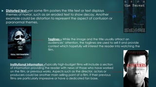
Evaluation Question 1
In what ways does your media
product use, develop or challenge
forms and conventions of real
media products?
(Part 1-Poster)
Codes and conventions of a horror
movie poster
 Dark and dull Colour Scheme – Horror film posters use a darker
colour scheme to represent the themes of the film, for example
shadows and darkness are linked with fear and terror. While a lack
of colour gives a lifeless feel to the poster, signifying death, again a
typical horror theme.
Red / Black Colour Scheme – While several posters use a
dark colour scheme to connote fear, others use bold
colours to signify the sub-genre of their horror film. An
example could be an excessive use of red to signify blood
in a ‘slasher’ horror.
 Distorted text –on some film posters the title text or text displays
themes of horror, such as an eroded text to show decay. Another
example could be distortion to represent the aspect of confusion or
paranormal themes.
Taglines – While the image and the title usually attract an
audiences’ attention, the taglines are used to sell it and provide
context which hopefully will interest the reader into watching the
film.
Institutional Information –Typically high-budget films will include a section
of information providing the reader with news of those who have worked
on the film, or previous works. Aspects such as the director, actors or
producers could be another main selling point of a film, if their previous
films are particularly impressive or have a dedicated fan base.
How I complied to these
conventions.
I included a tag line that states the film was ‘inspired by true
events’ as after researching and asking other this was a key
feature that attracted an audience. They stated that it was ‘far
more scarier when you believe it actually happened’.
I stuck to the darker colour scheme yet brought in the red with
the titles to connote blood and to indicate the genre as many
horror movies use red in their colour scheme.
Most horror posters feature a close up of the villains face, which I
have done also.
I edited the eyes on Photoshop to give in a more demonic feel.
I wanted my image to represent my narrative in a way. The
concept of good and evil being inside one being is the premise
for my film. To show this through my image I almost completely
darkened one side, while having light on the other. Representing
good and evil, as well as the light highlighting the knife. Which
acts as a motif for the genre.
I chose to include institutional information as it made the whole
text appear more professional.
Layout
The majority is
taken up the
image
Clear title in a large
font
Tag line
somewhere easily
visible but not
covering any
important features
of the image.
Clear symmetry
 I noticed that a lot of horror movie posters use a extreme close up of
a face (usually of the villain) for the poster. I felt that this was
accessible for me to produce effectively. Also considering this, I
didn’t want to use the same shot type for the poster and the
magazine cover. I felt that a mid-shot or full body shot would look
better and would be following conventions for the magazine cover.
So I chose to use a close up of my villains face for my poster.
How my poster is similar to a
genuine horror movie poster
Similarities and concepts that I have
followed or complied to
*A close up of the villains face
*Edited eyes to look unhuman
*Unnatural lighting that puts emphasis on
certain areas of the face.
*A symbol or motif (for mine the knife. For
silence of the lambs the moth)
*Using colour in the text for emphasis
*Symmetry
*A tag line
*Industry information

Evaluation question 1

  • 1.
    Evaluation Question 1 Inwhat ways does your media product use, develop or challenge forms and conventions of real media products? (Part 1-Poster)
  • 2.
    Codes and conventionsof a horror movie poster  Dark and dull Colour Scheme – Horror film posters use a darker colour scheme to represent the themes of the film, for example shadows and darkness are linked with fear and terror. While a lack of colour gives a lifeless feel to the poster, signifying death, again a typical horror theme. Red / Black Colour Scheme – While several posters use a dark colour scheme to connote fear, others use bold colours to signify the sub-genre of their horror film. An example could be an excessive use of red to signify blood in a ‘slasher’ horror.
  • 3.
     Distorted text–on some film posters the title text or text displays themes of horror, such as an eroded text to show decay. Another example could be distortion to represent the aspect of confusion or paranormal themes. Taglines – While the image and the title usually attract an audiences’ attention, the taglines are used to sell it and provide context which hopefully will interest the reader into watching the film. Institutional Information –Typically high-budget films will include a section of information providing the reader with news of those who have worked on the film, or previous works. Aspects such as the director, actors or producers could be another main selling point of a film, if their previous films are particularly impressive or have a dedicated fan base.
  • 4.
    How I compliedto these conventions. I included a tag line that states the film was ‘inspired by true events’ as after researching and asking other this was a key feature that attracted an audience. They stated that it was ‘far more scarier when you believe it actually happened’. I stuck to the darker colour scheme yet brought in the red with the titles to connote blood and to indicate the genre as many horror movies use red in their colour scheme. Most horror posters feature a close up of the villains face, which I have done also. I edited the eyes on Photoshop to give in a more demonic feel. I wanted my image to represent my narrative in a way. The concept of good and evil being inside one being is the premise for my film. To show this through my image I almost completely darkened one side, while having light on the other. Representing good and evil, as well as the light highlighting the knife. Which acts as a motif for the genre. I chose to include institutional information as it made the whole text appear more professional.
  • 5.
    Layout The majority is takenup the image Clear title in a large font Tag line somewhere easily visible but not covering any important features of the image. Clear symmetry
  • 6.
     I noticedthat a lot of horror movie posters use a extreme close up of a face (usually of the villain) for the poster. I felt that this was accessible for me to produce effectively. Also considering this, I didn’t want to use the same shot type for the poster and the magazine cover. I felt that a mid-shot or full body shot would look better and would be following conventions for the magazine cover. So I chose to use a close up of my villains face for my poster.
  • 7.
    How my posteris similar to a genuine horror movie poster Similarities and concepts that I have followed or complied to *A close up of the villains face *Edited eyes to look unhuman *Unnatural lighting that puts emphasis on certain areas of the face. *A symbol or motif (for mine the knife. For silence of the lambs the moth) *Using colour in the text for emphasis *Symmetry *A tag line *Industry information