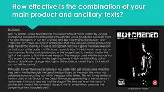
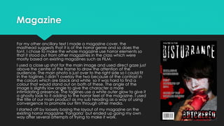
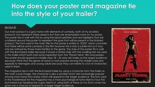
1) The poster for the film challenges horror poster conventions by featuring a protagonist instead of an antagonist. It uses red highlights and splatters to represent the gore in the film. The font is similar to 'Shaun of the Dead' hinting at comedy elements.
2) The magazine cover features a close-up shot of a zombie from the trailer with taglines. It uses horror elements throughout to distinguish it from other magazines.
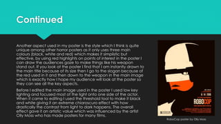
3) Both the poster and magazine tie into the trailer's style of gory horror comedy. The poster shares a similar scrolling text style from the trailer. The magazine features a character from the trailer to connect the pieces.