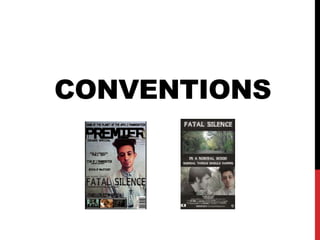
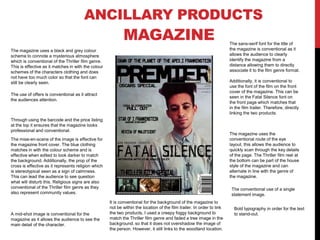
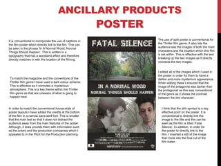
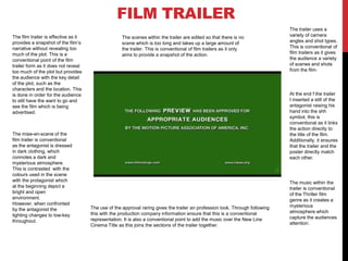
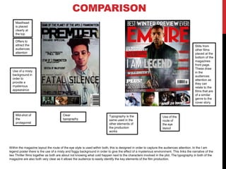
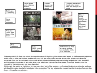
The document discusses conventions used across different ancillary products for a thriller film, including a magazine, poster, and film trailer. It notes that the magazine uses a dark color scheme and font from the film to match the thriller genre. The poster also uses a dark color scheme and split images of characters/locations. Both the magazine and poster use mid-shots of characters. The film trailer provides snapshots of the plot without revealing too much and uses varied camera angles, lighting, and editing techniques conventionally seen in trailers. Music and mise-en-scene create mystery. Typography, images, and continuity across elements effectively capture audience attention and link the products to the film.