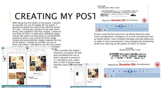
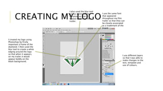
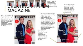
CREATING MY 
ANCILLARY PRODUCTS
CREATING MY POSTER 
After doing my first drafts of my poster, I started 
to consider my use of images for my poster. I 
decided to follow the style of the new film poster 
‘If I stay’. I firstly got a picture of my main actor, 
Kirsty, and cropped it into four images. I chose to 
use three of these. I made each individual image 
exactly the same size and chose to use publisher 
instead of word. I use a three by three image 
format and presented the images towards the top 
of the poster. I started to consider my use of 
fonts and colour. I decided to use the main actors 
names only at the top of my poster in an elegant 
serif font in order to connote the genre of my 
trailer. I then consider the slogan I 
wanted to use below my title 
and considered the use of 
fonts I wanted to present it 
in. I decided to use a paler 
font so that it did not draw 
attention away from the main 
title. 
Firstly I used the font above for my billing block but after 
much consideration I changed it to a more conventional font 
as shown below. I also included hashtags and web addresses 
to make it more conventional. I also changed the positioning 
of the text referring to the author of “when I'm home”.
CREATING MY LOGO 
I created my logo using 
Photoshop by firstly 
important a frame of the 
diamond. I then used the 
blur tool to create a white 
edging around the logo 
so that when it appears 
on my trailer it would 
appear boldly on the 
black background. 
I use the same font 
that appeared 
throughout my film 
trailer so that they can 
be closely associated 
as a trademark of the 
brand. 
I use different layers 
so that I was able to 
make changes to the 
text, template and 
use of colours. 
I also used the blur tool 
on the outline of the 
template so that it 
looked bolder on the 
trailer.
CREATING MY FILM 
MAGAZINE 
This is the first draft of 
my magazine poster. It 
is limited in terms of 
coverlines and some of 
the fonts are not greatly 
effective in relating to 
the genre and 
conventions. It is very 
simplistic and lacks a 
lot of text. 
My second draft has a wider 
range of coverlines and also 
a list of other films 
advertised across the 
bottom. I also included a 
greater amount of text along 
the right hand side of the 
poster. I changed the use of 
font above the ‘Film weekly’ 
to a simpler and smaller 
font. I also added the price 
above the barcode and text 
about popular film 
celebrities. 
I used Photoshop to 
put the title behind 
the image so that 
the image was the 
most appealing and 
clearly presented to 
the audience. 
After using 
Photoshop for my 
film title I 
transferred the 
text and image to 
publisher where I 
added the rest of 
my text. 
I took a range of 
photos before 
deciding which I 
thought would be 
most conventional.

Creating my ancillary products

  • 1.
  • 2.
    CREATING MY POSTER After doing my first drafts of my poster, I started to consider my use of images for my poster. I decided to follow the style of the new film poster ‘If I stay’. I firstly got a picture of my main actor, Kirsty, and cropped it into four images. I chose to use three of these. I made each individual image exactly the same size and chose to use publisher instead of word. I use a three by three image format and presented the images towards the top of the poster. I started to consider my use of fonts and colour. I decided to use the main actors names only at the top of my poster in an elegant serif font in order to connote the genre of my trailer. I then consider the slogan I wanted to use below my title and considered the use of fonts I wanted to present it in. I decided to use a paler font so that it did not draw attention away from the main title. Firstly I used the font above for my billing block but after much consideration I changed it to a more conventional font as shown below. I also included hashtags and web addresses to make it more conventional. I also changed the positioning of the text referring to the author of “when I'm home”.
  • 3.
    CREATING MY LOGO I created my logo using Photoshop by firstly important a frame of the diamond. I then used the blur tool to create a white edging around the logo so that when it appears on my trailer it would appear boldly on the black background. I use the same font that appeared throughout my film trailer so that they can be closely associated as a trademark of the brand. I use different layers so that I was able to make changes to the text, template and use of colours. I also used the blur tool on the outline of the template so that it looked bolder on the trailer.
  • 4.
    CREATING MY FILM MAGAZINE This is the first draft of my magazine poster. It is limited in terms of coverlines and some of the fonts are not greatly effective in relating to the genre and conventions. It is very simplistic and lacks a lot of text. My second draft has a wider range of coverlines and also a list of other films advertised across the bottom. I also included a greater amount of text along the right hand side of the poster. I changed the use of font above the ‘Film weekly’ to a simpler and smaller font. I also added the price above the barcode and text about popular film celebrities. I used Photoshop to put the title behind the image so that the image was the most appealing and clearly presented to the audience. After using Photoshop for my film title I transferred the text and image to publisher where I added the rest of my text. I took a range of photos before deciding which I thought would be most conventional.