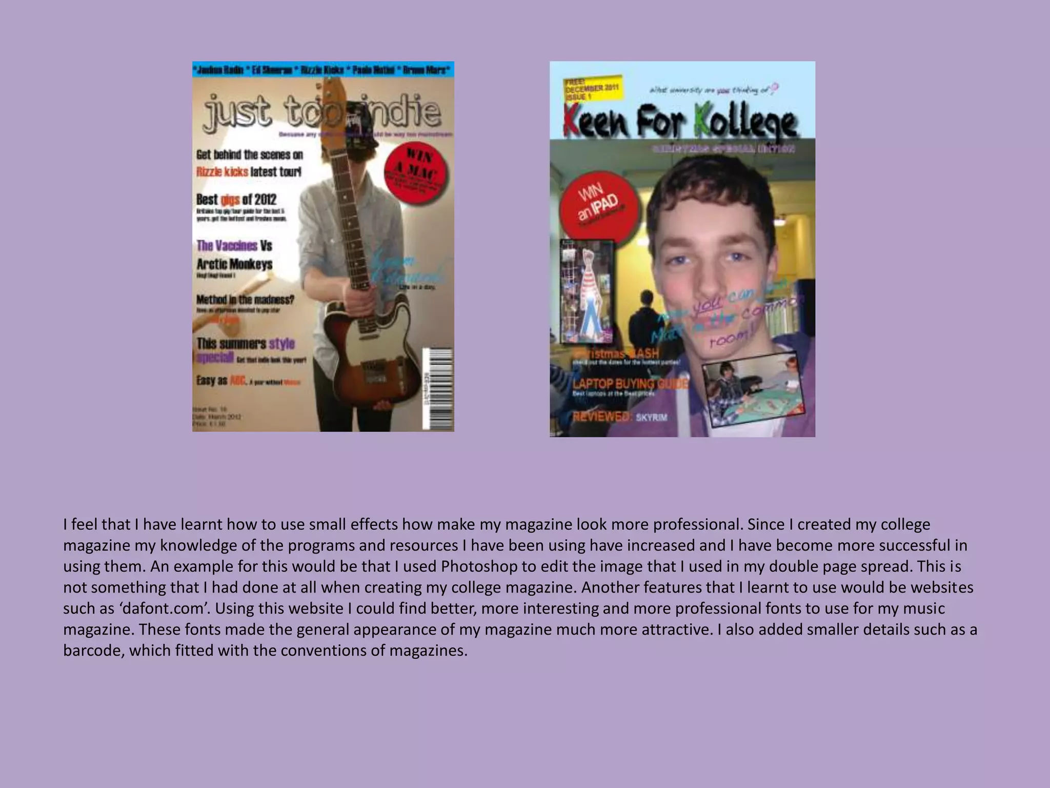
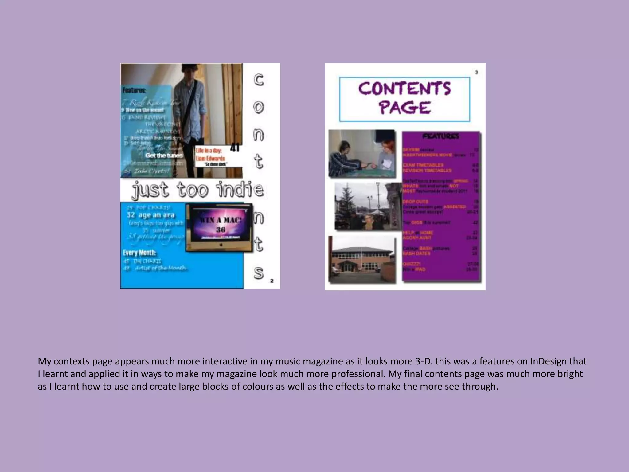
7. Looking back at your preliminary task, what do you feel you have learnt in the
                     progression from it to the full product?
I feel that I have learnt how to use small effects how make my magazine look more professional. Since I created my college
magazine my knowledge of the programs and resources I have been using have increased and I have become more successful in
using them. An example for this would be that I used Photoshop to edit the image that I used in my double page spread. This is
not something that I had done at all when creating my college magazine. Another features that I learnt to use would be websites
such as ‘dafont.com’. Using this website I could find better, more interesting and more professional fonts to use for my music
magazine. These fonts made the general appearance of my magazine much more attractive. I also added smaller details such as a
barcode, which fitted with the conventions of magazines.
My contexts page appears much more interactive in my music magazine as it looks more 3-D. this was a features on InDesign that
I learnt and applied it in ways to make my magazine look much more professional. My final contents page was much more bright
as I learnt how to use and create large blocks of colours as well as the effects to make the more see through.

7

  • 1.
    7. Looking backat your preliminary task, what do you feel you have learnt in the progression from it to the full product?
  • 2.
    I feel thatI have learnt how to use small effects how make my magazine look more professional. Since I created my college magazine my knowledge of the programs and resources I have been using have increased and I have become more successful in using them. An example for this would be that I used Photoshop to edit the image that I used in my double page spread. This is not something that I had done at all when creating my college magazine. Another features that I learnt to use would be websites such as ‘dafont.com’. Using this website I could find better, more interesting and more professional fonts to use for my music magazine. These fonts made the general appearance of my magazine much more attractive. I also added smaller details such as a barcode, which fitted with the conventions of magazines.
  • 3.
    My contexts pageappears much more interactive in my music magazine as it looks more 3-D. this was a features on InDesign that I learnt and applied it in ways to make my magazine look much more professional. My final contents page was much more bright as I learnt how to use and create large blocks of colours as well as the effects to make the more see through.