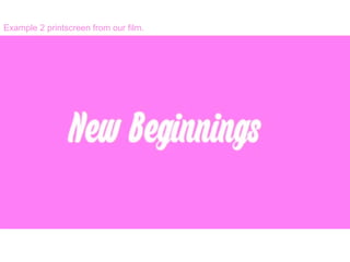
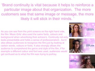
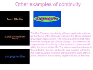
The effect of using a continual font
and colour.
Example 1 printscreen from our film.
Example 2 printscreen from our film.
Example 3 printscreen from our film.
‘Brand continuity is vital because it helps to reinforce a
particular image about that organization. The more
customers see that same image or message, the more
likely it will stick in their minds. ’
As you can see from the print screens on the right hand side,
the film ‘Mean Girls’ also used the same fonts, colours and
background when advertising their actress’s. Continuity not only
looks presentable and holds a sense of professionalism , but it
also allows audiences to recognize the film just by looking at
certain words, colours or fonts. It also strongly allows the
audience to comprehend the genre and style of the film, if for
example a different colour and font was used, audiences would
get confused as to what the film was trying to portray.
Other examples of continuity
The film‘ Clueless’ has slightly different continuity patterns
as the theme of the film itself, including the title is centered
around luminous colours. The fonts are all the same within
the trailer, however the colours change…this however still
keeps a state of continuity as the luminous colours are still
within the theme of the title. The colours are also relevant to
the context of the film, as the film was realised within the
mid nineties, where colourful and loud outfits were at their
prime, therefore the continuity represents that of the time.
What have I learnt?
• From using Youtube in order to research existing chick flick
trailers, I have learnt that nearly all trailers use a certain colour
theme, font and images in order to connote a certain message
and target a specific target audience. Chick flicks usually use
extremely stereotypical conventions in order to target their
audience, and this is what we tried to achieve within our trailer.
When using Final cut, it was then easy to duplicate the same
font and colours to the credit shots, we hope to achieve well
with regards to the conventions of the trailer as we have taken
into consideration how to target an audience through colours,
themes and fonts.

Continuity

  • 1.
    The effect ofusing a continual font and colour.
  • 2.
    Example 1 printscreenfrom our film.
  • 3.
    Example 2 printscreenfrom our film.
  • 4.
    Example 3 printscreenfrom our film.
  • 5.
    ‘Brand continuity isvital because it helps to reinforce a particular image about that organization. The more customers see that same image or message, the more likely it will stick in their minds. ’ As you can see from the print screens on the right hand side, the film ‘Mean Girls’ also used the same fonts, colours and background when advertising their actress’s. Continuity not only looks presentable and holds a sense of professionalism , but it also allows audiences to recognize the film just by looking at certain words, colours or fonts. It also strongly allows the audience to comprehend the genre and style of the film, if for example a different colour and font was used, audiences would get confused as to what the film was trying to portray.
  • 6.
    Other examples ofcontinuity The film‘ Clueless’ has slightly different continuity patterns as the theme of the film itself, including the title is centered around luminous colours. The fonts are all the same within the trailer, however the colours change…this however still keeps a state of continuity as the luminous colours are still within the theme of the title. The colours are also relevant to the context of the film, as the film was realised within the mid nineties, where colourful and loud outfits were at their prime, therefore the continuity represents that of the time.
  • 7.
    What have Ilearnt? • From using Youtube in order to research existing chick flick trailers, I have learnt that nearly all trailers use a certain colour theme, font and images in order to connote a certain message and target a specific target audience. Chick flicks usually use extremely stereotypical conventions in order to target their audience, and this is what we tried to achieve within our trailer. When using Final cut, it was then easy to duplicate the same font and colours to the credit shots, we hope to achieve well with regards to the conventions of the trailer as we have taken into consideration how to target an audience through colours, themes and fonts.