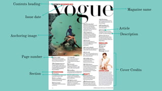
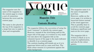
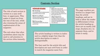
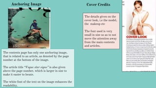
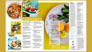
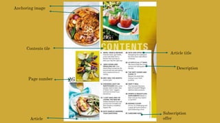
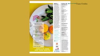
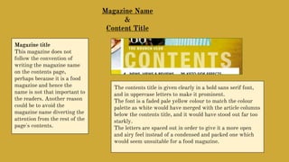
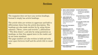
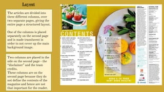
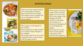
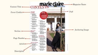
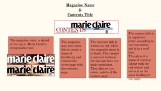
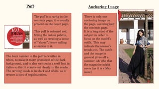
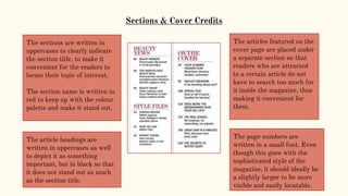
Content Page Analysis
Magazine name
Article
Description
Cover Credits
Contents heading
Issue date
Anchoring image
Page number
Section
Magazine Title
&
Contents Heading
The magazine uses the
name of the magazine in
the content page to create
a sort of connection
between the cover and the
content page.
The name is also placed at
the top of the magazine in
a large font size to make it
clear and recognisable.
The magazine name is in
the same recognisable
serif font.
However, unlike on the
cover page, it is written in
lowercase letters instead
of the usual uppercase.
This is possibly done to
avoid the contents page
looking as significant and
main as the cover page.
The magazine title is
written in black so as to
retain its sophistication,
and also fit the colour
palette.
The magazine follows the convention of using the
word “contents” to identify the content page.
However, instead of the word being used as the
major title of the page, it is written in very small
font size above the magazine title as the
columnist layout of the page is the main indicator
to identify it as a contents page.
The contents heading still stands out as it is in
uppercase letters and in a sans serif font. The
black colour ensures it is prominent against the
white background.
Contents Section
The title of each section is
written in a sans serif
font, in uppercases. This
makes it stand out from
the rest of the text, while
also retaining the sense of
sophistication of the
magazine.
The red colour that often
symbolises alarm may be
used to call attention to
the section titles instantly.
The page numbers are
written in a larger font
than the article
headings, and are in
bold to allow the reader
to differentiate it from
the article heading as
there are no marks (full
stops, brackets etc.) to
separate them, and to
locate it easily.The article heading is written in italics
and in a slightly larger font than the
article description to make it
distinguishable.
The font used for the article title and
description are sans serif fonts in order
to match the magazine name font.
Anchoring Image
The contents page has only one anchoring image,
that is related to an article, as denoted by the page
number at the bottom of the image.
The article title “Vogue star signs” is also given
above the page number, which is larger in size to
make it easier to locate.
The white font of the text on the image enhances the
readability.
Cover Credits
The details given on the
cover look, i.e the model,
the makeup etc
The font used is very
small in size so as to not
move the attention away
from the main contents
and articles.
Anchoring image
Contents tile
Page number
Article
Article title
Description
Subscription
offer
Team Credits
Magazine Name
&
Content Title
Magazine title
This magazine does not
follow the convention of
writing the magazine name
on the contents page,
perhaps because it is a food
magazine and hence the
name is not that important to
the readers. Another reason
could be to avoid the
magazine name diverting the
attention from the rest of the
page's contents.
The contents title is given clearly in a bold sans serif font,
and in uppercase letters to make it prominent.
The font is a faded pale yellow colour to match the colour
palette as white would have merged with the article columns
below the contents title, and it would have stood out far too
starkly.
The letters are spaced out in order to give it a more open
and airy feel instead of a condensed and packed one which
would seem unsuitable for a food magazine.
Sections
The magazine does not have any section headings.
Instead it simply has article headings.
The article titles are written in uppercase and bold to
differentiate them from the article description. The
headings are also made catchier by by using rhyme
schemes ("News, views and reviews"), alliterations
("The dirty dozen"), and also by using quotations as
headings, so that they appeal more to the reader and
do not seem mundane.
The page numbers are also written in bold and with
some space between itself and the article title to stand
out.
The articles are divided into
three different columns, over
two separate pages, giving the
entire page a structured layout.
One of the columns is placed
separately on the second page
and is made translucent in
order to not cover up the main
background image.
Two columns are placed in the
side on the second page - the
“disclaimer” and the team
credits.
These columns are on the
second page because they do
not define the contents of the
magazine and hence are not
that important for the reader.
Layout
There are many images used in
this content page to make it
more attractive to the reader.
The images used are bright and
are in accordance with the
colour palette.
Anchoring Images
The images are all related to
the articles.
Every image has a page number
on it which is large enough to
be readable.
The images also have the article
heading written on them along
with the page number.
This image is the main
image on the contents
page as it covers most
of an entire page in the
background. The
articles on this page
are written on a
translucent background
to avoid hiding the
image.
The colours in it also
fit the colour palette,
and make it more
aesthetically appealing
Magazine Name
Anchoring Image
Content Title
Cover Credits
Section
Page Number
Article
Description
Puff
Magazine Name
&
Contents Title
The magazine name is stated
at the top in Marie Claire’s
recognisable font.
The contents title is
written in red, while
the magazine name is
in black. This creates
a contrast between
the two and both are
made prominent.
They also set the
colour palette of the
content page.
The magazine
may have done
this to create a
sense of
familiarity and
connect the
cover page with
the contents
page.
The content title is
in uppercase
letter, according to
the convention,
and is in a serif
font.
This gives it a
sense of urgency
(along with the
red colour) and
states it as the
main heading of
the page.
Anchoring Image
There is only one
anchoring image on
the page, covering half
the contents page.
It is a long shot of the
subject in order to
focus on the model’s
outfit. This may
indicate the season’s
trends etc. The outfit
and the image in
general gives off a
summer-ish vibe that
the magazine might
cover (as it is a May
issue)
The puff is a rarity in the
contents page; it is usually
present on the cover page.
This puff is coloured red,
fitting the colour palette,
as well as creating a sense
of “alarm”, hence calling
attention to it.
The buzz number in the puff is written in
white, to make it more prominent of the dark
background, and is also written in a serif font in
italics so that it stands out clearly to the reader.
The writing inside is in black and white, so it
creates a sort of sophistication.
Puff
Sections & Cover Credits
The sections are written in
uppercases to clearly indicate
the section title, to make it
convenient for the readers to
locate their topic of interest.
The section name is written in
red to keep up with the colour
palette and make it stand out.
The article headings are
written in uppercases as well
to depict it as something
important, but in black so that
it does not stand out as much
as the section title.
The articles featured on the
cover page are placed under
a separate section so that
readers who are attracted
to a certain article do not
have to search too much for
it inside the magazine, thus
making it convenient for
them.
The page numbers are
written in a small font. Even
though this goes with the
sophisticated style of the
magazine, it should ideally be
a slightly larger to be more
visible and easily locatable.

Content Page Analysis

  • 1.
  • 2.
    Magazine name Article Description Cover Credits Contentsheading Issue date Anchoring image Page number Section
  • 3.
    Magazine Title & Contents Heading Themagazine uses the name of the magazine in the content page to create a sort of connection between the cover and the content page. The name is also placed at the top of the magazine in a large font size to make it clear and recognisable. The magazine name is in the same recognisable serif font. However, unlike on the cover page, it is written in lowercase letters instead of the usual uppercase. This is possibly done to avoid the contents page looking as significant and main as the cover page. The magazine title is written in black so as to retain its sophistication, and also fit the colour palette. The magazine follows the convention of using the word “contents” to identify the content page. However, instead of the word being used as the major title of the page, it is written in very small font size above the magazine title as the columnist layout of the page is the main indicator to identify it as a contents page. The contents heading still stands out as it is in uppercase letters and in a sans serif font. The black colour ensures it is prominent against the white background.
  • 4.
    Contents Section The titleof each section is written in a sans serif font, in uppercases. This makes it stand out from the rest of the text, while also retaining the sense of sophistication of the magazine. The red colour that often symbolises alarm may be used to call attention to the section titles instantly. The page numbers are written in a larger font than the article headings, and are in bold to allow the reader to differentiate it from the article heading as there are no marks (full stops, brackets etc.) to separate them, and to locate it easily.The article heading is written in italics and in a slightly larger font than the article description to make it distinguishable. The font used for the article title and description are sans serif fonts in order to match the magazine name font.
  • 5.
    Anchoring Image The contentspage has only one anchoring image, that is related to an article, as denoted by the page number at the bottom of the image. The article title “Vogue star signs” is also given above the page number, which is larger in size to make it easier to locate. The white font of the text on the image enhances the readability. Cover Credits The details given on the cover look, i.e the model, the makeup etc The font used is very small in size so as to not move the attention away from the main contents and articles.
  • 7.
    Anchoring image Contents tile Pagenumber Article Article title Description Subscription offer
  • 8.
  • 9.
    Magazine Name & Content Title Magazinetitle This magazine does not follow the convention of writing the magazine name on the contents page, perhaps because it is a food magazine and hence the name is not that important to the readers. Another reason could be to avoid the magazine name diverting the attention from the rest of the page's contents. The contents title is given clearly in a bold sans serif font, and in uppercase letters to make it prominent. The font is a faded pale yellow colour to match the colour palette as white would have merged with the article columns below the contents title, and it would have stood out far too starkly. The letters are spaced out in order to give it a more open and airy feel instead of a condensed and packed one which would seem unsuitable for a food magazine.
  • 10.
    Sections The magazine doesnot have any section headings. Instead it simply has article headings. The article titles are written in uppercase and bold to differentiate them from the article description. The headings are also made catchier by by using rhyme schemes ("News, views and reviews"), alliterations ("The dirty dozen"), and also by using quotations as headings, so that they appeal more to the reader and do not seem mundane. The page numbers are also written in bold and with some space between itself and the article title to stand out.
  • 11.
    The articles aredivided into three different columns, over two separate pages, giving the entire page a structured layout. One of the columns is placed separately on the second page and is made translucent in order to not cover up the main background image. Two columns are placed in the side on the second page - the “disclaimer” and the team credits. These columns are on the second page because they do not define the contents of the magazine and hence are not that important for the reader. Layout
  • 12.
    There are manyimages used in this content page to make it more attractive to the reader. The images used are bright and are in accordance with the colour palette. Anchoring Images The images are all related to the articles. Every image has a page number on it which is large enough to be readable. The images also have the article heading written on them along with the page number. This image is the main image on the contents page as it covers most of an entire page in the background. The articles on this page are written on a translucent background to avoid hiding the image. The colours in it also fit the colour palette, and make it more aesthetically appealing
  • 13.
    Magazine Name Anchoring Image ContentTitle Cover Credits Section Page Number Article Description Puff
  • 14.
    Magazine Name & Contents Title Themagazine name is stated at the top in Marie Claire’s recognisable font. The contents title is written in red, while the magazine name is in black. This creates a contrast between the two and both are made prominent. They also set the colour palette of the content page. The magazine may have done this to create a sense of familiarity and connect the cover page with the contents page. The content title is in uppercase letter, according to the convention, and is in a serif font. This gives it a sense of urgency (along with the red colour) and states it as the main heading of the page.
  • 15.
    Anchoring Image There isonly one anchoring image on the page, covering half the contents page. It is a long shot of the subject in order to focus on the model’s outfit. This may indicate the season’s trends etc. The outfit and the image in general gives off a summer-ish vibe that the magazine might cover (as it is a May issue) The puff is a rarity in the contents page; it is usually present on the cover page. This puff is coloured red, fitting the colour palette, as well as creating a sense of “alarm”, hence calling attention to it. The buzz number in the puff is written in white, to make it more prominent of the dark background, and is also written in a serif font in italics so that it stands out clearly to the reader. The writing inside is in black and white, so it creates a sort of sophistication. Puff
  • 16.
    Sections & CoverCredits The sections are written in uppercases to clearly indicate the section title, to make it convenient for the readers to locate their topic of interest. The section name is written in red to keep up with the colour palette and make it stand out. The article headings are written in uppercases as well to depict it as something important, but in black so that it does not stand out as much as the section title. The articles featured on the cover page are placed under a separate section so that readers who are attracted to a certain article do not have to search too much for it inside the magazine, thus making it convenient for them. The page numbers are written in a small font. Even though this goes with the sophisticated style of the magazine, it should ideally be a slightly larger to be more visible and easily locatable.