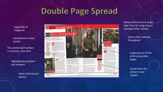
Codes and Conventions
By Ryan Frankish
Large, dominant
masthead,
making title of
the magazine
clear
Large, dominant
full page image of
the main article in
the magazine,
with a drummer
displayed
The musicians name
and name of band in
bold, dominant writing
so fans can clearly
identify that the main
article is about this
musician/band.
Clear
picture of
the subject
making eye
contact
References to other
important articles in the
magazine
Teasing
contents
Similar colour
scheme to the
drummers apparel
and drum kit
Unseen content
with first view
available to
attract the
reader
Large, dominant masthead,
making title of the
magazine clear
Large, dominant full
page image of the main
article in the magazine,
with a band displayed
Big, bold name of
the band to attract
their fans
Price
References to other
important articles
Clear picture of the frontman and
most iconic member of the band
in the foreground making eye
contact whilst the other less
iconic members are in the
background making different
poses.
Teasing contents
Ratings and reviews to advise the
reader
Large, dominant masthead,
making title of the magazine clear
References to other
important articles
Free gifts
Subject can be
clearly seen
with eye
contact
Price
Large, dominant full page
image of the main article in the
magazine, with a band
displayed
Bright colour scheme to
draw the readers attention
when purchasing
Large title
Large dominant
picture of artist
showing this is
relevant to the
main article Competitions
Artists name in big, bold letters to attract
people looking for the article
‘Features’ section
Page number
giving reference to
the location of the
article
Brief explanation of the main
article to attract interest
References to buy products
relevant to the magazines
subject
Large title and issue
number
Large dominant picture of
artist showing this is
relevant to the main
article
Page number giving
reference to the
location of the article
Pictures giving
references to other
important articles
Large, bold font
Date of issue
Brief explanation of
the article to gather
interest to read the
whole thing
Same colour scheme
throughout
Page title at the top of
the page with date of
the issue
Competitions
Free gifts
Page number giving
reference to the
location of the
articles
Large picture of artist
showing this is the main
article as it is dominant
Large, clear font
Continuous colour
scheme throughout
‘Features’ section
Title/logo of
magazine
The article itself
written in
columns, clear
font
Page number
helping to
locate the
article
Picture of the artist
Same colour
scheme
throughout
Logo/title of
magazine
The article itself written
in columns, clear font
Same colour scheme
throughout
Highlighted questions
and answers
Quote from the
article’s main
subject
Introduction to the
article
Large picture of the
artist across two
pages
‘Extra information’
column
Name of the artist in large,
clear font, for a big impact
amongst other articles
Quote from the artistPictures of the artist
across both pages
Title of the article
in large, bold
writing
The article itself
written in
columns, clear
font
Introduction to the
article
The same colour
scheme across
both pages
Key information in
bold, colourful font
Some text
highlighted. Big,
bright and colourful
Small title in the
top left corner
indicating what
the article
contains
I think it is clear that the codes and conventions for these
three different magazines are very similar, for example:
•Each front cover has a large photo of the artist, a large
masthead and also references to different articles.
•Each contents page has a large photo of the subject of the
main article, page numbers referencing the location of
articles, ‘features’ sections and brief descriptions of the
articles to attract interest to read them.
•Each double page spread has pictures of the artist, a
colour scheme that stays the same over both pages and
introductions to the article.
There are not many significant differences of the codes and
conventions between these three magazines, however there are a
few noticeable differences:
•One of the magazines has free gifts to offer as the other two do
not
•Two out of the three have the price on, I think it is important to
have the price on the magazine so that it is clear to see as the
product is at the customers expense so they need to know straight
away if they’re willing to pay the price for the product.

Codes and conventions

  • 1.
  • 2.
    Large, dominant masthead, making titleof the magazine clear Large, dominant full page image of the main article in the magazine, with a drummer displayed The musicians name and name of band in bold, dominant writing so fans can clearly identify that the main article is about this musician/band. Clear picture of the subject making eye contact References to other important articles in the magazine Teasing contents Similar colour scheme to the drummers apparel and drum kit Unseen content with first view available to attract the reader
  • 3.
    Large, dominant masthead, makingtitle of the magazine clear Large, dominant full page image of the main article in the magazine, with a band displayed Big, bold name of the band to attract their fans Price References to other important articles Clear picture of the frontman and most iconic member of the band in the foreground making eye contact whilst the other less iconic members are in the background making different poses. Teasing contents Ratings and reviews to advise the reader
  • 4.
    Large, dominant masthead, makingtitle of the magazine clear References to other important articles Free gifts Subject can be clearly seen with eye contact Price Large, dominant full page image of the main article in the magazine, with a band displayed Bright colour scheme to draw the readers attention when purchasing
  • 5.
    Large title Large dominant pictureof artist showing this is relevant to the main article Competitions Artists name in big, bold letters to attract people looking for the article ‘Features’ section Page number giving reference to the location of the article Brief explanation of the main article to attract interest References to buy products relevant to the magazines subject
  • 6.
    Large title andissue number Large dominant picture of artist showing this is relevant to the main article Page number giving reference to the location of the article Pictures giving references to other important articles Large, bold font Date of issue Brief explanation of the article to gather interest to read the whole thing Same colour scheme throughout
  • 7.
    Page title atthe top of the page with date of the issue Competitions Free gifts Page number giving reference to the location of the articles Large picture of artist showing this is the main article as it is dominant Large, clear font Continuous colour scheme throughout ‘Features’ section
  • 8.
    Title/logo of magazine The articleitself written in columns, clear font Page number helping to locate the article Picture of the artist Same colour scheme throughout
  • 9.
    Logo/title of magazine The articleitself written in columns, clear font Same colour scheme throughout Highlighted questions and answers Quote from the article’s main subject Introduction to the article Large picture of the artist across two pages ‘Extra information’ column Name of the artist in large, clear font, for a big impact amongst other articles
  • 10.
    Quote from theartistPictures of the artist across both pages Title of the article in large, bold writing The article itself written in columns, clear font Introduction to the article The same colour scheme across both pages Key information in bold, colourful font Some text highlighted. Big, bright and colourful Small title in the top left corner indicating what the article contains
  • 11.
    I think itis clear that the codes and conventions for these three different magazines are very similar, for example: •Each front cover has a large photo of the artist, a large masthead and also references to different articles. •Each contents page has a large photo of the subject of the main article, page numbers referencing the location of articles, ‘features’ sections and brief descriptions of the articles to attract interest to read them. •Each double page spread has pictures of the artist, a colour scheme that stays the same over both pages and introductions to the article.
  • 12.
    There are notmany significant differences of the codes and conventions between these three magazines, however there are a few noticeable differences: •One of the magazines has free gifts to offer as the other two do not •Two out of the three have the price on, I think it is important to have the price on the magazine so that it is clear to see as the product is at the customers expense so they need to know straight away if they’re willing to pay the price for the product.