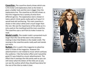
[1] The document analyzes the design elements of the magazine cover of Rollingstone, including the masthead title layout, grayscale model image, use of font styles and sizing in the coverlines, and placement of other text elements.
[2] Key aspects noted are that the masthead title is obscured by the model, the model image stands out against the grayscale background, and coverlines are differentiated in size and boldness to denote importance and guide the reader.
[3] The analysis also comments on the eye flow across elements, color scheme, and differences from another magazine cover examined.