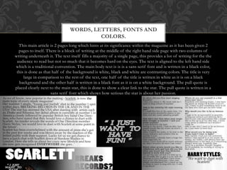
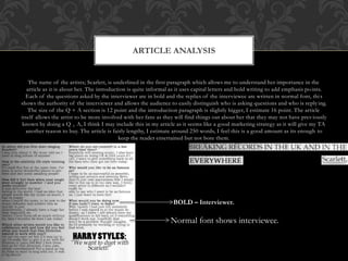
2. This main article is 2 pages long which hints at its significance within the magazine as it has been given 2
pages to itself. There is a block of writing at the middle of the right hand side page with two columns of
writing underneath it. The text itself fills a majority of a single page, this provides a lot of writing for the the
audience to read but not so much that it becomes hard on the eyes. The text is aligned to the left hand side
which is a traditional convention. The main body text is is is a sans serif font and is written in a black color,
this is done as that half of the background is white, black and white are contrasting colors. The title is very
large in comparison to the rest of the text, one half of the title is written in white as it is on a black
background and the other half is written in a black font as it is on a white background. The pull quote is
placed clearly next to the main star, this is done to show a clear link to the star. The pull quote is written in a
sans serif font which shows how serious the star is about her passion.
WORDS, LETTERS, FONTS AND
COLORS.
3. There are 7 shots in total on the DPS and they are all taken in a studio setting. For me I think
I might include one shot from a different location just to change the mood of the DPS. All of
the photos are studio lit. By giving the star a acoustic guitar they have followed the well
recognized house style that the audience will be looking for as it is a magazine about acoustic
music. The photos around the side. The images suit the TA as the TA will obviously have an
interest in acoustic music therefore the pictures include a acoustic guitar and player. Around 6
of the photos there is a old film frame which gives a subliminal feeling of classic music which
also hints to the reader the exact genre of the star, classic acoustic.
GRAPHOLOGY
4. GENERAL ANALYSIS
The tenor of the text
is relaxed as it feels
like the article is
talking to the
audience.
Old film frame
hints at the classic
aspect of her work.
Black and
white creates a
traditional
image of good
VS evil which
could further
link to her
music and how
it can vary.
Denim
jacket
which is a
classic
look.
The
register is
fairly
informal
as its like
the writer
is talking
to you
The medium of
the text is a
conversation as it
has a Q and A
aspect in and the
first paragraph
feels like a spoken
introduction.
5. The name of the artists; Scarlett, is underlined in the first paragraph which allows me to understand her importance in the
article as it is about her. The introduction is quite informal as it uses capital letters and bold writing to add emphasis points.
Each of the questions asked by the interviewer are in bold and the replies of the interviewee are written in normal font, this
shows the authority of the interviewer and allows the audience to easily distinguish who is asking questions and who is reply ing.
The size of the Q + A section is 12 point and the introduction paragraph is slightly bigger, I estimate 16 point. The article
itself allows the artist to be more involved with her fans as they will find things out about her that they may not have previously
known by doing a Q + A, I think I may include this in my article as it seems like a good marketing strategy as it will give my TA
another reason to buy. The article is fairly lengthy, I estimate around 250 words, I feel this is a good amount as its enough to
keep the reader entertained but not bore them.
ARTICLE ANALYSIS
BOLD – Interviewer.
Normal font shows interviewee.