Download to read offline

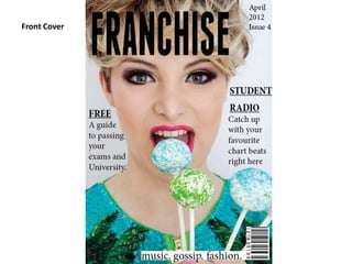
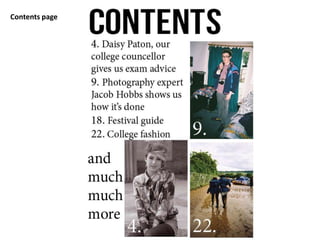
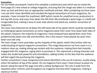
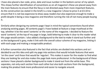

This document discusses the preliminary task of creating the front cover and contents page for a new school/college music magazine. For the front cover, conventions from existing music magazines were followed, including a large masthead, cover lines down the left side, a main image taking up most of the cover, and inclusion of barcode, price, date and issue in the bottom corner. For the contents page, conventions like a large masthead at the top, dividing articles into labeled sections, and use of backgrounds/colors to make sections and text stand out were utilized to create a clear and professional looking page. Overall, the document evaluates how conventions from analyzed magazines were identified and applied to the preliminary task designs to


