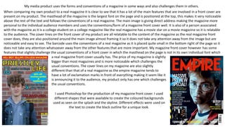
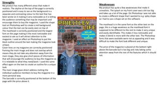
My media product uses conventions of magazines but also challenges some conventions. It has key magazine features like a masthead at the top in the largest font, a main image giving direct address, and cover lines framing the image. However, some features differ from conventions, like the masthead not having its own unique font and the price being larger than typical. Photoshop was used to create colored backgrounds, text effects, and shapes, though font and shape options were limited. Strengths include positioning of elements and use of contrasting colors, but weaknesses include a large splash and masthead blending in due to shared font.