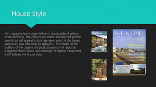
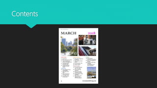
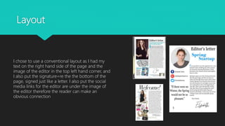
This document analyzes how the media product uses and develops conventions of real magazines. It discusses the conventions used and some challenges to conventions across various pages of the magazine including the front cover, contents page, editor's letter, advertisements, website, and billboard. Overall, it mostly conforms to typical magazine conventions but also challenges some conventions, such as using two paragraphs in the editor's letter rather than one, and positioning elements differently on some pages for improved readability or aesthetics. Maintaining consistency in branding elements like the masthead also helps develop the brand image.
In what ways does your media product use, develop or challenge forms and conv...S0016315
Harry Iggleden
AS Media Studies.
Evaluation Question 1: In what ways does your media product use, develop or challenge forms and conventions of real media products?
The Art Pastor's Guide to Sabbath | Steve ThomasonSteve Thomason
What is the purpose of the Sabbath Law in the Torah. It is interesting to compare how the context of the law shifts from Exodus to Deuteronomy. Who gets to rest, and why?
Unit 8 - Information and Communication Technology (Paper I).pdfThiyagu K
This slides describes the basic concepts of ICT, basics of Email, Emerging Technology and Digital Initiatives in Education. This presentations aligns with the UGC Paper I syllabus.
Welcome to TechSoup New Member Orientation and Q&A (May 2024).pdfTechSoup
In this webinar you will learn how your organization can access TechSoup's wide variety of product discount and donation programs. From hardware to software, we'll give you a tour of the tools available to help your nonprofit with productivity, collaboration, financial management, donor tracking, security, and more.
The Roman Empire A Historical Colossus.pdfkaushalkr1407
The Roman Empire, a vast and enduring power, stands as one of history's most remarkable civilizations, leaving an indelible imprint on the world. It emerged from the Roman Republic, transitioning into an imperial powerhouse under the leadership of Augustus Caesar in 27 BCE. This transformation marked the beginning of an era defined by unprecedented territorial expansion, architectural marvels, and profound cultural influence.
The empire's roots lie in the city of Rome, founded, according to legend, by Romulus in 753 BCE. Over centuries, Rome evolved from a small settlement to a formidable republic, characterized by a complex political system with elected officials and checks on power. However, internal strife, class conflicts, and military ambitions paved the way for the end of the Republic. Julius Caesar’s dictatorship and subsequent assassination in 44 BCE created a power vacuum, leading to a civil war. Octavian, later Augustus, emerged victorious, heralding the Roman Empire’s birth.
Under Augustus, the empire experienced the Pax Romana, a 200-year period of relative peace and stability. Augustus reformed the military, established efficient administrative systems, and initiated grand construction projects. The empire's borders expanded, encompassing territories from Britain to Egypt and from Spain to the Euphrates. Roman legions, renowned for their discipline and engineering prowess, secured and maintained these vast territories, building roads, fortifications, and cities that facilitated control and integration.
The Roman Empire’s society was hierarchical, with a rigid class system. At the top were the patricians, wealthy elites who held significant political power. Below them were the plebeians, free citizens with limited political influence, and the vast numbers of slaves who formed the backbone of the economy. The family unit was central, governed by the paterfamilias, the male head who held absolute authority.
Culturally, the Romans were eclectic, absorbing and adapting elements from the civilizations they encountered, particularly the Greeks. Roman art, literature, and philosophy reflected this synthesis, creating a rich cultural tapestry. Latin, the Roman language, became the lingua franca of the Western world, influencing numerous modern languages.
Roman architecture and engineering achievements were monumental. They perfected the arch, vault, and dome, constructing enduring structures like the Colosseum, Pantheon, and aqueducts. These engineering marvels not only showcased Roman ingenuity but also served practical purposes, from public entertainment to water supply.
Read| The latest issue of The Challenger is here! We are thrilled to announce that our school paper has qualified for the NATIONAL SCHOOLS PRESS CONFERENCE (NSPC) 2024. Thank you for your unwavering support and trust. Dive into the stories that made us stand out!
Students, digital devices and success - Andreas Schleicher - 27 May 2024..pptxEduSkills OECD
Andreas Schleicher presents at the OECD webinar ‘Digital devices in schools: detrimental distraction or secret to success?’ on 27 May 2024. The presentation was based on findings from PISA 2022 results and the webinar helped launch the PISA in Focus ‘Managing screen time: How to protect and equip students against distraction’ https://www.oecd-ilibrary.org/education/managing-screen-time_7c225af4-en and the OECD Education Policy Perspective ‘Students, digital devices and success’ can be found here - https://oe.cd/il/5yV
Synthetic Fiber Construction in lab .pptxPavel ( NSTU)
Synthetic fiber production is a fascinating and complex field that blends chemistry, engineering, and environmental science. By understanding these aspects, students can gain a comprehensive view of synthetic fiber production, its impact on society and the environment, and the potential for future innovations. Synthetic fibers play a crucial role in modern society, impacting various aspects of daily life, industry, and the environment. ynthetic fibers are integral to modern life, offering a range of benefits from cost-effectiveness and versatility to innovative applications and performance characteristics. While they pose environmental challenges, ongoing research and development aim to create more sustainable and eco-friendly alternatives. Understanding the importance of synthetic fibers helps in appreciating their role in the economy, industry, and daily life, while also emphasizing the need for sustainable practices and innovation.
3. Masthead
My masthead is large and bold serif style font that
changes font in the title to handwritten is in the
middle of the page and catches they eye of the
reader immediately. My masthead overlaps the
image and takes up more space than normal but
this to make the masthead stand out further to my
audience and establish more of a brand name. My
magazine masthead is similar to real media.
4. Image
The image on the front cover of my magazine is
a long establishing shot. The photograph was
taken of a natural area and therefore follows that
convention of regional magazines. This long shot
makes the audience feel as if they are part of the
image and they are actually there. There is also a
second image in the banner of my front cover
which is also a convention of regional magazines.
5. House Style
My magazine front cover follows a house style of yellow,
white and blue. The colours are subtle and are not gender
specific so will appeal to both genders which is the target
audience I was intending to appeal to. The footer at the
bottom of the page is a typical convention of regional
magazine front covers, and although is slightly translucent,
it still follows the house style.
7. Fonts & Features
There are short insights to the articles offered
and informs the reader on title of the article
(Uses and Grats) the font is serif style which is
more sophisticated and elegant which is
representative of the target audience and their
ideologies of how the page should be
presented. I chose to make the feature sections
different colour to make it stand out to the
audience. It is not a common convention of
contents pages but has been used, fulfils the
audiences cognitive needs tofor easy navigation
8. Images
I followed the convention of having images on
my contents page to break up the text. I used a
variety of different image on my page which is
also a convention of images on contents pages.
The images are not clear and can be easily
understood, this creates an enigma (Barthes)
and makes the reader want to read on.
9. Numbering
The numbering on my contents page is very
conventional of regional magazines as they are
vertical to each other, and horizontal to the
article. This allows for easy navigation to fulfil
the audiences individuals needs and it also
informs them (Uses and Grats)
10. Rows and columns
I chose to have 3 columns of text as I
saw it as conventional for regional
magazines, the rows and columns are
laid out so that finding information
becomes easy as information is
organised (uses and Grats). I had tabs
separation each category of article
which made it even more easy to
navigate. Colour also appeal to a
younger audience and also makes
the page look more appealing.
12. Image
The image I have used is cropped in a circular style for
magazine, it is not a typical convention of regional
magazine editors letters but has been used in some, it
gives the image a more sleek look and makes it appear
more modern appealing to my audience. The image is a
medium close up of a model looking at the camera. The
direct mode of address is a common convention and
helps establish a relationship between reader model and
audience.
13. Text
I chose to have two paragraphs in my
editors letter which is slightly
unconventional to the usual one
paragraph but I wanted to add an
introduction to the editors letter. I also
used the the common convention of
using a signature at the end, this makes
it look more personal and also more
professional. I also used a quote on the
topic which I saw to be a convention on
some editors letters.
14. Layout
I chose to use a conventional layout as I had my
text on the right hand side of the page and the
image of the editor in the top left hand corner, and
I also put the signature=re the the bottom of the
page, signed just like a letter. I also put the social
media links for the editor are under the image of
the editor therefore the reader can make an
obvious connection
16. Text
The text on the page includes a slogan for the company and
it is in two different fonts, one font is formal serif style and
the other is handwritten, this is unconventional of
advertisements but I have done it so that the advert is more
informal with the reader and engages with them more
wanting to take their service. There is also a link so that the
reader can easily find where to book increasing the chance
of making a sale by making it more accessible (uses and
Grats)
17. Image
`
The image is slightly unconventional of an
hotel advertisement, typically the image
would show the product itself like the room or
facilities but due to not having the luxury of
being able to take photos of the hotel I used
the view as the image, the image is a long
shot of a natural setting this makes the reader
feel part of the image. On the image I also
used the logo of the company to advertise
the company even more and create more
brand exposure.
18. Layout
I followed layout conventions on my
advertisement like including the logo of
the company in the top right corner of
the advertisement, however I
challenged the convention the slogan/
sell line at the bottom middle of the
page purely due to the fact the slogan
was more visible and easier to read at
the top and also the writing blended in
with the clouds making it look more
aesthetically pleasing.
20. Layout
I conformed to typical conventions of
magazine websites having the logo and the
masthead at the top and center of the page,
This allows the audience to clearly recognize
the brand name and image. I put my menu
underneath my advertisement for my physical
copy of my magazine, this allows my website
to be clearly and easily navigated (uses
&Grats).
I also conformed to the tile style of stories on
my website so stories can easily be navigated
and seen (uses & Grats)
21. Image
I used a variety of different images to support
stories on my website as this is a common
convention of regional magazine websites. I also
conformed to the convention that websites often
show their magazine front cover on their website.
23. Layout
The layout of my billboard is conventional with the
name of the magazine on the left and a slogan
underneath although it was difficult to find codes
and conventions dues to the lack of regional
magazine billboards. ‘The Resident is the only one I
could find so I stuck closely to the design. I included
my website and the bottom and the image
portraying the multiple platforms on the right which
is a common convention of magazine billboards.
24. Image
The image on my billboard is of the multiple platforms
which is a convention of billboards. The billboard itself I
chose to make as a brighter colour to attract attention.
I also use the same masthead consistent across my
front cover and website to create a brand image