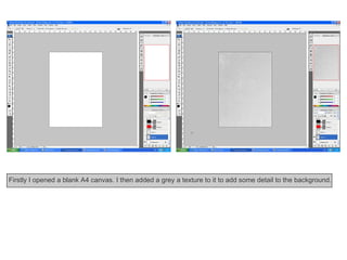
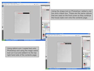
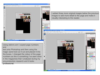
Contents Page
Firstly I opened a blank A4 canvas. I then added a grey a texture to it to add some detail to the background.
Using the shape tool on Photoshop I added a red  box and a black box. These are the same colours that are used on the front cover so they continue the house style over onto the contents page.  Using dafont.com I copied text onto Photoshop and using the magic wand tool cut it out and added it to the top right hand side of the contents page.
Using the shape tool I added two black boxes so that the text on the page will stand out from the background. Again, I used this because it is on the  front cover and I needed to continue the house style on the contents page.  Next I added a grey box and altered the opacity to 20%. I created the 100X100 pixel images from my original photos and placed them on top of that box.
I added three more original images below the previous  images to add more detail to the page and make it  visually interesting to the reader.  Using dafont.com I copied page numbers and  text onto Photoshop and then using the magic wand tool cut it out and placed it into the boxes. I changed the colour of the page numbers as this is something I’ve seen done in the magazines that I analysed during my pre-production research and it looks professional.
Using the same steps as I have done previously I added smaller text to explain features on the contents page. Finally, I added an image of a microphone on the left hand side. I put it behind the text boxes as I  didn’t want it to stand out I just wanted to add some small detail to the left hand side as it looked too plain.


Contents Pagestepbystep

  • 1.
  • 2.
    Firstly I openeda blank A4 canvas. I then added a grey a texture to it to add some detail to the background.
  • 3.
    Using the shapetool on Photoshop I added a red box and a black box. These are the same colours that are used on the front cover so they continue the house style over onto the contents page. Using dafont.com I copied text onto Photoshop and using the magic wand tool cut it out and added it to the top right hand side of the contents page.
  • 4.
    Using the shapetool I added two black boxes so that the text on the page will stand out from the background. Again, I used this because it is on the front cover and I needed to continue the house style on the contents page. Next I added a grey box and altered the opacity to 20%. I created the 100X100 pixel images from my original photos and placed them on top of that box.
  • 5.
    I added threemore original images below the previous images to add more detail to the page and make it visually interesting to the reader. Using dafont.com I copied page numbers and text onto Photoshop and then using the magic wand tool cut it out and placed it into the boxes. I changed the colour of the page numbers as this is something I’ve seen done in the magazines that I analysed during my pre-production research and it looks professional.
  • 6.
    Using the samesteps as I have done previously I added smaller text to explain features on the contents page. Finally, I added an image of a microphone on the left hand side. I put it behind the text boxes as I didn’t want it to stand out I just wanted to add some small detail to the left hand side as it looked too plain.
  • 7.
  • 8.