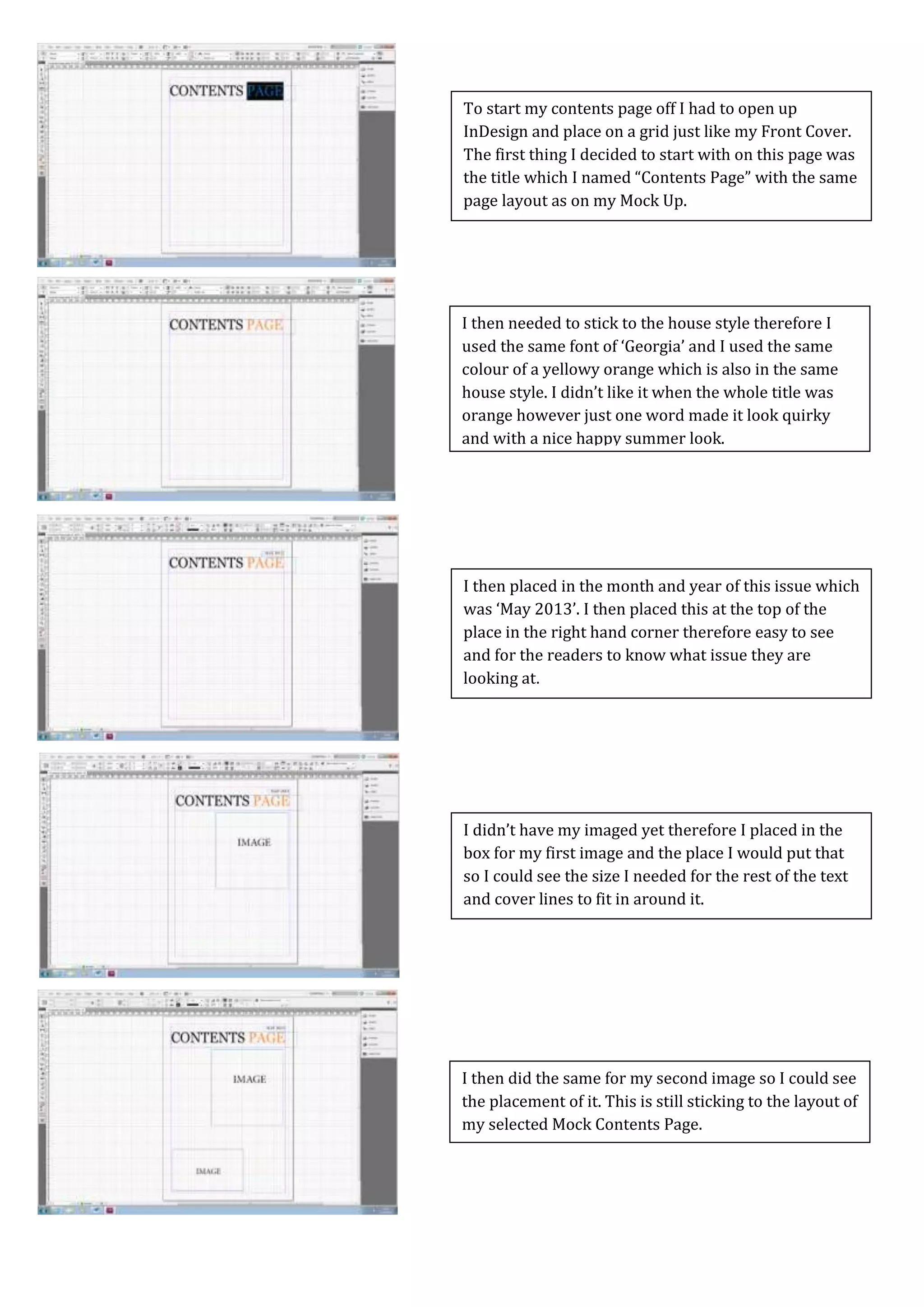
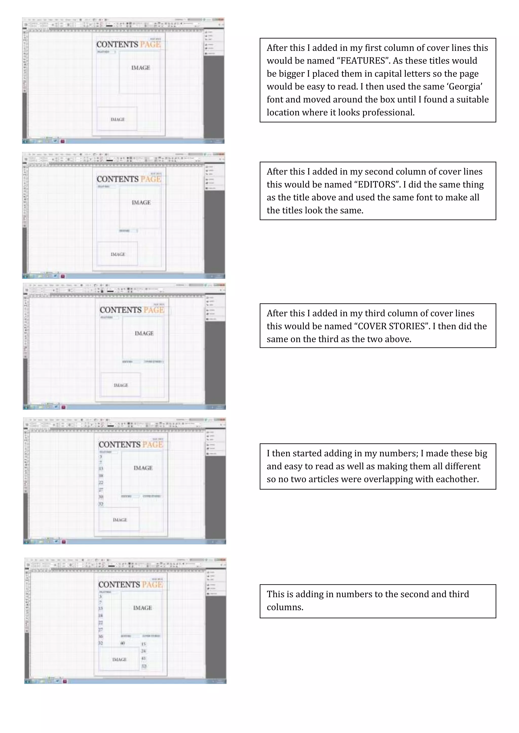
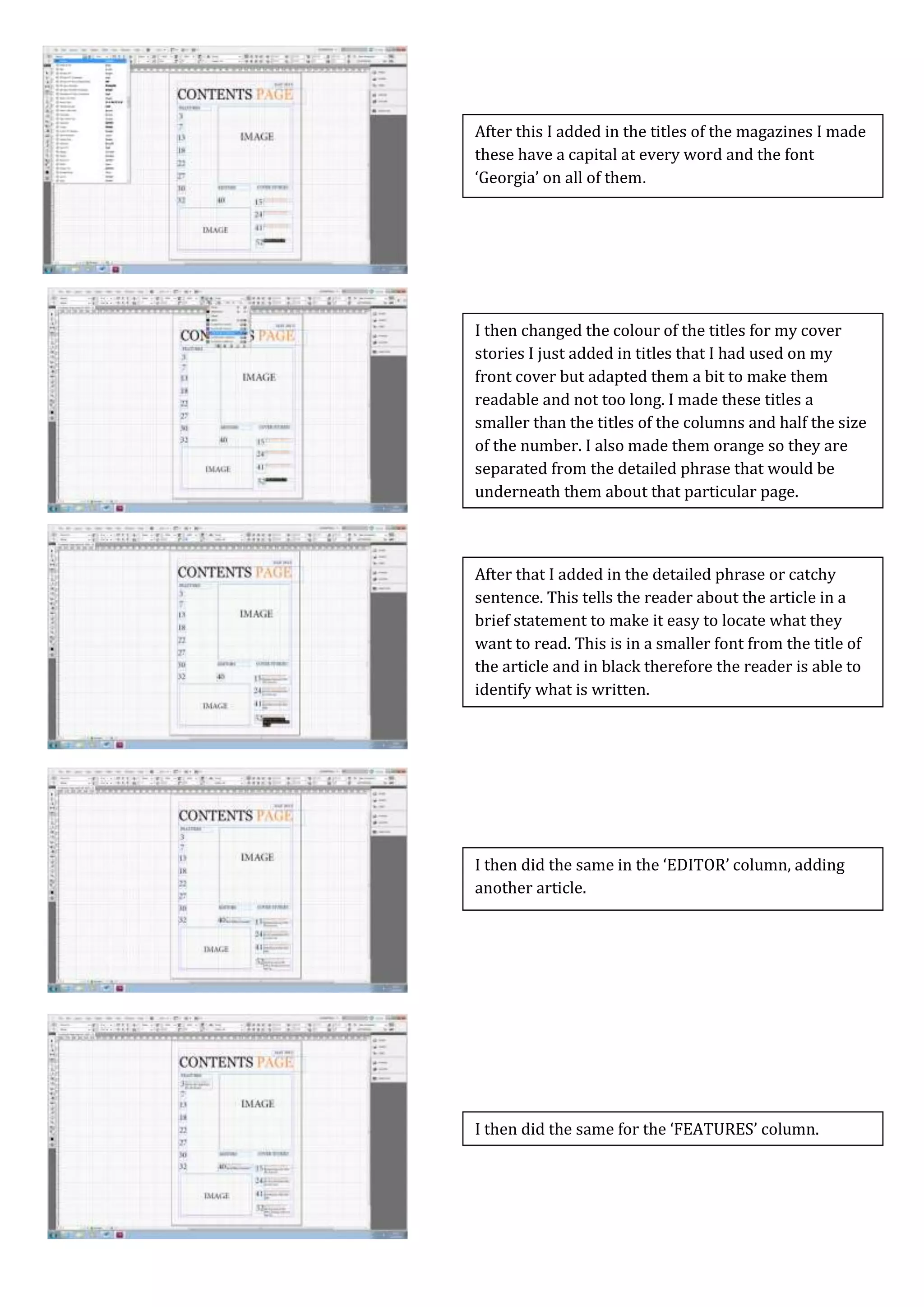
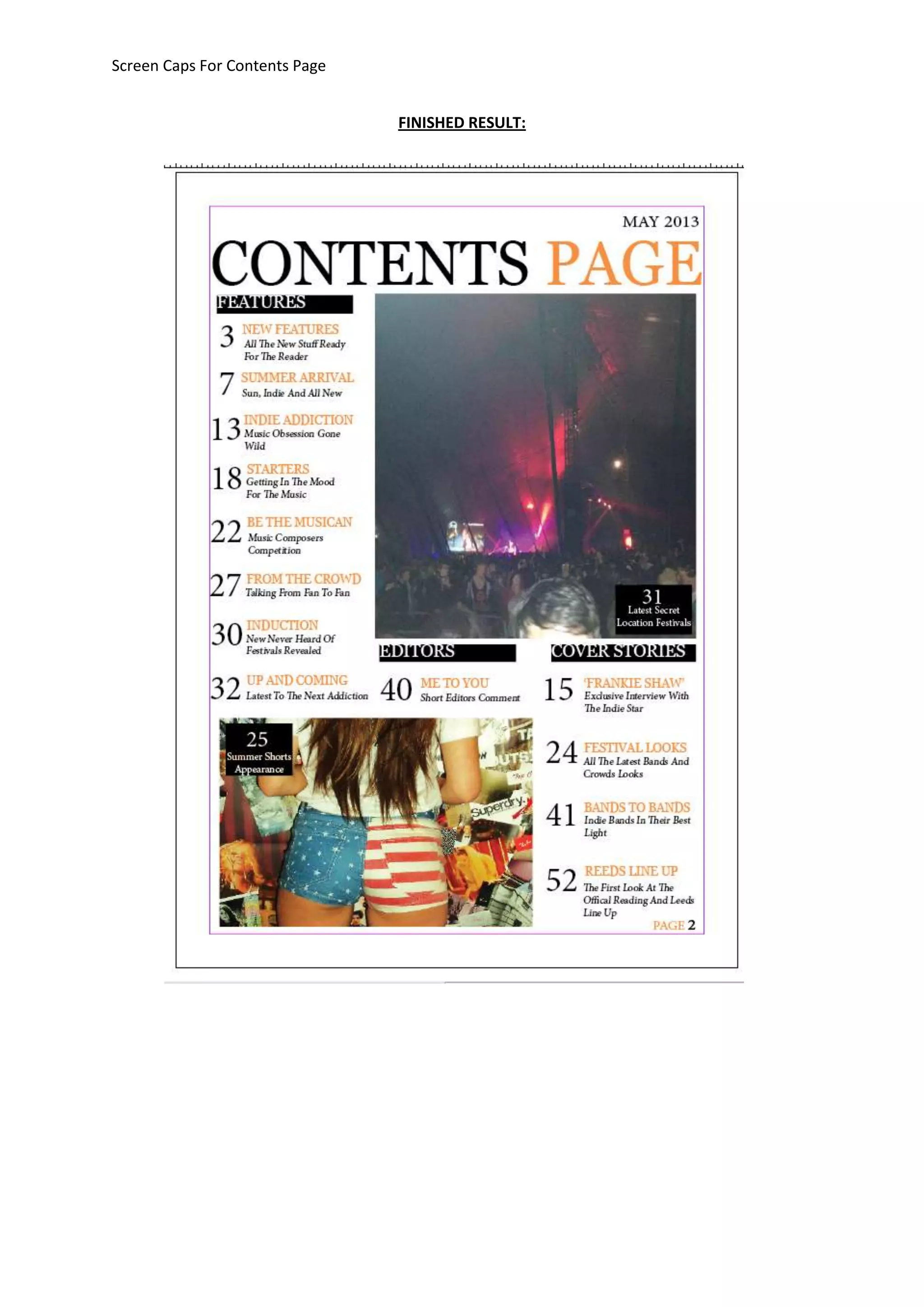
This document describes the process of creating a contents page for an indie rock magazine in InDesign. It involves:
1) Setting up a grid and placing section titles, article numbers, and cover lines in different columns. Fonts and colors are used consistently with the magazine style.
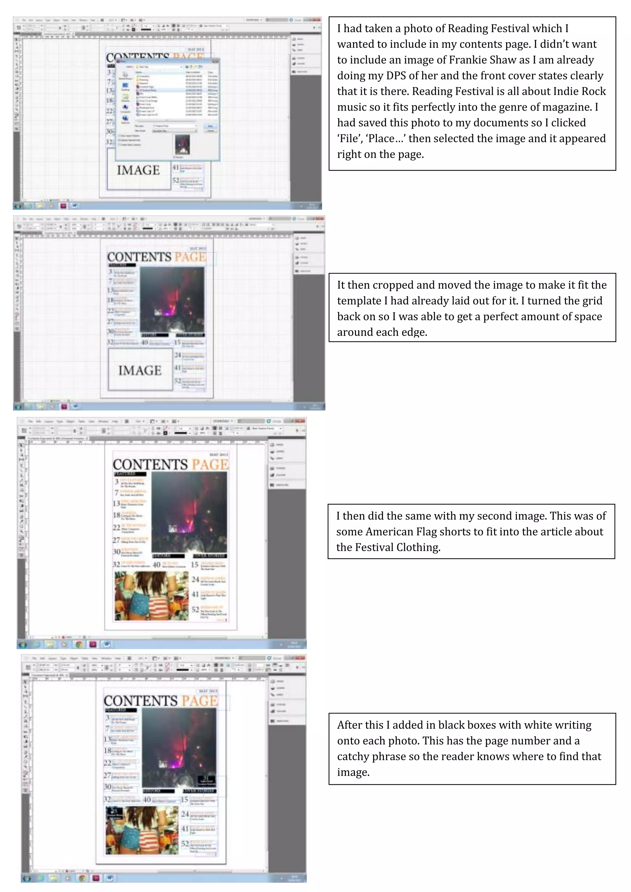
2) Adding article titles in the cover stories section along with descriptive phrases. Images are also placed with corresponding page numbers.
3) Tweaking the layout by moving elements, outlining images, and previewing to check the final design before it is ready to print. The contents page effectively lists and promotes the stories in the upcoming issue.


![Coded Agents – with UiPath SDK + LangGraph [Virtual Hands-on Workshop]](https://cdn.slidesharecdn.com/ss_thumbnails/codedagentsdeck-251215155422-5497c599-thumbnail.jpg?width=640&height=640&fit=bounds)


