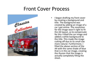
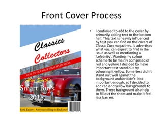
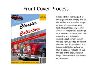
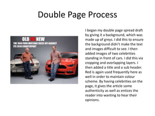
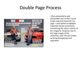
Experiments
William Anderson
Front Cover Process
• I began drafting my front cover
by creating a background and
title. The background was
created by adding an image of a
car I got online. The resolution
for the image wasn’t right to fit
the A4 layout, so to compensate
for this I tilted the car image and
added a white background to
the title. This made the image
cutting off due to its small size
more natural. Furthermore, I
filled the above section of the
A4 with the same shade of blue
that is in the car image, creating
the illusion that the image is
actually completely filling the
sheet.
Front Cover Process
• I continued to add to the cover by
primarily adding text to the bottom
half. This text is heavily influenced
by text you can find on the covers of
Classic Cars magazines. It advertises
what you can expect to find in the
issue as well as mentioning a
‘celebrity’. Wanting my colour
scheme to be mainly comprised of
red and yellow, I decided to make
important text stand out by
colouring it yellow. Some text didn’t
stand out well against the
background and/or didn’t look
important enough, so I decided to
add red and yellow backgrounds to
them. These background also help
to fill out the sheet and make it feel
less barren.
Front Cover Process
I decided that the top part of
the page was too empty, and so
decided to add a smaller image
of a car with accompanying
text. This is frequently seen in
actual car magazines, as it helps
to advertise the contents of the
magazine and get readers
excited about certain cars. In
the top right, I added a box with
the text ‘Hot 50 Roadsters’ in it.
I coloured this box yellow so
that it not only helps to fill out
the top of the page, but also
helps to balance the placement
of the colour.
Reflection
I will include the colour scheme of red and yellow in my final product, as
these colours help to bring each other out. Furthermore, red is a colour
frequently used in car magazines, meaning it adheres to the target audience. I
will also utilise the images of cars at the top of the page, as they help to fill up
extra space whilst enticing people into reading the magazine. The title will
also stay the same, as it is short and alliterative, giving it an appealing aspect.
Overall I am happy with this piece. Although I definitely believe I can improve,
I think this would work to an extent as an actual final product. Main
improvements would include ensuring all the reds and yellows use are of
consistent shade and adding slightly more to the top of the page to fill in the
centre of it.
Double Page Process
I began my double page spread draft
by giving it a background, which was
made up of greys. I did this to ensure
the background didn’t make the text
and images difficult to see. I then
added images of two celebrities
standing in front of cars. I did this via
cropping and overlapping layers. I
then added a title and a sub header.
Red is again used frequently here as
well in order to maintain colour
scheme. By having celebrities on the
page, it gives the article some
authenticity as well as entices the
reader into wanting to hear their
opinions.
Double Page Process
I then proceeded to add
placeholder text so that I could
create a general layout for my
page. I used yellow to highlight
important words and phrases,
maintaining the colour scheme of
the magazine. However, due to
the large images of the
celebrities used, the text ended
up being disorganised and
separated.
Reflection
Whilst I will include images of celebrities, I will make sure to greatly reduce
the size of them to allow for better organization of the text. I will also use red
and yellow in my final product as I believe this colour scheme works well. The
use of a simple colour for the background works well in not taking away from
the colour of the images and text, and thus I will make sure to use this feature
in my final piece (however I may not use grey depending on the images used).
Overall, I wouldn’t be happy with this piece as a final product. However, as a
draft it does its job in telling me what does and doesn’t work.

Production Experiments

  • 1.
  • 2.
    Front Cover Process •I began drafting my front cover by creating a background and title. The background was created by adding an image of a car I got online. The resolution for the image wasn’t right to fit the A4 layout, so to compensate for this I tilted the car image and added a white background to the title. This made the image cutting off due to its small size more natural. Furthermore, I filled the above section of the A4 with the same shade of blue that is in the car image, creating the illusion that the image is actually completely filling the sheet.
  • 3.
    Front Cover Process •I continued to add to the cover by primarily adding text to the bottom half. This text is heavily influenced by text you can find on the covers of Classic Cars magazines. It advertises what you can expect to find in the issue as well as mentioning a ‘celebrity’. Wanting my colour scheme to be mainly comprised of red and yellow, I decided to make important text stand out by colouring it yellow. Some text didn’t stand out well against the background and/or didn’t look important enough, so I decided to add red and yellow backgrounds to them. These background also help to fill out the sheet and make it feel less barren.
  • 4.
    Front Cover Process Idecided that the top part of the page was too empty, and so decided to add a smaller image of a car with accompanying text. This is frequently seen in actual car magazines, as it helps to advertise the contents of the magazine and get readers excited about certain cars. In the top right, I added a box with the text ‘Hot 50 Roadsters’ in it. I coloured this box yellow so that it not only helps to fill out the top of the page, but also helps to balance the placement of the colour.
  • 5.
    Reflection I will includethe colour scheme of red and yellow in my final product, as these colours help to bring each other out. Furthermore, red is a colour frequently used in car magazines, meaning it adheres to the target audience. I will also utilise the images of cars at the top of the page, as they help to fill up extra space whilst enticing people into reading the magazine. The title will also stay the same, as it is short and alliterative, giving it an appealing aspect. Overall I am happy with this piece. Although I definitely believe I can improve, I think this would work to an extent as an actual final product. Main improvements would include ensuring all the reds and yellows use are of consistent shade and adding slightly more to the top of the page to fill in the centre of it.
  • 6.
    Double Page Process Ibegan my double page spread draft by giving it a background, which was made up of greys. I did this to ensure the background didn’t make the text and images difficult to see. I then added images of two celebrities standing in front of cars. I did this via cropping and overlapping layers. I then added a title and a sub header. Red is again used frequently here as well in order to maintain colour scheme. By having celebrities on the page, it gives the article some authenticity as well as entices the reader into wanting to hear their opinions.
  • 7.
    Double Page Process Ithen proceeded to add placeholder text so that I could create a general layout for my page. I used yellow to highlight important words and phrases, maintaining the colour scheme of the magazine. However, due to the large images of the celebrities used, the text ended up being disorganised and separated.
  • 8.
    Reflection Whilst I willinclude images of celebrities, I will make sure to greatly reduce the size of them to allow for better organization of the text. I will also use red and yellow in my final product as I believe this colour scheme works well. The use of a simple colour for the background works well in not taking away from the colour of the images and text, and thus I will make sure to use this feature in my final piece (however I may not use grey depending on the images used). Overall, I wouldn’t be happy with this piece as a final product. However, as a draft it does its job in telling me what does and doesn’t work.

Editor's Notes

  • #3 Discuss the tools and processes used in your experiments
  • #4 Discuss the tools and processes used in your experiments
  • #5 Discuss the tools and processes used in your experiments
  • #7 Discuss the tools and processes used in your experiments
  • #8 Discuss the tools and processes used in your experiments