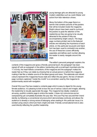
The document analyzes and compares the contents pages of two teen pop magazines, We Love Pop and Top of the Pops. It discusses the layout, visual design, language, and conventions used on each page to attract their target audiences of teenage girls. Both magazines employ bright colors, images of celebrities, and brief article descriptions to grab readers' attention. However, We Love Pop uses a busier, more image-heavy design while Top of the Pops focuses more on information. The analysis shows how each magazine effectively brands itself and connects with readers through their contents pages.