
Recommended
More Related Content
Viewers also liked
Viewers also liked (17)
Similar to Contents as1
Similar to Contents as1 (20)
Recently uploaded
Recently uploaded (20)
Contents as1
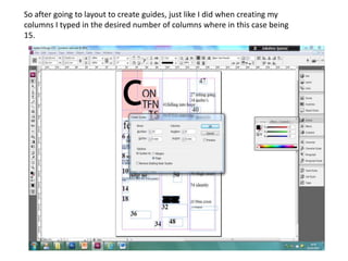
- 1. So after going to layout to create guides, just like I did when creating my columns I typed in the desired number of columns where in this case being 15.
- 2. Note: Once your columns or guides are inserted you can Here it is in action, and move lines by; 1) right clicking on that line 2) going to grids neater. and guides 3) unclick ‘lock column guides‘ 4) Then drag!
- 3. Subheadings are very important as this could potentially be what people are drawn to the article through. ‘6 Deepness of shallowness’ a short subheading which has two strong abstract nouns which show this is a subject of strong emotions. This will appeal to my target audience as many youth are interested in shocking stories. It rhyming and having a rhythm allows it to become memorable to the reader so that even if they put down the magazine they will remember to read this later. ‘10 Only God can judge me’ here I used a popular phrase which everyone will know of; Christian or non Christian. This is a line used much by the youth as well so they will be attracted to this article. You see an example of a popular phrase used in one of my case studies. ‘31 leaving lonely’ is the use of In my study I saw that they included popular social network sites on their personification which many will find magazine as internet is a major part of peoples life. I used ‘14 Gospel puzzling and will want to find out the Cypher’ a popular music websites where young people share and comment story behind it. I use a similar tactic with on gospel rap/hip-hop, many of my target audience will be able to relate to this as it is widely known among the youth not only Christians but anyone ‘18 Fall in hope’ this is a paradox that as interested in rap. well will draw people into reading this article. I got this technique from my research.
- 4. I changed my masthead into a simpler font to match that of the front page and to make it My text in preview mode more clear. Although my seems a bit too spaced research showed me most rap out and resembling that of magazines do not have ‘contents’ written on it I a shopping list. wanted to put it up to give the page ‘power!’ As to me this is an important page that deserves its own name. I put the masthead in the upper left hand corner as this is where westerners automatically look when observing a document with text.
- 5. Here I have the heading of each section bolder than the rest of the text so that readers can navigate to their favourite articles quicker. I made the heading larger and a more trendy font so that it will be clear to the Just as you see here. reader where each sections starts.
- 6. To develop the photos idea I Yes I was challenging started of by making a rectangle. I conventions, as my case copied and pasted it , making studies showed me there sure that all were the same, then was one main picture by using the rotator I would rotate that takes up a third of a it to my desired position. page. But though I have four small pictures all are in the middle- still centre staged, they all give a variation of what is going to be in the magazine visually and lastly it gives my magazine its own individual identity
- 7. Choosing my pictures Putting a picture of an attractive girl with headsets round her neck staring has an effect on my audience. One is With this picture my aim was people will be inquisitive of why she is to make it come across that staring into space and will want to the two boys are a group find out more. The headset supports (there album cover is on the the theme of a music magazine. front page) and that V.I.P tickets were given away , I do this by getting the two girls to wear tags around their neck. This will interest boys as they would want to know how this group got girls to admire them and girls will be interested in how these girls This image is meant to create got these tickets and what an impression that she is event was going on. creating music, I do this by including a keyboard in the picture and getting her to Here I have a photo of a girl standing in a wear headsets. Much of my pose that suggests this page will have to do with fashion this is to make my target audience will be magazine come across broad and appeal to both genders equally. interested in how the production of music works.