
Recommended
More Related Content
What's hot
Viewers also liked
Viewers also liked (17)
Similar to Softening gospel rap magazine background
Similar to Softening gospel rap magazine background (20)
Recently uploaded
Recently uploaded (20)
Softening gospel rap magazine background
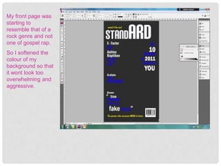
- 1. My front page was starting to resemble that of a rock genre and not one of gospel rap. So I softened the colour of my background so that it wont look too overwhelming and aggressive.
- 2. Here I am making a sell line to encourage people to purchase the magazine. I made the background yellow like the slogan to create a trend and being the bright colour it is will make it very noticeable. The word ‘Free’ being highlighted and larger than the rest will call for peoples attention as people generally like this word. ‘Shamballa’s’ is a popular unisex bracelet amongst the youth black culture generally can cost over a thousand pounds or just £15. Being tactical, my target audience does not know how much I got these shamballa’s for and they may just assume it is the most expensive ones , loads of people buy the magazine to get this prize where it did not cost my company much – the industry is all about making profit. B) Companies may give away free shamballa’s to my company as Many famous black they know that it is a fashionable item rappers wear this as amongst my target audience and the more you see to the right. youth that wear it the more people will be People may question persuaded to buy it. Plan B not only what does this have to achieves plan A buy getting people who do with gospel but this wouldn’t normally buy the magazine to is a gospel rap/hip-hop invest in it but there's the possibility that magazine aiming at companies will even pay for my magazine to young people and give away the free products they give as Christians still like to they know in the long run they will benefit be fashionable.
- 3. Most front pages have the main image giving direct eye contact. I broke this code however because it makes it look so stereotypical and unnatural. Where here where the artist is communicating with someone, give the magazine a sense of realism and youth do not like things to fancied up and like genuineness. With him having a smile on his face show us that he is having a good time and that makes people curious of what was happening encouraging them to buy it so they can find out. Him being a black youth will reach out to all of my target audience both girls and boys , Christian and non- Christian. Having a ‘JESUS IS MY LOGO’ badge makes it evident to the audience this magazine has something to do with Christianity and especially reaches out to my Christian target audience. The main thing however is that there is a microphone and a headset which both shows that this is a music magazine.
- 4. It is hard to cut pictures accurately so enlarging the picture makes it more easier. This tool
- 5. Always make sure your on the right layer when cropping.
- 6. Here I used the polygon Lasso tool to carefully outline the parts I wanted to keep.