production log continued
•Download as PPTX, PDF•
0 likes•267 views

This is a slide share of how I made the main features of my contents page.

Recommended
More Related Content
What's hot
What's hot (16)
Viewers also liked
Viewers also liked (20)
Similar to production log continued
Similar to production log continued (20)
More from Janet Lunkusé
More from Janet Lunkusé (16)
Recently uploaded
Recently uploaded (20)
production log continued
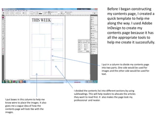
- 1. Before I began constructing my contents page, I created a quick template to help me along the way. I used Adobe InDesign to create my contents page because it has all the appropriate tools to help me create it successfully. I put in a column to divide my contents page into two parts. One side would be used for images and the other side would be used for text. I divided the contents list into different sections by using subheadings. This will help readers to allocate the articles they want to read first. It also makes the page look my I put boxes in this column to help me professional and neater. know were to place the images. It also gives me a vague idea of how the contents page will look like with the images.
- 2. I decided to put a border underneath the page title. I think this makes it stand out more These are all the images I want to incorporate into my contents page. I've chosen to use five images because I think that it is more than enough to use for a contents page. All these images relate to my target audience because all the people in the images are all roughly the same age.
- 3. I used this shape tool to help me create borders for all my subtitles. I decided to make the borders black so it can match with the border of the page title
- 4. In the filter column in adobe Photoshop, I clicked the sharpen. From here, I had the choice of sharpening the image in different ways For all the image I put on my contents page, I made sure I put them into high quality. I first did this by airbrushing and sharpening them in adobe Photoshop. I then right clicked all the images in InDesign and displayed them in high quality.
- 5. Using the internet, I researched different contents I was successful in creating my contents page pages. I found this contents page and realised that it and making it look like the contents page I was similar to my contents page layout. I decided to researched. I decided to alter the way my construct my contents page around this contents page images were displayed on the page so I by taking ideas from it. changed the shapes of the images into triangles. This makes my contents page look more interesting and fun to look at.
- 6. Firstly, I placed the image into InDesign. I was able to adjust the size of the image once it was placed by using the select tool I then used the direct selection tool to change the shape of the image. By double clicking the image, a blue frame appeared and I was able to adjust the walls of the image into any shape. This is the outcome of how I was able to change my images into triangles.
- 7. I featured a subscription box on the bottom right of the contents page. I first placed a black box in the grid lines on InDesign. I then started to put in the text. I decided to make the “subscribe” into a stamp form text. This is successful because it the colour stands out and it makes it more noticeable. I went on Google to find the icons for Facebook, twitter and blackberry. I wanted to put these icons into my subscription box so my readers can recognise them and realise there are different ways to subscribe to the magazine.