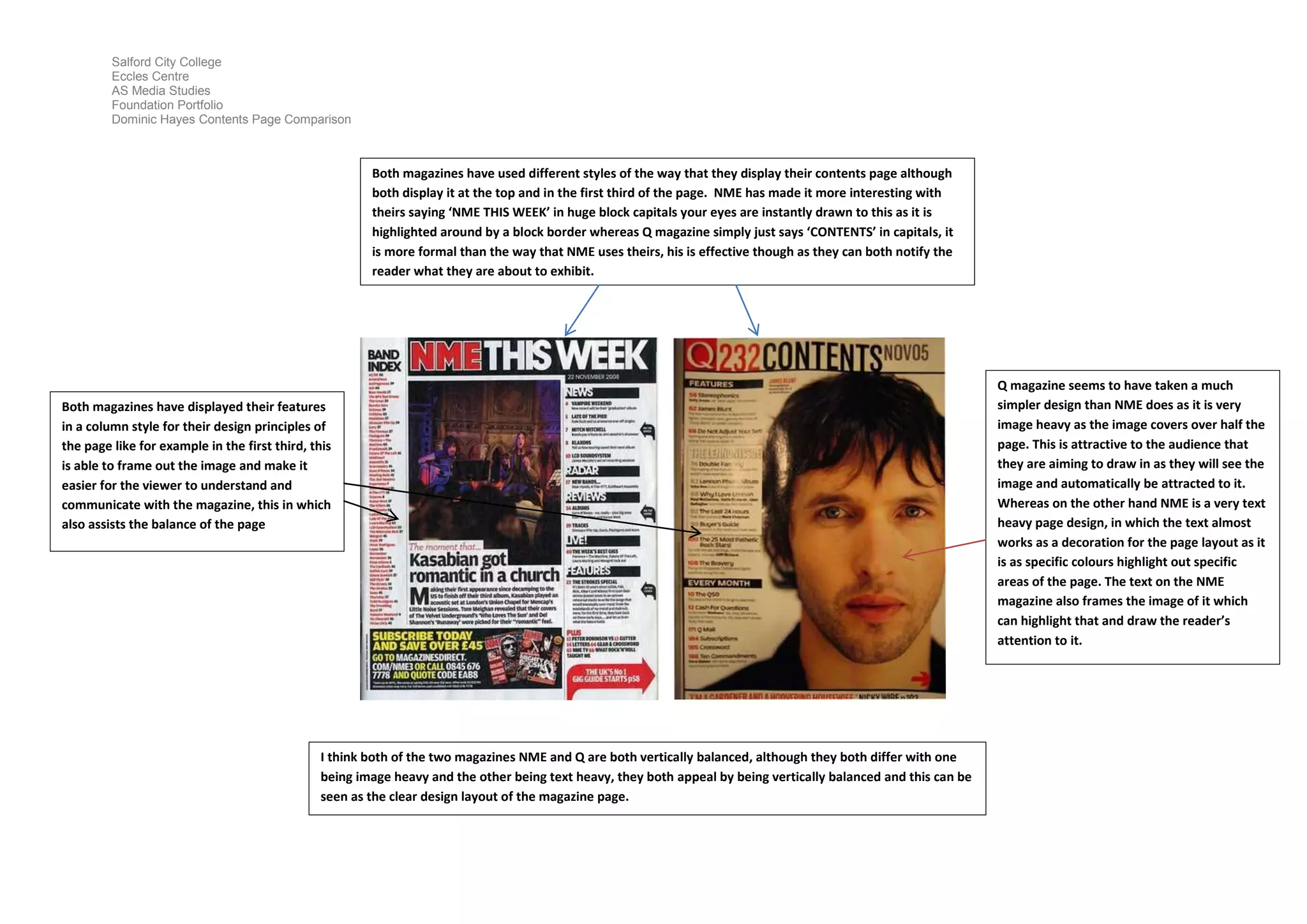
The document compares the contents pages of two music magazines, NME and Q. It finds that while NME uses large colorful text and Q uses simple capitalized text, both effectively notify readers of the contents. The magazines also similarly use a column structure and vertical balance to organize information, though NME relies more on text and Q more on large images. Overall, the document analyzes how the magazines employ different design styles but achieve readable layouts through balanced structures.