Research – Front Covers (1)
                  This front cover of the preliminary task uses a clear
                  colour scheme that matches the school emblem. It uses a
                  main image that covers the whole page and they have
                  used layering on top of the image. They have used a
                  large title at the top of the page and have added effects
                  to the writing. I like that they have placed the writing on
                  the left of the page so it does not layer over the top of
                  the main subjects in the picture. I like that they have
                  used another smaller image to break up the two sections
                  of writing.
                  I think that maybe they should have added a little bit
                  more vary in colour because it will make the page more
                  visually exciting. I also think they should have used a
                  little more layering.
                  Overall I think that the layout of the magazine is good
                  and I like that they used an image that covers the whole
                  page.
Research – Front Covers (2)
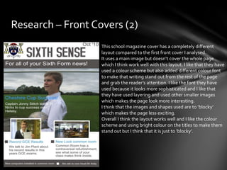
                   This school magazine cover has a completely different
                   layout compared to the first front cover I analysed.
                   It uses a main image but doesn’t cover the whole page
                   which I think work well with this layout. I like that they have
                   used a colour scheme but also added different colour font
                   to make that writing stand out from the rest of the page
                   and grab the reader’s attention. I like the font they have
                   used because it looks more sophisticated and I like that
                   they have used layering and used other smaller images
                   which makes the page look more interesting.
                   I think that the images and shapes used are to ‘blocky’
                   which makes the page less exciting.
                   Overall I think the layout works well and I like the colour
                   scheme and using bright colour on the titles to make them
                   stand out but I think that it is just to ‘blocky’.
Research – Contents Pages (1)
               I think that this contents page has an interesting
               layout and use of space. I like the way he has uses
               shapes and the way to split the page in two halves but
               not in the conventional way. I think that they have
               used a good use of colour scheme and I like the way
               they have used big font for the numbers of the pages.
               The only thing I would say is that they have included a
               competition but I think that they should have made it
               stand out more to get the reader’s attention maybe
               by making it a different colour from the colour
               scheme.
               Overall I think that this contents page uses a good
               layout and successful colour scheme but it may be a
               little dull because they haven’t used a break from the
               colour scheme for the competition for example.
Research – Contents Pages (2)
                This contents page uses an image as the main
                focus. I think that the image is interesting because
                they have modified it using a photo manipulation
                program. They have turned it into cartoon style
                picture and I think it works well with the red black
                and white colour scheme. I also think that the title
                is interesting.
                But I think that the actual contents information of
                the pages is maybe a too small of a font and the red
                font is hard to read in some places.
                Overall I think the image used and the colour
                scheme is successful but the information on the
                page is to small and in some places the red font
                makes it hard to read.
My Preliminary Magazine
Preliminary Task
Front Cover - Analysis
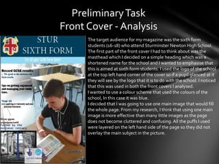
      The target audience for my magazine was the sixth form
      students (16-18) who attend Sturminster Newton High School.
      The first part of the front cover I had to think about was the
      masthead which I decided on a simple heading which was a
      shortened name for the school and I wanted to emphasise that
      this is aimed at sixth form students. I used the logo of the school
      at the top left hand corner of the cover so if a pupil glanced at it
      they will see by the logo that it is to do with the school. I noticed
      that this was used in both the front covers I analysed.
      I wanted to use a colour scheme that used the colours of the
      school, In this case it was blue.
      I decided that I was going to use one main image that would fill
      the whole page. From my research, I think that using one main
      image is more effective than many little images as the page
      does not become cluttered and confusing. All the puffs I used
      were layered on the left hand side of the page so they did not
      overlay the main subject in the picture.
Preliminary Task
Contents Page - Analysis
       For the contents page of my magazine, I wanted to carry on the
       theme of blue and white. I repeated the use of the school logo
       and the use of a blue rectangle which had the title inside.
       I wanted the page to be simple in layout and colour. So I used a
       white background which works well with the colour scheme. The
       layout of the text was inspired by one of the contents pages I
       analysed. I didn’t want the page to be to busy so I only included
       one image. The image is showing the gym equipment being
       awarded to the school which was one of the main stories
       analysed on the front cover. I edited the image by feathering the
       edges which helps in blending the image into the background. I
       noticed that I had some empty space on the right hand side of
       the page so I thought I would include a puff which was about a
       competition. I used a oval shape as my magazine was mainly
       straight lines, so I thought this would help to make it stand out.
       The use of the competition would draw in readers to read it as
       they have a chance to win an ‘iPod Nano’.

Preliminary task complete

  • 2.
    Research – FrontCovers (1) This front cover of the preliminary task uses a clear colour scheme that matches the school emblem. It uses a main image that covers the whole page and they have used layering on top of the image. They have used a large title at the top of the page and have added effects to the writing. I like that they have placed the writing on the left of the page so it does not layer over the top of the main subjects in the picture. I like that they have used another smaller image to break up the two sections of writing. I think that maybe they should have added a little bit more vary in colour because it will make the page more visually exciting. I also think they should have used a little more layering. Overall I think that the layout of the magazine is good and I like that they used an image that covers the whole page.
  • 3.
    Research – FrontCovers (2) This school magazine cover has a completely different layout compared to the first front cover I analysed. It uses a main image but doesn’t cover the whole page which I think work well with this layout. I like that they have used a colour scheme but also added different colour font to make that writing stand out from the rest of the page and grab the reader’s attention. I like the font they have used because it looks more sophisticated and I like that they have used layering and used other smaller images which makes the page look more interesting. I think that the images and shapes used are to ‘blocky’ which makes the page less exciting. Overall I think the layout works well and I like the colour scheme and using bright colour on the titles to make them stand out but I think that it is just to ‘blocky’.
  • 4.
    Research – ContentsPages (1) I think that this contents page has an interesting layout and use of space. I like the way he has uses shapes and the way to split the page in two halves but not in the conventional way. I think that they have used a good use of colour scheme and I like the way they have used big font for the numbers of the pages. The only thing I would say is that they have included a competition but I think that they should have made it stand out more to get the reader’s attention maybe by making it a different colour from the colour scheme. Overall I think that this contents page uses a good layout and successful colour scheme but it may be a little dull because they haven’t used a break from the colour scheme for the competition for example.
  • 5.
    Research – ContentsPages (2) This contents page uses an image as the main focus. I think that the image is interesting because they have modified it using a photo manipulation program. They have turned it into cartoon style picture and I think it works well with the red black and white colour scheme. I also think that the title is interesting. But I think that the actual contents information of the pages is maybe a too small of a font and the red font is hard to read in some places. Overall I think the image used and the colour scheme is successful but the information on the page is to small and in some places the red font makes it hard to read.
  • 6.
  • 7.
    Preliminary Task Front Cover- Analysis The target audience for my magazine was the sixth form students (16-18) who attend Sturminster Newton High School. The first part of the front cover I had to think about was the masthead which I decided on a simple heading which was a shortened name for the school and I wanted to emphasise that this is aimed at sixth form students. I used the logo of the school at the top left hand corner of the cover so if a pupil glanced at it they will see by the logo that it is to do with the school. I noticed that this was used in both the front covers I analysed. I wanted to use a colour scheme that used the colours of the school, In this case it was blue. I decided that I was going to use one main image that would fill the whole page. From my research, I think that using one main image is more effective than many little images as the page does not become cluttered and confusing. All the puffs I used were layered on the left hand side of the page so they did not overlay the main subject in the picture.
  • 8.
    Preliminary Task Contents Page- Analysis For the contents page of my magazine, I wanted to carry on the theme of blue and white. I repeated the use of the school logo and the use of a blue rectangle which had the title inside. I wanted the page to be simple in layout and colour. So I used a white background which works well with the colour scheme. The layout of the text was inspired by one of the contents pages I analysed. I didn’t want the page to be to busy so I only included one image. The image is showing the gym equipment being awarded to the school which was one of the main stories analysed on the front cover. I edited the image by feathering the edges which helps in blending the image into the background. I noticed that I had some empty space on the right hand side of the page so I thought I would include a puff which was about a competition. I used a oval shape as my magazine was mainly straight lines, so I thought this would help to make it stand out. The use of the competition would draw in readers to read it as they have a chance to win an ‘iPod Nano’.