1. Evaluation
Question 1: In what ways does your media product use, develop or challenge forms
and conventions of real media products?
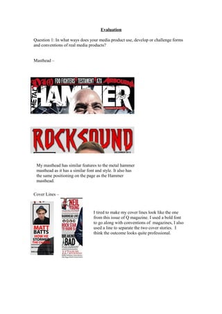
Masthead –
My masthead has similar features to the metal hammer
masthead as it has a similar font and style. It also has
the same positioning on the page as the Hammer
masthead.
Cover Lines –
I tired to make my cover lines look like the one
from this issue of Q magazine. I used a bold font
to go along with conventions of magazines, I also
used a line to separate the two cover stories. I
think the outcome looks quite professional.
2. Cover Photo –
My cover photo I took inspiration from this copy of Q. Really
like the photo. I think my version is quite good as it is a well
framed shot and so the some emotion and gives you an insight
into the story. I made Dennis wear a leather jacket as it look him
look like a rock star.
Colours – I used the colours red, white and black mainly as they the most used
within all magazines. They also stand well. I used yellow in my magazine for things I
wanted stand out from the rest of it. I think the use of yellow is good as it breaks up
the red and black.
Double
Page
layout –
The
layout
of my
double
3. page keeps with the conventions of them as it has 1 main photo, a title and 2 colums
of text.
The story is written in to columns with a drop The main photo is a good as it shows all
cap for the start of the article. I tried to use an the band members and is a medium shot. I
easy to read font so the reader enjoys reading had to cut out all the background. I did this
it. In the middle of the article I added a pull in Photoshop with the magnetic selection
quote as it breaks up the blocks of text and tool, also the quick selection tool. I made
makes it more enjoyable to read again. The any small adjustments with the rubber tool.
font size is 13 I choose this as it isn’t to big but I added a drop shadow to the picture so it
still a readable size and it also fit well into the looked a bit more realistic against the
margins I had set. background.