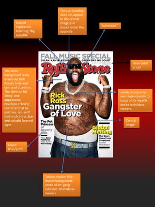
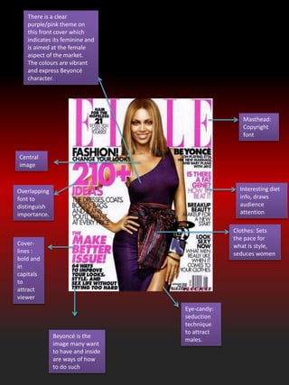
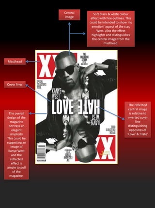
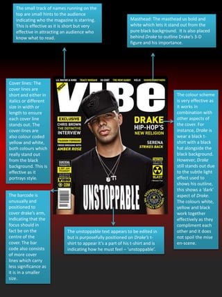
The document summarizes the design elements of several magazine covers and contents pages:
- Magazine covers use bold mastheads, colorful cover lines, central images of celebrities, and coordinated color schemes to attract attention and convey information about the publication and topics.
- Contents pages organize information through headings, images, logos and issue dates to inform readers about articles and establish a consistent brand identity.
- Design choices like fonts, layout, colors and photographs are used strategically to target intended audiences and portray particular tones or messages about the publications and their subjects.
Residential electricity usage varies depending on climate and availability of other fuel sources (natural gas, fuel oil, etc.). This presentation looks at average usage by state and how electricity rates and electricity bills vary between different states.
Corrugated Steel Bridge and Tunnel Solutions Agata Woźniak
Join Ron Prychitko & Lorne Mielty for an overview of various Bridge-Plate, Multi-Plate and Tunnel Liner Plate applications. Through the presentation of various case studies they will cover product selection criteria for corrugated steel plate structures and best practices including assembly and installation.
Case study examples will include bridges, culverts, wildlife passes, mine portals, pedestrian tunnels and more.
What You’ll Learn:
-Learn about unique applications that solve demanding -problems
-Advantages of soil/steel structures
-Construction process for structures
-Available product, application and design resources
-General Canadian Codes and Standards will be referenced
Who Should Attend
-Bridge / Structural Engineers
-Municipal & Transportation Engineers
-Municipal, Provincial and Federal Infrastructure personnel
-Developers
-Earthworks & Highways Contractors
-Mining Engineers & Contractors
-Road Superintendents
Model Attribute Check Company Auto PropertyCeline George
In Odoo, the multi-company feature allows you to manage multiple companies within a single Odoo database instance. Each company can have its own configurations while still sharing common resources such as products, customers, and suppliers.
Instructions for Submissions thorugh G- Classroom.pptxJheel Barad
This presentation provides a briefing on how to upload submissions and documents in Google Classroom. It was prepared as part of an orientation for new Sainik School in-service teacher trainees. As a training officer, my goal is to ensure that you are comfortable and proficient with this essential tool for managing assignments and fostering student engagement.
Welcome to TechSoup New Member Orientation and Q&A (May 2024).pdfTechSoup
In this webinar you will learn how your organization can access TechSoup's wide variety of product discount and donation programs. From hardware to software, we'll give you a tour of the tools available to help your nonprofit with productivity, collaboration, financial management, donor tracking, security, and more.
Synthetic Fiber Construction in lab .pptxPavel ( NSTU)
Synthetic fiber production is a fascinating and complex field that blends chemistry, engineering, and environmental science. By understanding these aspects, students can gain a comprehensive view of synthetic fiber production, its impact on society and the environment, and the potential for future innovations. Synthetic fibers play a crucial role in modern society, impacting various aspects of daily life, industry, and the environment. ynthetic fibers are integral to modern life, offering a range of benefits from cost-effectiveness and versatility to innovative applications and performance characteristics. While they pose environmental challenges, ongoing research and development aim to create more sustainable and eco-friendly alternatives. Understanding the importance of synthetic fibers helps in appreciating their role in the economy, industry, and daily life, while also emphasizing the need for sustainable practices and innovation.
We all have good and bad thoughts from time to time and situation to situation. We are bombarded daily with spiraling thoughts(both negative and positive) creating all-consuming feel , making us difficult to manage with associated suffering. Good thoughts are like our Mob Signal (Positive thought) amidst noise(negative thought) in the atmosphere. Negative thoughts like noise outweigh positive thoughts. These thoughts often create unwanted confusion, trouble, stress and frustration in our mind as well as chaos in our physical world. Negative thoughts are also known as “distorted thinking”.
How to Split Bills in the Odoo 17 POS ModuleCeline George
Bills have a main role in point of sale procedure. It will help to track sales, handling payments and giving receipts to customers. Bill splitting also has an important role in POS. For example, If some friends come together for dinner and if they want to divide the bill then it is possible by POS bill splitting. This slide will show how to split bills in odoo 17 POS.
The French Revolution, which began in 1789, was a period of radical social and political upheaval in France. It marked the decline of absolute monarchies, the rise of secular and democratic republics, and the eventual rise of Napoleon Bonaparte. This revolutionary period is crucial in understanding the transition from feudalism to modernity in Europe.
For more information, visit-www.vavaclasses.com
The French Revolution Class 9 Study Material pdf free download
Magazine analysis
1. Masthead
Central
Image
Cover-
lines/puffs
Tattoos explain Rick
Rosses background,
sense of art, gang
relations. Intimidates
viewers.
Jewels/accessories
worn intentionally to
boast of his wealth
and to intimidate
viewers.
Excited
expression,
boasting. ‘Big
appetite’
The white
background really
draws out Rick
Rosses body and
centre of attention.
The shine on his
‘bling’ and
appearance
develops a ‘bossy’
character that he
portrays. san-serif
fonts indicate a clear
and striaght forward
style.
Issue date/
price/
The sub-heading
does not appeal
to the central
image as it
shows rather the
opposite.
2. Masthead:
Copyright
font
Cover-
lines :
bold and
in
capitals
to
attract
viewer
Interesting diet
info, draws
audience
attention
Central
image
Eye-candy:
seduction
technique
to attract
males.
Beyoncé is the
image many want
to have and inside
are ways of how
to do such
Clothes: Sets
the pace for
what is style,
seduces women
Overlapping
font to
distinguish
importance.
There is a clear
purple/pink theme on
this front cover which
indicates its feminine and
is aimed at the female
aspect of the market.
The colours are vibrant
and express Beyoncé
character.
3. Central
image
Soft black & white colour
effect with fine outlines. This
could be intended to show ‘no
emotion’ aspect of the star,
West. Also the effect
highlights and distinguishes
the central image from the
masthead.
The reflected
central image
is relative to
inverted cover
line
distinguishing
opposites of
‘Love’ & ‘Hate’
Masthead
The overall
design of the
magazine
portrays an
elegant
simplicity.
This could be
suggesting an
image of
Kanye West
and the
reflected
effect is
ample to pull
of the
magazine.
Cover lines
4. Masthead: The masthead us bold and
white which lets it stand out from the
pure black background. It is also placed
behind Drake to outline Drake’s 3-D
figure and his importance.
The small track of names running on the
top are small hints to the audience
indicating who the magazine is starring.
This is effective as it is short but very
effective in attracting an audience who
know what to read.
Cover lines: The
cover lines are
short and either in
italics or different
size in width or
length to ensure
each cover line
stands out. The
cover-lines are
also colour coded
yellow and white,
both colours which
really stand out
from the black
background. This is
effective as it
portrays style.
The unstoppable text appears to be edited in
but is purposefully positioned on Drake’s t-
shirt to appear it’s a part of his t-shirt and is
indicating how he must feel – ‘unstoppable’.
The barcode is
unusually and
positioned to
cover drake’s arm,
indicating that the
focus should in
fact be on the
centre of the
cover. The bar
code also consists
of more cover
lines which carry
less significance as
it is in a smaller
size.
The colour scheme
is very effective as
it works in
combination with
other aspects of
the cover. For
instance, Drake is
wear a black t-
shirt with a black
hat alongside the
black background.
However, Drake
still stands out due
to the subtle light
effect used to
shows his outline,
this shows a ‘dark’
aspect of Drake.
The colours white,
yellow and black
work together
effectively as they
compliment each
other and it does
not spoil the mise
en-scene.
5. The soft tone of
greys and blacks
induces a formal and
serious element.
The restricted
involvement of
red is intended
to draw the
readers
attention to
the key parts
of the page
C lose-up
image of the
singer Adele
with a plain
expression
exaggerates
the formality
of the
magazine but
also the
sincere
emotion the
image is
portraying.
This magazine
tailors for the
soul genre
audience
including
classical/R&B.
The small
contents
headlines on
the left give a
‘low-down’ of
the magazine.
They illustrate
a sense of
organisation. The ‘Q.Review’
section shows the
magazine is well
established that they
organise interviews
with popular bands.
The MOD is very serious and
stern. The clean-cut Adele and
correctly organised subheadings
support this view.
6. Black and
orange are the
main colour
scheme of this
contents page
and most likely
the front
magazine
cover. Orange
is a juvenile
bold colour
and when
mixed with
black shows
clear vibrant
distinctions
attracting the
audiences
attention;
The main
image appeals
to the contents
theme
‘Drummer’.
The black and
white
represents
shows the
image may
have come
from an older
age.
Alternatively
the black and
white maybe
intentional to
remake and
idea of the past
50 years of
drumming
history.
Secondary images provide a
visual insight into the magazine and
also corresponds to the number
sub-headings that provide more
information.
The style of font is serif which
shows the magazine is relaxed and
trending. This style and colour of
font is likely to have been carried
on from the magazine cover page.
Issue date :is important for
the magazine as it sets a
schedule and indication of
which magazine has been
released but also keeps
audiences informed of and up
to date of which is the latest
magazine out.
Structured sub-
headings with
spec of
information is
used to draw in
the audience.
7. The slanted page effect gives
the magazine a different angle
the audience can read from
which is different. The slant
also reflects the attitude of
the secondary main image.
Bold san-serif font creates an
idea that this magazine
contains serious informative
news/gossip about popular
artists and about the music
industry.
Small print
contents takes up
a small area of
the page than the
secondary image.
This initially
shows that XXL
believe the
reader will get a
better
understanding of
the contents from
viewing the
image rather than
reading the
information
provided. This
shows that
images can
transfer more
information at
times than
written text.
The XXL logo;
reminds
readers of the
magazineXXL issued a simple
colour scheme, main
colours include black,
white and red. This is
a recurring pattern
within XXL which
means it is their main
theme. The majority
of the colour is
white, this is to
distinguish all the
dark colours.
Issue date
The jewellery shown in the secondary
image shows the audience this magazine
has established what a ‘typical’ rap artist
should look like i.e. intimidating.
8. The ‘contents’
font style is a
trademark for
Vibe magazine.
It also works as
a reminder for
audiences of
the magazine
they’re reading
and it also suits
contemporary
audience with
its different
style.
The colour of burgundy is shared in different
shades throughout the page and also compliments
the white texts alongside the main image. This
works very well the different shading of Burgundy
near the corners of the page gives the page depth.
The overall colour scheme appears to give off a
‘warm’ welcoming feeling however this is
completely contradicted by the main image who
appears provocative and rough.
The image is very bold as it captures the artist
holding up several chains whilst revealing his gold
teeth. The image is very provocative and over
powers all other texts on the page.
Reminder of
issue date
The contents is
in a very small
font outlining
its lack of
importance in
comparison to
all other texts
on the page. It
does share a
theme of
‘white’ with the
page title which
is effective in
giving the page
a constant
theme
throughout.