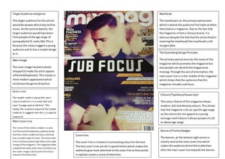
Target Audience and genre 
The target audience for this article 
would be people who enjoy techno 
music. As the picture depicts, the 
target audience would have been 
from people of the age range of 
young adults(15- early 20s).This is 
because the colour suggest a young 
audience and its has a simple design 
to it. 
Main Image 
The main image has been photo 
shopped to make the artist appear 
reflected/duplicated .This creates a 
more modern appearance which 
reinforces the genre of techno. 
Model credit 
The model credit is above the main 
cove line which is in a small text and 
says “o-page special edition”. This 
makes the audience aware of the model 
credit as it suggests that this is a special 
magazine 
Main Cover Line 
The name of the artist i s simply in a sans-seri 
f font which makes the audience know 
that the artist is called sub focus and they 
are a modern type of music .The main cover 
l ine is sub focus which also links to the cover 
image of the magazine. The magazine shows 
supports the main cover line of sub focus as 
the cover image i s blurry and not in focus 
towards the artists face. 
Masthead 
The masthead is at the primary optical area 
which is where the audience first looks at when 
they look at a magazine. Due to the fact that 
the magazine is from a famous brand, it is 
obvious (despite the fact that the artists head is 
covering the masthead) the masthead is still 
recognisable. 
The Gutenberg Design Principle 
The primary optical area has the name of the 
magazine which promotes the magazine but 
also people can identify the magazine as 
mixmag. Through the axis of orientation, the 
main cover line is in the middle of the magazine 
which shows that the audience that this 
magazine includes sub focus. 
Colours/Typefaces/House style 
The colour theme of this magazine shows: 
modern, dull and dreamy colours. This shows 
that the magazine is for an specific age range 
as the colours do not appeal to a young 
teenager and it doesn’t attract people of a 25 
or above age range. 
Coverlines 
The cover line is in boxes in contrasting colour for the text. 
The text cover lines are all in capital letters which makes the 
audience give more attention to the cover line as they words 
in capitals create a sense of attention. 
Banners/Flashes/badges 
The banner, at the bottom right corner is 
closely next to the main cover line which 
makes the audience direct there attention 
after the main cover line towards the banner.

Front Cover Analysis

  • 1.
    Target Audience andgenre The target audience for this article would be people who enjoy techno music. As the picture depicts, the target audience would have been from people of the age range of young adults(15- early 20s).This is because the colour suggest a young audience and its has a simple design to it. Main Image The main image has been photo shopped to make the artist appear reflected/duplicated .This creates a more modern appearance which reinforces the genre of techno. Model credit The model credit is above the main cove line which is in a small text and says “o-page special edition”. This makes the audience aware of the model credit as it suggests that this is a special magazine Main Cover Line The name of the artist i s simply in a sans-seri f font which makes the audience know that the artist is called sub focus and they are a modern type of music .The main cover l ine is sub focus which also links to the cover image of the magazine. The magazine shows supports the main cover line of sub focus as the cover image i s blurry and not in focus towards the artists face. Masthead The masthead is at the primary optical area which is where the audience first looks at when they look at a magazine. Due to the fact that the magazine is from a famous brand, it is obvious (despite the fact that the artists head is covering the masthead) the masthead is still recognisable. The Gutenberg Design Principle The primary optical area has the name of the magazine which promotes the magazine but also people can identify the magazine as mixmag. Through the axis of orientation, the main cover line is in the middle of the magazine which shows that the audience that this magazine includes sub focus. Colours/Typefaces/House style The colour theme of this magazine shows: modern, dull and dreamy colours. This shows that the magazine is for an specific age range as the colours do not appeal to a young teenager and it doesn’t attract people of a 25 or above age range. Coverlines The cover line is in boxes in contrasting colour for the text. The text cover lines are all in capital letters which makes the audience give more attention to the cover line as they words in capitals create a sense of attention. Banners/Flashes/badges The banner, at the bottom right corner is closely next to the main cover line which makes the audience direct there attention after the main cover line towards the banner.