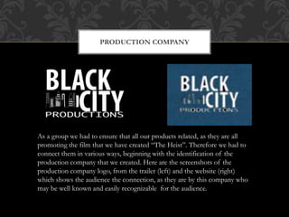
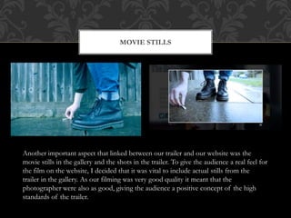
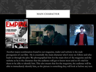
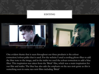
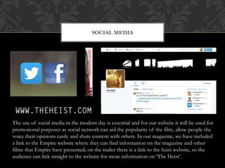
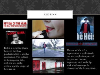
The document discusses the equipment, software, and websites used to create a trailer, poster, and magazine for a film project. A Canon 550D SLR camera was used for filming due to its light weight and ease of use. Final Cut Pro X was used to edit clips, add transitions, titles, and effects to create tension. Music was taken from Purple Planet Music and altered to fit the video. Photoshop and Illustrator were used to design the magazine cover and poster, allowing logos and titles to be precisely positioned. Research websites like Val Morgan and YouTube provided information on target audiences and conventions of trailers. Issues with repetitive footage were overcome through editing techniques in Final Cut Pro X.
The document discusses the importance of gaining audience feedback at various stages of creating a media product. It describes getting feedback on a rough cut of their teaser trailer from other students, which highlighted positives like good editing but also areas to improve like shortening the length. Further feedback was gathered on the final teaser cut, poster, and magazine. This feedback confirmed the products cohesively conveyed the genre and satisfied the target audience, ensuring the work would be successful.
George learned from audience feedback on test screenings of his film. Feedback helped him better understand and cater to his target audience of 15-40 year olds. He received feedback on his pitch presentation, teaser trailer, poster, and magazine. This feedback highlighted needed improvements and helped George set clear goals for polishing his marketing materials and narrative. Overall, the feedback suggested his audience engaged with the materials and wanted to see the film, showing the marketing campaign was successful.
The document discusses the layout, color scheme, and stylistic elements used across a movie poster, movie trailer, and movie magazine article to promote an upcoming horror film. Blue, red, black and white were prominent colors. The same font was used across all pieces to create coherence. The trailer, poster, and magazine work together as a complete promotional package, with the trailer teasing the audience, the poster providing more details, and the magazine targeting a wider audience. Styling of the actor was kept consistent across pieces to appeal to the target youth audience.
The document discusses the marketing campaign for the film Star Wars: The Force Awakens. It summarizes how the campaign established the film's identity over 10 years through unique trailers and marketing techniques. Different elements of the marketing campaign, such as the film poster, teaser trailer, and magazine covers are then analyzed in more detail to show how they portrayed the film's brand identity and appealed to fans of the Star Wars franchise through familiar elements and characters.
The document discusses how continuity was created across products promoting a film by using the same actors, settings, colors, fonts, shots, and production/distribution company logos. Actors were featured in both the trailer and magazine cover to emphasize important roles. Backgrounds in the trailer and magazine reflected the genre. Colors were muted in the trailer and carried over to other products to convey a dark, mysterious tone. The same font was used for the film title in all products to aid recognition. One shot from the trailer was reused on the poster. Including the logos of the production and distribution companies on the trailer and poster improved opinions of the work.
The document discusses how continuity was created across products promoting a film by using the same actors, settings, colors, fonts, shots, and production/distribution company logos. Actors were featured in both the trailer and magazine cover to emphasize important roles. Backgrounds in the trailer and magazine reflected the genre. Colors were muted in the trailer and carried over to other products to convey a dark, mysterious tone. The same font was used for the film title in all products to aid recognition. One shot from the trailer was reused on the poster for continuity. Including company logos on the trailer and poster improved opinions of the work.
Our media product uses conventions of real trailers but also challenges some conventions:
- It follows Todorov's story structure theory of equilibrium, disruption, new equilibrium.
- Unlike most horror films, it only uses male characters.
- The trailer editing techniques make it seem realistic. It gives viewers a taste without revealing too much.
- Viral marketing on Facebook was used to target the 16-25 age group.
- The professional website and logos help promote the film.
The media product challenged and developed conventions of real media in several ways:
1) The movie trailer used natural lighting, shadows, and low-key lighting to create tension, similar to techniques used in the horror film Annabelle.
2) Editing techniques like titles, graphics, jump cuts, and shot variation were used to link scenes and convey character emotions, following conventions.
3) The trailer was filmed using a Canon G7X and iPhone X, challenging conventions by using cheaper equipment like many films on YouTube.
4) The magazine cover and poster were designed by analyzing real horror media, taking elements, and gathering feedback on the designs from the target audience.
How effective is the combination of your main product and ancillary texts?EllisHackett
The document discusses how the marketing campaign for a crime/thriller film effectively combined different products including a trailer, poster, and magazine. Continuity was created across products by using the same actors, costumes, settings, colors, fonts, shots, production and distribution company logos. This helped audiences instantly recognize the products were related and accurately portrayed the film's genre. The mystery of who the villain is was conveyed through both the trailer and poster using silhouettes and giving little away. Key aspects like the characters being thieves were shown throughout to effectively sell the film across all products.
The student created a teaser trailer, poster, and website for a horror film as part of their A2 media studies course. They conducted extensive research into existing horror film conventions to ensure their products adhered to typical codes and genres. Feedback from target audiences helped the student improve their teaser trailer by making scenes faster paced. A variety of media technologies were used at different stages, including YouTube for research, Windows Movie Maker for planning, and editing software to construct the teaser trailer.
The document discusses how effective the combination of the main film "Voices" and its ancillary texts (trailer, poster, magazine) are at marketing the film. It analyzes how using consistent elements like the same actors, fonts, colors, and shots creates recognition and links the different marketing pieces together. However, it notes that some inconsistencies, like the use of silhouettes in the poster, could reduce clarity. Overall, replicating key elements across the trailer, poster and magazine helps make the marketing campaign cohesive and raises audience awareness of the film.
The document summarizes the creation of a teaser trailer and ancillary texts for a student media production project. It discusses how the teaser trailer and poster use conventions of real media products in their genre while also attempting to challenge conventions. Audience feedback was gathered at various stages and incorporated to improve the products for the target audience. New media technologies like photo editing, video editing, and web design software were used to construct and evaluate the ancillary texts.
The group's main marketing product was a teaser trailer for their film, as it provides information to demonstrate the narrative without fully revealing the plot. They also created two ancillary texts: a film poster and magazine cover. The poster and magazine used consistent blue and red color branding and fonts to match the trailer and help audiences connect the different products. Both the poster and magazine featured the main character and slogans to advertise the dancing theme of the film. The teaser trailer then incorporated elements from the ancillary texts while providing a more detailed preview of the narrative through moving images.
The document discusses the process of creating promotional materials for a film project including a teaser trailer, poster, and magazine cover. It describes analyzing existing examples to understand conventions of the genre. Feedback was gathered from an audience who felt the locations and visuals matched the crime genre. Some elements like the magazine cover background could be improved. Overall, technology played an important role in research, production, and editing the final materials.
The document summarizes the creative choices made in developing a film trailer, poster, and magazine cover that are effectively linked together through shared visual elements. An image from the trailer was used for the black and white poster to connect the two. The same actress, costume, and text styling from the trailer were featured on the magazine cover to clearly show their relationship. Color schemes were varied between the poster and magazine to distinguish the production and publishing entities while still representing the thriller genre.
This document discusses how the media product utilizes and challenges horror genre conventions. It analyzes existing horror works to understand codes and conventions to use in its advanced portfolio. The teaser trailer follows conventions like fast pacing and glimpses of the narrative but challenges expectations by not revealing the antagonist. The magazine and poster styles are cohesive but put a unique triangular logo spin and feature an Asian female lead with a doll in the window linking to the film's narrative.
The ancillary texts like posters and radio trailers were important to promote the film production. The group had difficulties creating the initial posters but eventually decided on a final poster. They researched posters in similar genres for inspiration, particularly drawing from the pink and white color scheme and character displays of the Pretty Woman poster. Their final poster used these conventions with a love triangle storyline hinted through character placements and interactions. It also included film details like the title, certificate, actors' names, and reviews. Their radio trailer consisted of a voiceover advertising the film and dialogue excerpts to entice listeners without revealing plot details. In conclusion, the poster and radio trailer complemented each other when released together, showing creative synergy within the group
To promote the movie Need for Speed, Aaron Paul appeared on several TV shows and events. His appearance on Top Gear was effective because it featured an interview about the film and a trailer, along with Paul driving a car, relating to his role as a race car driver in the movie. He also appeared on The Graham Norton Show to reach a different audience. Additionally, Paul gave a speech at the E3 convention for the new Need for Speed game to appeal to gamers. His popularity from Breaking Bad helped attract viewers who may not otherwise be interested in cars.
The document discusses how the media production group used and developed conventions of real media genres in their mystery/thriller trailer. They researched conventions like editing techniques and soundtracks used in movie trailers like Inception. Their trailer used conventions like fade to black cuts and syncing visuals with music to build tension. They also challenged conventions by using a non-white lead actor to diversify typical genres. The group felt their trailer effectively used key conventions seen in real media to engage audiences.
The document discusses how the combination of main products and ancillary tasks can be effective for advertising. It maintains consistent elements like the film title "The Deprived" across all products to create a recognizable brand. Key props and imagery are also consistently featured, like a map carried by the protagonist, to better link the narratives between advertisements. Themes of death, blood and nature are expressed in both the film trailer and poster to create a stronger bond between the media. These consistent elements and themes across products help audiences more easily identify them as advertising the same film.
The short film uses a romantic drama genre with two main characters who never physically meet, leaving the conclusion open to interpretation. Various film techniques like natural lighting, camera angles, and stop-frame animation were used to tell the story and appeal to young audiences. Technology elements like iPods and mobile phones were incorporated to make the setting seem modern. The film aims to challenge gender roles and appeal to both modern and art house audiences.
The document discusses ancillary texts for advertising a film. It describes creating a poster and radio trailer to promote the film. The poster design process included researching other films' posters and analyzing one from a similar genre film. The final poster incorporated elements from different drafts, including images from the film. The radio trailer included dialogue and sound effects from the film along with key details. In conclusion, ancillary texts are effective for attracting audiences and the poster and radio trailer created will help promote the film.
How effective is the combination of your main evaluation 2joeyblack214
The document discusses the effectiveness of film posters and radio trailers in promoting movies. It argues that posters are effective because they can be widely placed in public areas like bus stops to reach a large target audience, and help make the film title memorable. Radio trailers also promote films by providing short clips and descriptions to intrigue listeners. While both posters and radio spots help sell films, posters may reach a broader audience since not everyone listens to the radio. The document concludes by comparing its own film poster to The Dark Knight poster, noting similarities in imagery and focus on the antagonist but differences in use of quotes.
Evaluation question 1 A2 Media coursework portfoliobobonthedrums
This document discusses how the media product challenges, develops, and follows conventions of real trailers. It followed conventions in using only 3 characters and color grading to create mood. It developed conventions by having a revenge narrative but twisting the hero into an antagonist. It challenged conventions by ending with a long static shot instead of constant pacing. Overall, it balanced following and challenging conventions to create an understandable but original teaser trailer.
Aaron Gomez was involved in the hardware production aspects of constructing the trailer, film poster, and magazine cover. For the trailer, he ensured proper lighting and use of lighting gels. For the poster and cover, he helped set up backgrounds and lighting to achieve red and blue tones. He also edited scenes and titles for the trailer, and created photo shop credit blocks for the poster.
The document discusses the goals and creative process behind a student film project that included a trailer, poster, and magazine cover. The group aimed to create a psychological horror piece similar to the "Saw" films. They researched conventions of the horror genre from films like "Hostel" and "Silence of the Lambs" to inform their trailer. For the poster, they studied "Saw" posters and included imagery and text featuring blood. Across the trailer, poster, and magazine cover, they incorporated consistent visual elements like an actress and blood to tie the pieces together and market the film.
Este cronograma detalla las actividades de ensayo y presentación de una obra de teatro que se llevará a cabo del 13 de agosto al 11 de septiembre. Incluye fechas, horarios y responsables de cada actividad como teoría, asignación de roles, ensayos, pruebas de vestuario y maquillaje, ensayos generales y la presentación final. También incluye notas sobre la conducta esperada en los ensayos y recomendaciones para los actores.
This document provides information about Shakespeare Primary School in London, England. It includes the school's contact details and resources such as a library, laboratory, and sports facilities. It also shares a survey for parents to evaluate their children's home and academic lives. The survey includes questions about homework, languages spoken, hobbies, and family activities. Finally, it outlines a game called "Do You Know Me?" where students take turns asking each other two true/false questions about themselves to earn points and interact with their classmates.
List of classic noir films, the directors, the years that they were written a...ellenkenrick82
The document provides details on numerous classic film noir movies from the 1940s and 1950s, including The Maltese Falcon (1941), The Big Sleep (1946), Double Indemnity (1944), The Killers (1946), Sweet Smell of Success (1957), Kiss Me Deadly (1955), Out of the Past (1947), The Postman Always Rings Twice (1946), The Big Heat (1953), Spellbound (1945), Detour (1945), Touch of Evil (1958), In a Lonely Place (1950), and Murder My Sweet (1944). Each entry lists the year, country of origin, director(s), producer(s), screenwriter(s), and other relevant information.
This document is a profile and portfolio for an artist named Cody Hunter. It provides biographical information about Cody, including being born in Titusville, Florida and growing up near Disney, which inspired his love of animation. It outlines Cody's educational path, including taking art classes in high school and college. The portfolio highlights Cody's skills and areas of focus, including drawing, painting, and 3D artwork. It expresses Cody's goals and how he will achieve them through practice, dedication, and maintaining a brand mantra of persevering through challenges. Contact information is provided at the end.
This document outlines strategies for running an effective internal fundraising campaign among faculty and staff at a university. It discusses why these campaigns are important in creating a culture of philanthropy and building partnerships. However, it also notes that faculty and staff can be cynical donors because giving is tied to their feelings about their job. The document provides tips on tools to use like volunteer ambassadors, direct mail, email and events. It emphasizes the importance of thoughtful planning, rotating messages over five weeks of an intensive solicitation phase, and ongoing stewardship of donors after the campaign. The goal is to make fundraising an ongoing campus tradition.
Este documento presenta resúmenes de cuatro obras teatrales: El lago de los cisnes, El fantasma de la ópera, y Romeo y Julieta. Incluye información sobre la trama, personajes, y contexto histórico de cada obra. Para El lago de los cisnes detalla los cuatro actos e incluye extractos de cada uno. Para El fantasma de la ópera menciona los personajes principales y la ambientación en la Ópera de París en 1857-1874. Para Romeo y Julieta resume que trata sobre la histor
Information systems provide essential support to businesses in three key ways:
1. They support business processes and operations by coordinating activities and workflows.
2. They support managerial decision making through tools that help identify problems, compile relevant data, and evaluate alternatives.
3. They support business strategies for gaining competitive advantages through approaches like reducing costs, innovating products, and expanding markets globally.
Este documento resume tres obras literarias clásicas: Romeo y Julieta de Shakespeare, que narra la historia de amor entre dos jóvenes de familias enemistadas; Los miserables de Víctor Hugo, una novela épica sobre la pobreza y la justicia social en el siglo XIX; y El principito de Antoine de Saint-Exupéry, un cuento sobre la amistad y el amor contado desde la perspectiva de un niño.
Shashikant Shankar Mane is applying for a trainee engineer position. He has a Bachelor's degree in Mechanical Engineering from Dr. J.J. Magdum College of Engineering. His skills include CAD software like CATIA and AutoCAD as well as Microsoft Office. He completed a 15-day vocational training at Kirloskar Brothers Limited and his hobbies include reading books and visiting new places. Mane is looking for a job that provides satisfaction and allows for self-development while helping achieve personal and organizational goals.
Este documento describe las bases generales de una convocatoria para promover la cultura del teatro en una región. Los participantes podrán presentar dramaturgias como monólogos, adaptaciones e improvisaciones. Habrá categorías para drama y comedia. Los interesados tendrán hasta el 8 de julio para inscribirse. Los beneficios para los seleccionados incluyen apoyo con vestuario, escenografía y reconocimientos. Habrá audiciones los días 9, 10 y 11 de julio, y ensayos la semana siguiente.
El cine es la técnica y arte de proyectar fotogramas de forma rápida y sucesiva para crear la impresión de movimiento, mostrando algún video. Fue un neologismo creado a finales del siglo XIX y compuesto a partir de dos palabras griegas: por un lado κινή (kiné), que significa «movimiento»; y por otro γραφóς (grafós). Con ello se intentaba definir el concepto de «imagen en movimiento».
The document discusses the benefits of exercise for mental health. Regular physical activity can help reduce anxiety and depression and improve mood and cognitive functioning. Exercise stimulates the production of endorphins in the brain which elevate mood and reduce stress levels.
El documento presenta un cronograma detallado de actividades y ensayos para la presentación de las obras "Farsa y justicia del señor corregidor" y "Mamma Mía". Incluye fechas, horarios y responsables para cada actividad como entrega de propuestas, ensayos, revisión de vestuario, escenografía, coreografía, entre otros. El cronograma comprende desde el 26 de enero hasta el 23 de febrero, fecha de la presentación pública en el Teatro Victoria.
L’obiettivo di “T-FARM trailer” è stato quello realizzare azioni di promozione e di marketing territoriale per iniziative imprenditoriali giovanili con insite caratteristiche di successo.
Este documento presenta varias técnicas de análisis de documentos. Describe la técnica de análisis que implica descomponer un objeto en sus partes. También explica cómo detectar palabras clave, hacer anotaciones, analizar la estructura, subrayar ideas clave y usar la síntesis y esquemas para organizar la información. El objetivo final es lograr una comprensión profunda del tema.
Este documento define y explica diferentes figuras retóricas como la comparación, metáfora, anáfora, epíteto, prosopopeya, antítesis, hipérbaton, hipérbole, ironía, sinécdoque, metonimia, onomatopeya y polisíndeton. Además, incluye ejemplos de cada una y un ejercicio para identificar las figuras retóricas en expresiones dadas.
The document provides an evaluation of the media products created for a fictional viral marketing campaign for a horror movie. It summarizes how the posters, teaser trailer, and websites used both conventional and unconventional forms. The posters and missing persons website aimed for realism to generate intrigue, while the movie website and teaser trailer used familiar horror movie conventions. Audience feedback found the teaser trailer intriguing through its ambiguity and fast pace. A range of media technologies were used in the construction, research, planning and evaluation of the viral marketing campaign.
The document summarizes an A2 media evaluation for a short teaser trailer created by the author. The teaser trailer featured an all-male cast, challenging the typical damsel-in-distress trope in horror films. Storyboards and viral marketing on Facebook were used to plan shots and gather audience feedback. Based on feedback, additional shots were added to make the teaser more tense. Editing software and camera equipment allowed the trailer to be professionally edited in HD quality.
Tanaka Tiriboyi evaluated their media products including a film poster, magazine, and trailer. For the poster, Tanaka followed conventions such as including the film title, character image, slogan, and cast/crew information to make it look professional. Some conventions were developed, such as placing the character image in front of the title to emphasize their importance. For the magazine, conventions like the masthead, promotional text, and thumbnail images were used. Developing conventions included overlapping the main image and tagline. The trailer included disclaimers, production logos, camerawork to convey emotion, and mood music as conventions. Developing conventions in the trailer included changing the upbeat soundtrack in the second half for irony. Feedback
The document discusses the media productions that inspired the creator's trailer and ancillary texts, how they used conventions from real media, and how they effectively linked the pieces together. It also outlines the media technologies used in researching, planning, constructing, and evaluating the project, including cameras, editing software, websites for design work, and tools for gathering and presenting audience feedback.
The document discusses a student's action film trailer project. The student feels they successfully incorporated conventions of the action genre such as length, fast pacing, and intense mise-en-scene. Audience feedback was positive and suggested minor improvements like additional music and sound editing. The student also created accompanying promotional materials like a website and magazine cover that maintained consistency with the trailer and received good feedback. Overall, the student learned from the audience feedback and successfully used various media technologies throughout the project.
Our media product uses conventions of real trailers but also challenges some conventions:
- It follows Todorov's story structure theory of equilibrium, disruption, new equilibrium.
- Unlike most horror films, it only uses male characters.
- The trailer editing techniques make it seem realistic. It gives viewers a taste without revealing too much.
- Viral marketing on Facebook was used to target the 16-25 age group.
- The professional website and logos help promote the film.
1. The candidate created a film poster, magazine cover, and teaser trailer for their media portfolio that followed conventions of real media products in their genres.
2. Feedback indicated the strengths were title slates, effects, and retro style suiting the sci-fi genre. Improvements could be shorter clips and clearer storyline.
3. The candidate used various media technologies like Blogger, Photoshop, GarageBand, YouTube, and camera equipment to construct, research, plan, and evaluate their portfolio.
The document discusses the house styles used for various ancillary tasks created to promote a short film called "Note to Self". It describes how each group member established a consistent style across their poster and double-page spread. Key elements included color schemes, fonts, images and layouts that tied the pieces together and connected them to the film's themes of memory and time. Maintaining professional conventions like ratings, quotes and production logos helped the pieces appear polished and appealing to their target young adult audience.
The document summarizes an A2 media evaluation for a teaser trailer project. The teaser trailer used an all-male cast to challenge conventions of typically featuring female characters. Storyboards and viral marketing on Facebook were used to plan shooting and gather feedback. Audience feedback suggested adding more shots and a point-of-view shot of a victim to increase tension. Advanced editing software and HD cameras were used to professionally construct and edit the teaser trailer.
Evaluation powerpoint both together initguestbfbdf32
This document summarizes the use of conventions and techniques in the construction of a film trailer. It discusses how the trailer follows conventions like building tension through changing editing speeds from slow to fast. It establishes a hero/villain distinction through clothing. It builds tension in editing by starting slow and becoming faster as the "equilibrium breaks." Music and selective shots are used to create an atmospheric and tense feeling. While most thriller trailers are mysterious, this one reveals more of the plot to explain it. New media like digital cameras, editing software, blogs, and photo manipulation were used in planning, research, and presenting the project.
The document analyzes the website for the film "Gone Girl" and discusses elements that could be useful for a website promoting the film being analyzed. It identifies navigation bars, the logo, interactive elements like arrows and videos, synopses, sign-up forms, and options to purchase the film as key components of the Gone Girl website that provide information and marketing opportunities. The document suggests incorporating navigation bars, logos, interactive clips, sign-up forms, and pre-order options on a website for the film being analyzed.
The document evaluates a film trailer by analyzing nine frames focusing on aspects like titles, setting, characters, and sound. It discusses how the trailer both challenges and conforms to conventions of real media products. For example, one frame challenges conventions by hiding a character's face to create mystery. Audience feedback noted that the storyline was enjoyed but the narration could be clearer over the music. The target audience for the film is identified as 15-33 year olds, especially females interested in supernatural genres.
The document provides feedback on a student's media products for their horror film project. It summarizes the student's trailer, website, and poster. The student received feedback that the trailer lacked pace and needed to include more of the main character's actions. For the website, the student added recommended elements like media icons and moved elements for better balance. The student also adjusted fonts and imagery based on feedback.
The document discusses a student's media production of a teaser trailer for an action film called "Conspiracies". The student conducted extensive research on conventions of action film trailers in order to include all necessary forms and conventions in their teaser trailer. They created several ancillary texts including a website, magazine cover, and DVD cover to promote the film. The student gathered feedback on their work and found it was generally positive, with some suggestions for minor improvements. The student learned about their audience and how to improve through gathering this feedback.
The document discusses the production of a film trailer for a psychological thriller genre film. It summarizes that the group analyzed real film trailers to understand conventions like three-act structure. They applied conventions of the psychological thriller genre such as darkness and confusion. The trailer incorporated structure, text, and music as key conventions. Feedback was gathered through audience comments on a blog.
The document provides details about the production process of a short horror film and accompanying promotional materials. It discusses researching conventions of the horror genre to inform the filmmaking. Various software programs were used at different stages - Blogger to design a blog, Slideshare to share mood boards, Animoto to embed presentations, Final Cut Pro to edit footage, Dreamweaver to build a website, Photoshop to design promotional poster and images. Audience feedback on draft materials informed revisions to things like trailer fonts, pacing and footage selection. Overall the document outlines the multimedia design process for this short horror film project from research to production to evaluation.
Power Director 10 was used to edit the trailer. This software allowed for various editing techniques like fading between shots and adding transitions. It was easy to use and reliable. Transitions helped provide continuity and interest for the audience. They also allowed the directors to take a more professional approach. The software made it simple to show contrasts between different tones, like fading love scenes versus quick shots of violence.
The combination of the film poster and trailer effectively reinforce each other's brand identity through consistent use of fonts, phrases, images, and color palette (red and white). The trailer prominently features the film's slogan "BE CAREFUL WHAT YOU SAY" and blood imagery, mirroring elements from the poster. Both the poster and trailer end with the film name "AMY" in black and white, solidifying the brand identity across marketing materials.
The document discusses the effectiveness of advertisements for a short film called "Unforgettable". It analyzes a poster and 30-second radio trailer created to promote the film. Research was conducted on successful film advertisements. The poster features the two main characters prominently and conveys a sense of their relationship without spoiling the film's twist. The radio trailer uses sounds and a quote to hint at the story and intrigue audiences. Overall, the advertisements are deemed effective at teasing the plot and genre while maintaining secrecy around the twist ending.
How to Fix the Import Error in the Odoo 17Celine George
An import error occurs when a program fails to import a module or library, disrupting its execution. In languages like Python, this issue arises when the specified module cannot be found or accessed, hindering the program's functionality. Resolving import errors is crucial for maintaining smooth software operation and uninterrupted development processes.
Walmart Business+ and Spark Good for Nonprofits.pdfTechSoup
"Learn about all the ways Walmart supports nonprofit organizations.
You will hear from Liz Willett, the Head of Nonprofits, and hear about what Walmart is doing to help nonprofits, including Walmart Business and Spark Good. Walmart Business+ is a new offer for nonprofits that offers discounts and also streamlines nonprofits order and expense tracking, saving time and money.
The webinar may also give some examples on how nonprofits can best leverage Walmart Business+.
The event will cover the following::
Walmart Business + (https://business.walmart.com/plus) is a new shopping experience for nonprofits, schools, and local business customers that connects an exclusive online shopping experience to stores. Benefits include free delivery and shipping, a 'Spend Analytics” feature, special discounts, deals and tax-exempt shopping.
Special TechSoup offer for a free 180 days membership, and up to $150 in discounts on eligible orders.
Spark Good (walmart.com/sparkgood) is a charitable platform that enables nonprofits to receive donations directly from customers and associates.
Answers about how you can do more with Walmart!"
How to Add Chatter in the odoo 17 ERP ModuleCeline George
In Odoo, the chatter is like a chat tool that helps you work together on records. You can leave notes and track things, making it easier to talk with your team and partners. Inside chatter, all communication history, activity, and changes will be displayed.
The simplified electron and muon model, Oscillating Spacetime: The Foundation...RitikBhardwaj56
Discover the Simplified Electron and Muon Model: A New Wave-Based Approach to Understanding Particles delves into a groundbreaking theory that presents electrons and muons as rotating soliton waves within oscillating spacetime. Geared towards students, researchers, and science buffs, this book breaks down complex ideas into simple explanations. It covers topics such as electron waves, temporal dynamics, and the implications of this model on particle physics. With clear illustrations and easy-to-follow explanations, readers will gain a new outlook on the universe's fundamental nature.
Exploiting Artificial Intelligence for Empowering Researchers and Faculty, In...Dr. Vinod Kumar Kanvaria
Exploiting Artificial Intelligence for Empowering Researchers and Faculty,
International FDP on Fundamentals of Research in Social Sciences
at Integral University, Lucknow, 06.06.2024
By Dr. Vinod Kumar Kanvaria
A review of the growth of the Israel Genealogy Research Association Database Collection for the last 12 months. Our collection is now passed the 3 million mark and still growing. See which archives have contributed the most. See the different types of records we have, and which years have had records added. You can also see what we have for the future.
LAND USE LAND COVER AND NDVI OF MIRZAPUR DISTRICT, UPRAHUL
This Dissertation explores the particular circumstances of Mirzapur, a region located in the
core of India. Mirzapur, with its varied terrains and abundant biodiversity, offers an optimal
environment for investigating the changes in vegetation cover dynamics. Our study utilizes
advanced technologies such as GIS (Geographic Information Systems) and Remote sensing to
analyze the transformations that have taken place over the course of a decade.
The complex relationship between human activities and the environment has been the focus
of extensive research and worry. As the global community grapples with swift urbanization,
population expansion, and economic progress, the effects on natural ecosystems are becoming
more evident. A crucial element of this impact is the alteration of vegetation cover, which plays a
significant role in maintaining the ecological equilibrium of our planet.Land serves as the foundation for all human activities and provides the necessary materials for
these activities. As the most crucial natural resource, its utilization by humans results in different
'Land uses,' which are determined by both human activities and the physical characteristics of the
land.
The utilization of land is impacted by human needs and environmental factors. In countries
like India, rapid population growth and the emphasis on extensive resource exploitation can lead
to significant land degradation, adversely affecting the region's land cover.
Therefore, human intervention has significantly influenced land use patterns over many
centuries, evolving its structure over time and space. In the present era, these changes have
accelerated due to factors such as agriculture and urbanization. Information regarding land use and
cover is essential for various planning and management tasks related to the Earth's surface,
providing crucial environmental data for scientific, resource management, policy purposes, and
diverse human activities.
Accurate understanding of land use and cover is imperative for the development planning
of any area. Consequently, a wide range of professionals, including earth system scientists, land
and water managers, and urban planners, are interested in obtaining data on land use and cover
changes, conversion trends, and other related patterns. The spatial dimensions of land use and
cover support policymakers and scientists in making well-informed decisions, as alterations in
these patterns indicate shifts in economic and social conditions. Monitoring such changes with the
help of Advanced technologies like Remote Sensing and Geographic Information Systems is
crucial for coordinated efforts across different administrative levels. Advanced technologies like
Remote Sensing and Geographic Information Systems
9
Changes in vegetation cover refer to variations in the distribution, composition, and overall
structure of plant communities across different temporal and spatial scales. These changes can
occur natural.
How to Make a Field Mandatory in Odoo 17Celine George
In Odoo, making a field required can be done through both Python code and XML views. When you set the required attribute to True in Python code, it makes the field required across all views where it's used. Conversely, when you set the required attribute in XML views, it makes the field required only in the context of that particular view.
2. PRODUCTION COMPANY
As a group we had to ensure that all our products related, as they are all
promoting the film that we have created “The Heist”. Therefore we had to
connect them in various ways, beginning with the identification of the
production company that we created. Here are the screenshots of the
production company logo, from the trailer (left) and the website (right)
which shows the audience the connection, as they are by this company who
may be well known and easily recognizable for the audience.
3. MOVIE STILLS
Another important aspect that linked between our trailer and our website was the
movie stills in the gallery and the shots in the trailer. To give the audience a real feel for
the film on the website, I decided that it was vital to include actual stills from the
trailer in the gallery. As our filming was very good quality it meant that the
photographer were also as good, giving the audience a positive concept of the high
standards of the trailer.
4. SPLASH PAGE
In the website, I have taken a clip of the trailer after post-production and used it as our
splash page, to introduce a motion clip and make the website much more advanced and
technical. It is really affective and combines the visual aspect of a film with the website,
which without it would be much more basic. It also links us with the character of Dom
as the clip makes the audience uneasy and they begin to question why he is running
and what he is running from, intriguing them and encouraging them to see the film.
This is why we decided to use this clip for the ‘splash’ page.
5. MAIN CHARACTER
Another major combination found in our magazine, trailer and website is the male
protagonist of our film. He is essentially the main character who’s story we follow and who
leads us through the plot. We photographed him for the main shot of the magazine and the
website as he is the character that the audience will get to know most and so it’s vital for
them to be able to identify him. This also means that for the magazine, the audience will be
able to immediately identify him, as the picture is something they will look at before any text.
6. EDITING
One evident theme that is seen throughout our three products is the colour
correction/colour pallet that is used. For the website I used a cooling photo filter to add
the blue tone to the image, and in the trailer we used the colour correction to add a blue
filter. This inspiration was taken from the ‘Brick’ film, which was a main inspiration for
our film and trailer. The blue hue also aids the emphasis on the neo noir genre as this is
something seen in some neo noir films including ‘Brick’
7. SOCIAL MEDIA
The use of social media in the modern day is essential and for our website it will be used for
promotional purposes as social network can aid the popularity of the film, allow people the
voice their opinions easily and share content with others. In our magazine, we have included
a link to the Empire website where they can find information on the magazine and other
films that Empire have presented; on the trailer there is a link to the heist website, so the
audience can link straight to the website for more information on ‘The Heist’.
8. RED LINK
Red in a recurring theme
between the three
products which is another
connection. The red text
in the magazine links
with the text in the
website and the images all
have red in.
The use of the red is
important as it really stands
out and emphasizes parts of
the product that are
important, such as the lip
stick which conveys the
character of the femme fatale.